
SAADAA × OPTIPHOENIX: A SIZE SELECTION REDESIGN DROVE A 20% CONVERSION RATE UPLIFT
Flooret sells luxury vinyl plank flooring – a considered, high-involvement purchase where buyers are comparing materials, finishes, and fit-for-room across multiple product options. The product detail page is where that decision happens.
But on the original PDP, most users weren’t getting far enough to make it. A 70% bounce rate signaled widespread early abandonment. Heatmap data confirmed what was happening: users engaged with the image gallery and the model/type section, then dropped off. 15% left before even reaching the Type section. 50% exited once they hit the accordion sections lower on the page.
The Add to Cart CTA was being largely ignored. And analytics revealed something strategically important: users who added a sample to cart converted at a significantly higher rate than those who went straight to box purchases, yet samples weren’t being surfaced in a way that drove that behavior.
OptiPhoenix partnered with Flooret to redesign the first fold of the PDP to make the purchase decision clearer and the sample pathway more prominent.
The product page had the right content. The sequence in which it presented that content was creating decision friction rather than resolving it.
The sample-first pathway was Flooret’s highest-converting route to a box purchase, yet sample kits were buried within the Type selection toggle without distinct visual prominence. Users who might have committed to a sample – a low-risk entry into the purchase journey – were leaving before they even understood it was an option.
The first fold needed to do three things it wasn’t doing: signal the sample pathway clearly, make type selection intuitive, and keep the Add to Cart CTA persistently accessible.
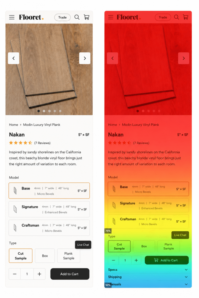
If the first fold of the PDP is redesigned to prominently badge the Cut Sample option, restructure the Buy Now section for clarity, and introduce a sticky Add to Cart CTA, users will engage more deeply with the page and convert at a higher rate across both sample and box purchases.
OptiPhoenix designed an A/B test with three coordinated design changes:
Variant A (Control): Original PDP layout with Type selection (Cut Sample, Box, Plank Sample) as a flat toggle and no persistent CTA.
Variant B (Test): Three changes applied together – a badge labeling the Cut Sample option prominently at the top of the page, a repositioned and redesigned Buy Now section with clearer type differentiation and descriptions, and a sticky Add to Cart CTA that remained accessible as users scrolled.
Metrics Measured: Add-to-cart rate, checkout movement, overall conversion rate, sample purchases, box purchases

The redesigned first fold produced improvement across every measured metric.
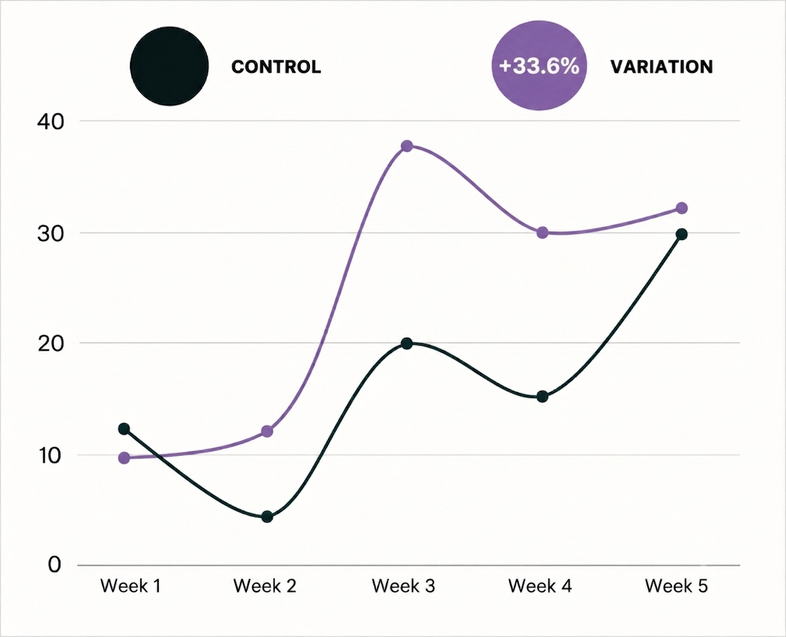
Add-to-cart rate increased by 23%. Checkout movement grew by 12%. Overall conversion rate increased by 33.6%. Sample purchases rose by 53% and box purchases by 10%.
Making the sample pathway visible and the purchase decision clearer at the top of the page drove both entry-level and direct purchases upward simultaneously.
The entry-level purchase is the high-converting one. For products that benefit from physical trial before full commitment, making the trial option prominent and clear is a direct conversion lever. Samples weren’t just good for engagement; they were the path most likely to lead to a box sale.
First-fold clarity determines whether users stay. When the most important decision cues aren’t immediately visible, a meaningful share of users leaves before the page makes its case.
Sticky CTAs reduce the cost of engagement. When users are actively reading, comparing, and evaluating, a CTA they don’t have to scroll back for removes a small but real friction at the moment of decision.
Flooret’s PDP already had a high-converting pathway built into the product structure. The experiment didn’t create it – it made it visible. When the sample option was badged, the Buy Now section was restructured, and the CTA was kept accessible throughout the page, users could find and act on the path that worked best for them. The result was a conversion rate improvement of more than a third, and a 53% increase in the sample purchases that drive long-term box revenue.
