MR. TUNING × OPTIPHOENIX: A “DOES THIS FIT MY CAR?” COMPATIBILITY CTA DROVE A 10.93% REVENUE UPLIFT
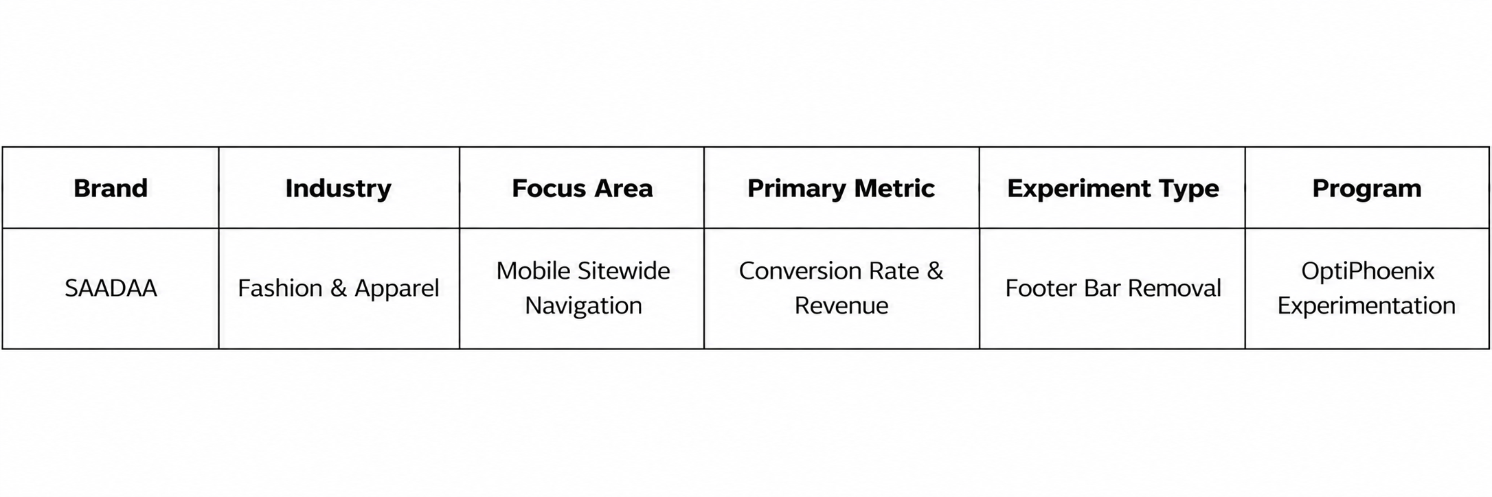
SAADAA is a fashion brand selling everyday apparel such as kurtas and pants. On its mobile site, a fixed footer bar stayed at the bottom of every page, with shortcuts such as Home, Menu, and Log in. That bar offered a second route into navigation next to the hamburger menu at the top. It also took up screen space on a small display where every inch of product content counts.

OptiPhoenix partnered with SAADAA to test whether removing the footer bar would simplify navigation and improve conversion.
A mobile screen has room for one clear navigation path. When two compete, shoppers have to decide which to use.
The footer bar repeated options that the hamburger menu already offered. So the gap sat between a shopper trying to explore the range and a screen that split their attention across two sets of navigation.
OptiPhoenix proposed removing the footer bar sitewide on mobile. This would free up screen space and direct more shoppers to the hamburger menu as the single route into the catalogue. This was expected to improve navigation focus and lift the conversion rate.

OptiPhoenix ran a controlled A/B test across the SAADAA mobile site, for all users. The test ran for 2 days, from 7 July to 9 July.
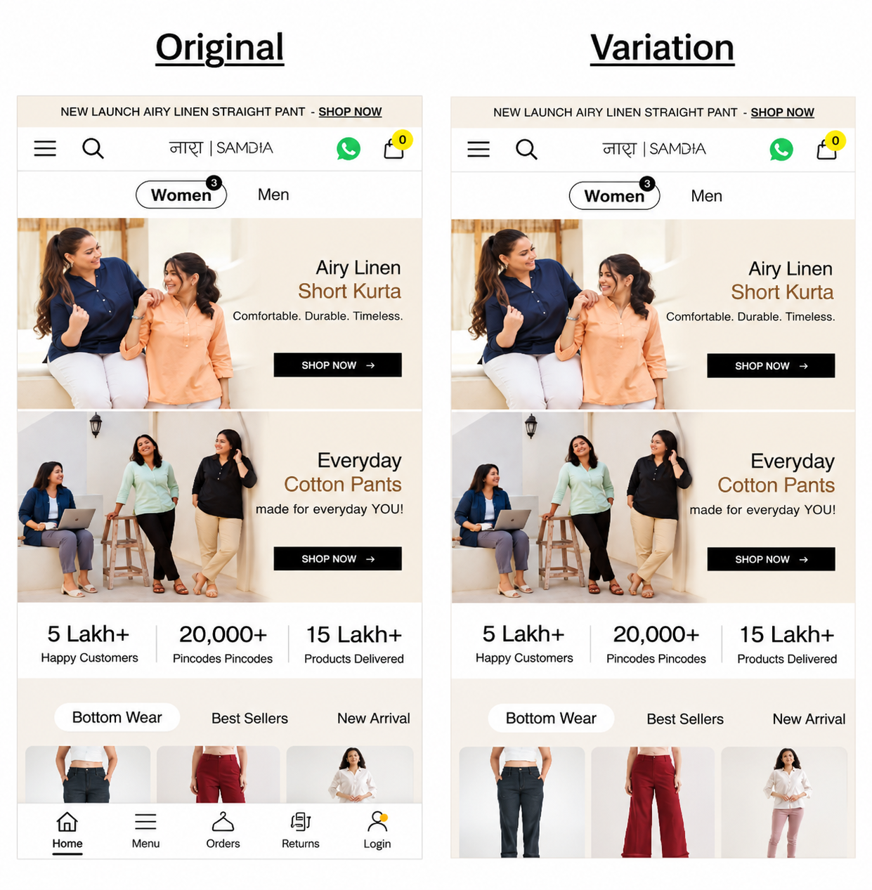
Variant A (Control): The original mobile site, with the fixed footer bar at the bottom of the screen.
Variant B (Test): The same site with the footer bar removed.
Metrics measured: Conversion Rate, Revenue, and interaction with the Hamburger Menu.
With one navigation path to follow, more shoppers completed a purchase.
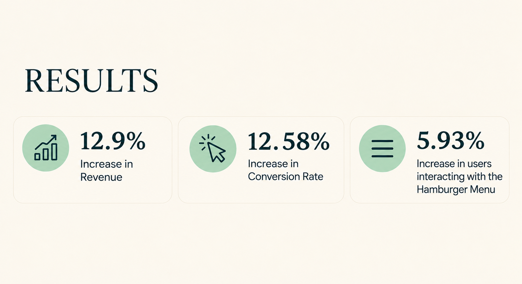
Conversion Rate rose 12.58%, and Revenue rose 12.9%. Interaction with the hamburger menu rose 5.93%, so more users reached for the menu once the footer bar was gone.
Duplicate navigation can dilute attention. The footer bar repeated options that the hamburger menu already carried. Removing it left one clear path, and menu interaction rose.

Removing an element can be a valid test. The variation added nothing new to the screen. The gain came from taking something away.
Read the test length with care. The test ran for 2 days, and the deck reports no statistical confidence for this run. A longer test would confirm the size of the lift.
SAADAA‘s shoppers did not need a second set of navigation. They needed one clear way in. By removing the mobile footer bar, OptiPhoenix reduced the competition for attention. Revenue rose 12.9% and Conversion Rate rose 12.58%.