
SAADAA × OPTIPHOENIX: A SIZE SELECTION REDESIGN DROVE A 20% CONVERSION RATE UPLIFT
A shopper who lands on one product is rarely certain it is the one. They want to see what sits nearby: the same style in another color the broader category, the adjacent option they had not considered. On Neeman’s PDP, that exploration was hard. Related categories and alternative product paths had little visibility, and discovery depended almost entirely on the navigation menu.
A shopper who wanted to browse sideways had to back out and start again, which most do not bother to do. The product title also sat above the image gallery, which pushed the breadcrumb and any sense of where the product lived in the catalogue further down and out of view.
OptiPhoenix partnered with Neeman’s to test whether bringing discovery onto the product page itself would deepen browsing and lift conversion.
The PDP was a dead end where it should have been a junction.
Once a shopper arrived, the page offered two choices: buy this exact item, or leave. There was no in-page prompt toward a related sandal, a different colorway, or the wider category, so a shopper close to buying but wanting to compare had nowhere to go without losing their place. The gap was navigability, sitting between a shopper ready to explore and a page that gave them no way to do it.
If contextual product discovery links are surfaced on the PDP and breadcrumb visibility is improved, shoppers will explore related categories more easily, browse deeper, and convert at a higher rate.
OptiPhoenix ran a controlled A/B test on the PDP layout:
Variant A (Control): The original PDP, with the product title above the image gallery and related category pathways given little prominence.
Variant B (Test): The product title moved below the image gallery to raise breadcrumb visibility, with contextual discovery links added directly on the page, such as more of the same style, more in the same colour, and more of the broader category.
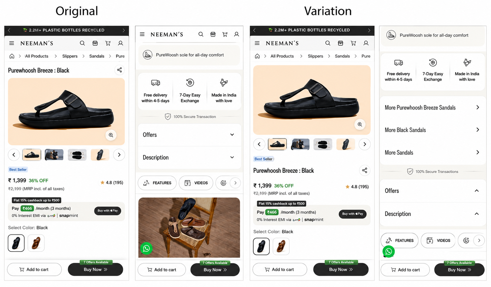
Duration: 6 days
Metrics Measured: conversion rate, revenue per visitor
The test gave shoppers a way to explore without leaving, and they took it.
Revenue per visitor rose 5.8%. The add-to-cart that happened through the discovery link popup converted at 32.61% higher than the baseline path, which shows shoppers who followed a contextual link were moving closer to a purchase rather than wandering off.
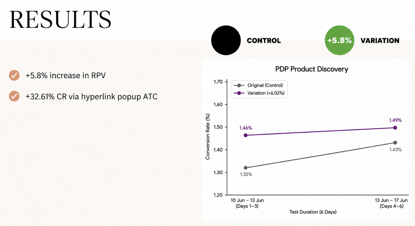
Bringing discovery onto the product page lifted revenue per visitor by 5.8% and turned sideways browsing into add-to-cart.
Exploration is part of the purchase. The shoppers who followed contextual links converted at a higher rate, which means in-page discovery served buying intent rather than diluting it.
Breadcrumb visibility shapes confidence. Moving the title below the gallery raised the breadcrumb’s prominence and helped shoppers understand where a product sat in the range, which made the adjacent options feel like a natural next step.
Put the next option where the decision happens. Discovery that lived only in the navigation menu went unused. The same pathways, surfaced on the PDP, changed behaviour.

Neeman’s shoppers were not refusing to explore the catalogue. They were given no way to do it without abandoning the page they were on. By surfacing related categories and alternative paths directly on the PDP, and by raising breadcrumb visibility, the product page became a place to browse forward rather than a point to leave from.
