
SAADAA × OPTIPHOENIX: A SIZE SELECTION REDESIGN DROVE A 20% CONVERSION RATE UPLIFT
Flo Mattress is a D2C sleep and bedding brand from India, focused on delivering high-quality, comfortable sleep solutions by blending thoughtful engineering with customer-centric design. The brand re-engineers traditional mattress supply chains to remove unnecessary middlemen and pass cost savings directly to customers. On Flo Mattress’s Product Listing Page, users faced friction navigating the shopping journey. Excessive scrolling, hidden pricing, and unclear calls-to-action made the page cumbersome to use. Without visible discounts or motivational cues, users were left uncertain, which undermined trust, reduced engagement, and lowered conversions.

OptiPhoenix partnered with Flo Mattress to test whether clearer product cards would reduce that friction and improve conversion.
A product card is where a shopper decides whether something is worth a closer look. If price and discount information are hidden, that decision gets harder to make at a glance, and shoppers are left scrolling through more of the page just to find basic information they need.
Uncertainty at this stage does not just slow shoppers down, it erodes trust. Without visible pricing and a clear call to action, users had less reason to believe the page was working in their favor. The gap sat between shoppers ready to compare mattresses and product cards that made comparison harder than it needed to be.
OptiPhoenix proposed that highlighting price and discount information on every product tile, making the Shop Now CTA more prominent, and reducing tile size so more products were visible at once would let users compare mattresses at a glance. This was expected to improve trust and drive a higher conversion rate.

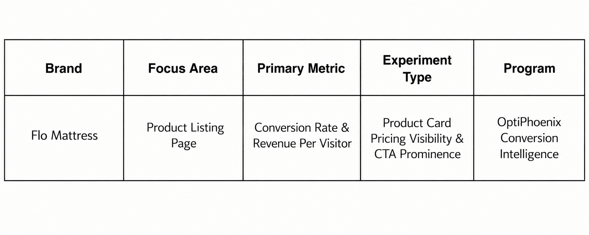
OptiPhoenix ran a controlled A/B test on Flo Mattress’s Product Listing Page.
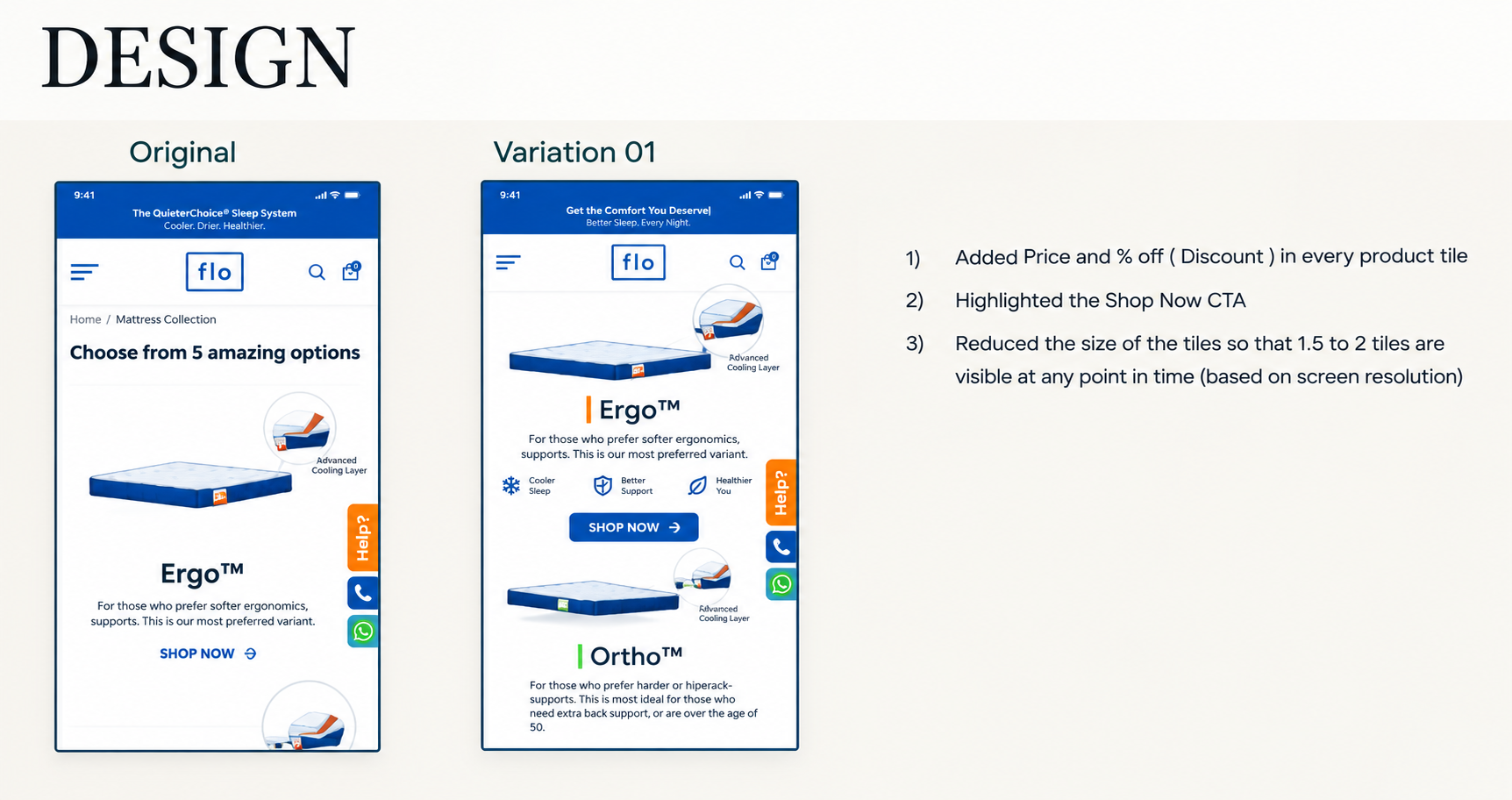
Variant A (Control): The original product cards, with pricing and discount information not clearly visible and a less prominent call to action.
Variant B (Test): Price and percentage discount added to every product tile, the Shop Now CTA highlighted, and tile size reduced so that 1.5 to 2 tiles were visible at any point in time, depending on screen resolution.
Metrics measured: Conversion Rate and Revenue Per Visitor (RPV).
Making pricing and discounts visible at a glance, without extra scrolling, moved more shoppers toward a purchase.
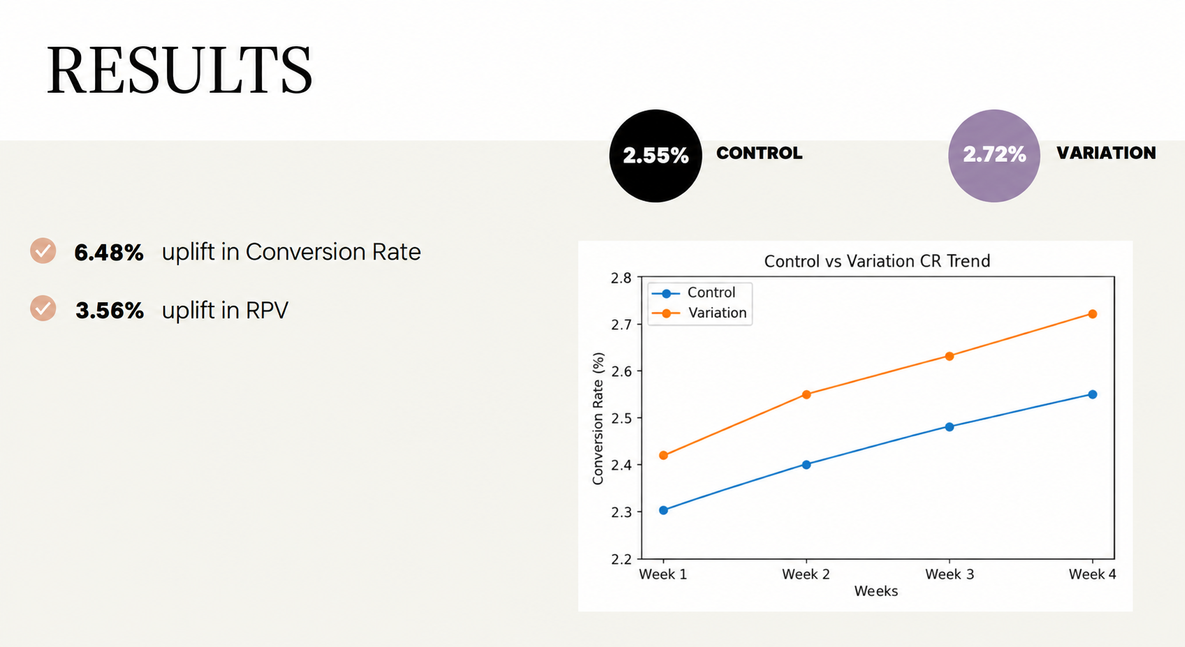
Conversion Rate rose from 2.55% to 2.72%, a 6.48% increase. Revenue Per Visitor rose 3.56% over the same test.
Hidden pricing reads as a reason to hesitate, not a reason to look closer. Shoppers comparing mattresses want price and discount information immediately, not after extra scrolling. Surfacing it directly on the tile removed a barrier to comparison.
Smaller tiles can improve, not hurt, product discovery. Reducing tile size to show more products at once let shoppers compare options within a single view, rather than relying on memory across multiple scrolls.
A stronger CTA works best alongside clearer information, not instead of it. Highlighting Shop Now mattered, but it moved conversion together with visible pricing, not on its own, showing that call-to-action prominence and information clarity reinforce each other.
Flo Mattress shoppers were not struggling to find a mattress they liked, they were struggling to compare options without clear pricing and too much scrolling. By making price, discounts, and the CTA visible at a glance, OptiPhoenix closed that gap, and shoppers moved through comparison and into a purchase decision faster.

