AI Agent vs Chatbot: What’s the Difference for Your Store?
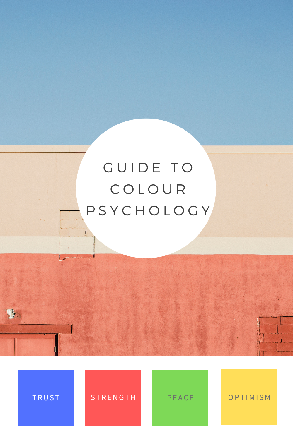
Colour has a strong psychological effect on people.
As per some reports, a colour can boost brand recognition by 80%. This implies that colour affects how consumers perceive the brand’s personality.
Colours also have a crucial role in influencing consumers’ purchase decisions as they serve as a means of expressing feelings and emotions.
The use of appropriate colours in marketing, advertising, or websites can have a significant impact since they have a profound impact on our minds and emotions like nothing else.
Colours have deep effects on people’s moods and behaviors. When choosing a colour scheme for your brand or product, it’s important to consider how it will affect your audience. The right colour combination may set the mood for a certain message or feeling that you want to convey with your brand or product.
When it comes to conversion rates on websites, there are many factors at play—but one thing we know for sure is that people like things that are easy on the eyes.
Suppose your website is difficult to navigate or hard on the eyes because of too many colours or design elements. In that case, visitors won’t be able to focus on what matters most: your offer and how they can benefit from it due to uneasy web design colours.
This is where the psychology of colour comes in. By consciously and subconsciously leveraging the principles of colours and layout designs, you can make sure that your site converts visitors.
Website colour psychology is a great marketing strategy that can influence 85% of consumer purchase decisions.
Colours and their meanings have been around since the dawn of time. So, is there a science or psychology behind these meanings?
As said by Wassily Kandinsky-
“Colour is a power which directly influences the soul.”
Colour psychology is the study of how colours make people feel, act, and behave. According to some research, colour psychologists believe that colours have the power to influence people’s mood, emotion, thought, and behavior. They also believe that certain colours can help you sell your products or ideas to customers.
The psychology of colour is used by designers, advertisers, and marketers to attract customers to their stores and websites.
As mentioned above, colours used in designs can have a huge impact on how the audience responds to the brand. It’s important to understand what colours mean, so you can make sure they’re used effectively in your design.

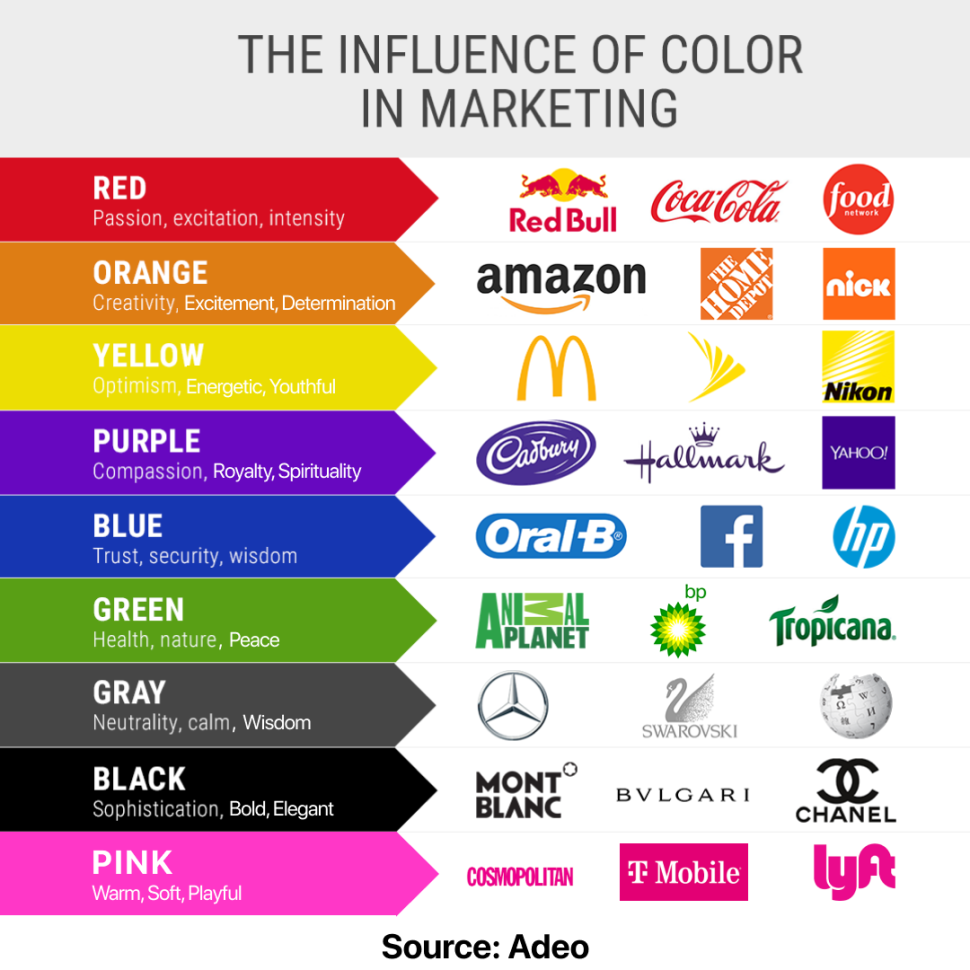
Many companies use colour as a marketing tool to appeal to a specific demograph or audience. For example, blue is often associated with trustworthiness and reliability, so businesses might use blue when trying to convince customers that their product is safe or trustworthy (like Pepsi using blue cans).
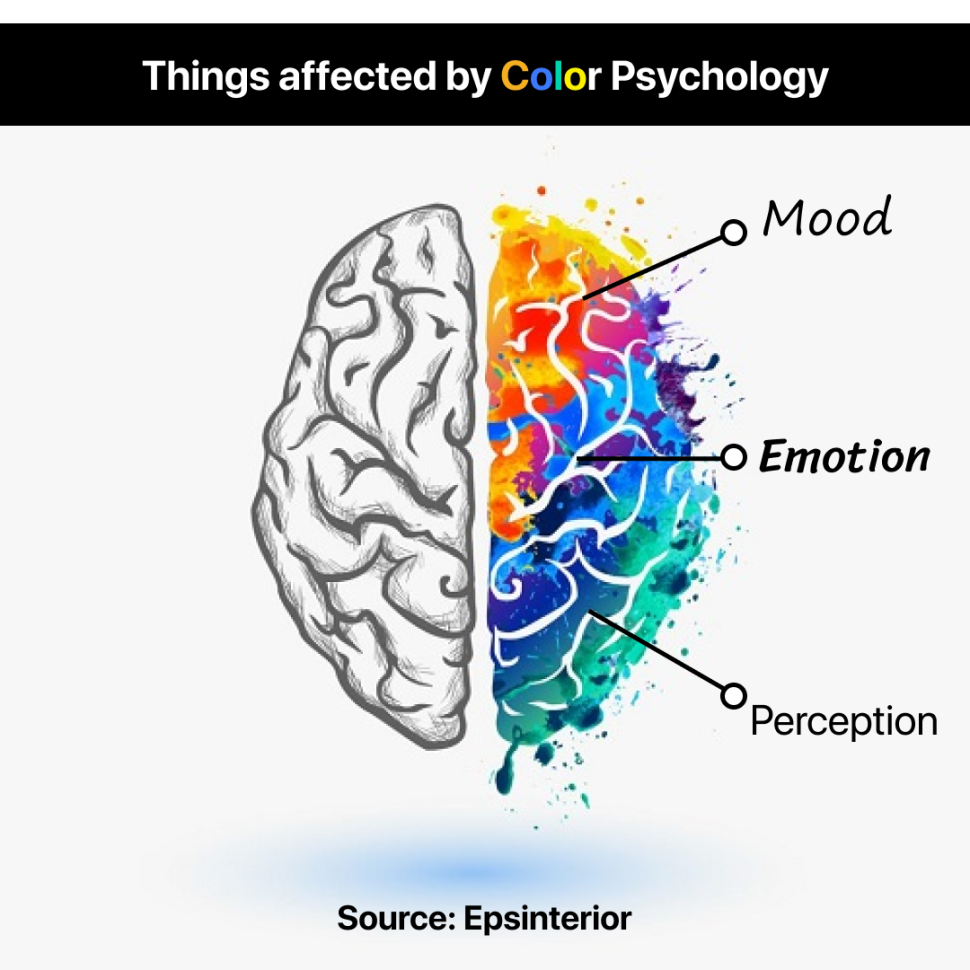
Colours can change how people feel about something. For example, if you’re using a colour that makes people feel sad or angry, they may be less likely to convert to your site. But if you use a colour that makes them feel happy or excited, they’re much more likely to convert.
If you want visitors to feel happy or excited about your product or service, using colour for website that are bright colours like reds, oranges and yellows are good ways to do so! However, if you want them to feel calm and relaxed (like when reading an eBook), blues and greens are probably better choices for you!
Different colours evoke different reactions in our minds – which means they also have an impact on how we perceive things around us! For example, red may make us feel hungry because it’s associated with food that is ideally used by Zomato.
Colours have proved to be one of the most important tools in marketing. A good choice of colour for the website can display a different mood among the masses. If you are a business owner, have you ever thought about what colours to use for your website? Which colours attract more visitors’ attention and convert them into buying customers?
Whereas colour is an essential component of a company’s brand because colour has the power to enhance brand recognition. It also contributes to improving brand value and leads to a positive impact on sales.
Psychology of colour is a powerful tool that you can use to your benefit when designing your website. The right colours can make your site more attractive and engaging, while the wrong ones can turn away visitors.
While making the proper colour for website choices might improve how people perceive your brand, making the wrong ones can hurt your business’s reputation.
For instance, if you use the incorrect colours for your text or logo, it may become harder for your audience to read and comprehend. Or you run the risk of being completely disregarded.
Marketers can utilize colour to affect how consumers feel and act toward a brand as well as how they comprehend any information. People can decide what is essential by using colour. And for that reason, content marketers must be aware of the significance of various colour schemes.
Colour plays a huge role in buying decisions. It’s the first thing people notice when they see a website or product, and it’s the first thing they remember. It’s also one of the most important factors in whether or not people buy what you’re selling.
If you want to increase your user conversion rate (the percentage of visitors who buy your product), you need to ensure that your Colour psychology in the website scheme is on point. If customers don’t like your colour choices, they won’t buy from you.
That’s because colour influences everything from moods to behaviors, so if it’s off-putting or confusing, then it could lead some people away from purchasing with you and toward buying from someone else instead.
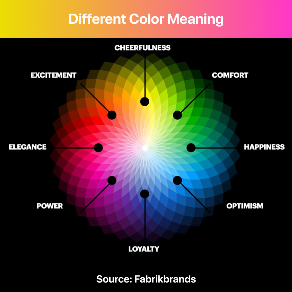
Colour psychology in websites is an important factor in website conversion. It can help you evoke the desired emotions from your visitors, which can lead to more user conversion. Some examples of widely used colours are:
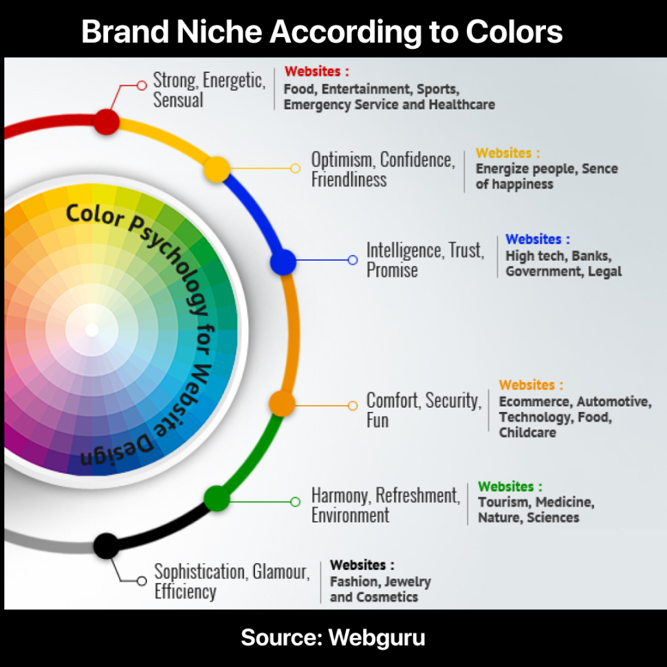
For example, if you’re trying to get people to sign up for an email newsletter, you want them to be excited by what they see and feel compelled to sign up. If your newsletter sign-up form is red, that’s going to make it hard for people who are anxious or fearful because red is associated with danger.
It can also make people excited about signing up for something new if their dominant personality traits are extroverted (which makes them more likely to respond well to bright colours).
We overlook one hue, which is utilized on websites the most when studying website colour psychology. Every webpage uses the colour white. White, however, is not considered a colour by many colour theorists. Regardless, white space must be utilized as a strong design element. The most popular search engine, “Google,” is one such example.
Your brand may be strengthened via the power of colour, which can also boost sales and direct website users to certain pages or calls to action. According to studies, consumers determine whether or not they like a product in less than 90 seconds, and 90% of that choice is made entirely on the basis of colour.
How can colour psychology on websites and conversion process and theory can be used to entice people to click a button? One of the oldest arguments around website conversion and optimization is the colour of the call-to-action button.
For every expert who asserts that the ideal colour for a button is attention-grabbing red, there are two more who assert that the best colour is green since it is secure and denotes “go.”
A test conducted by HubSpot demonstrated how a CTA button’s colour has a significant influence on signups. The red button received 21% more clicks despite their initial expectation that the green button would perform better. The red button was probably preferred by the audience since it was the sole colour that sticks out on the website, despite HubSpot’s disclaimer that test results are subjective.
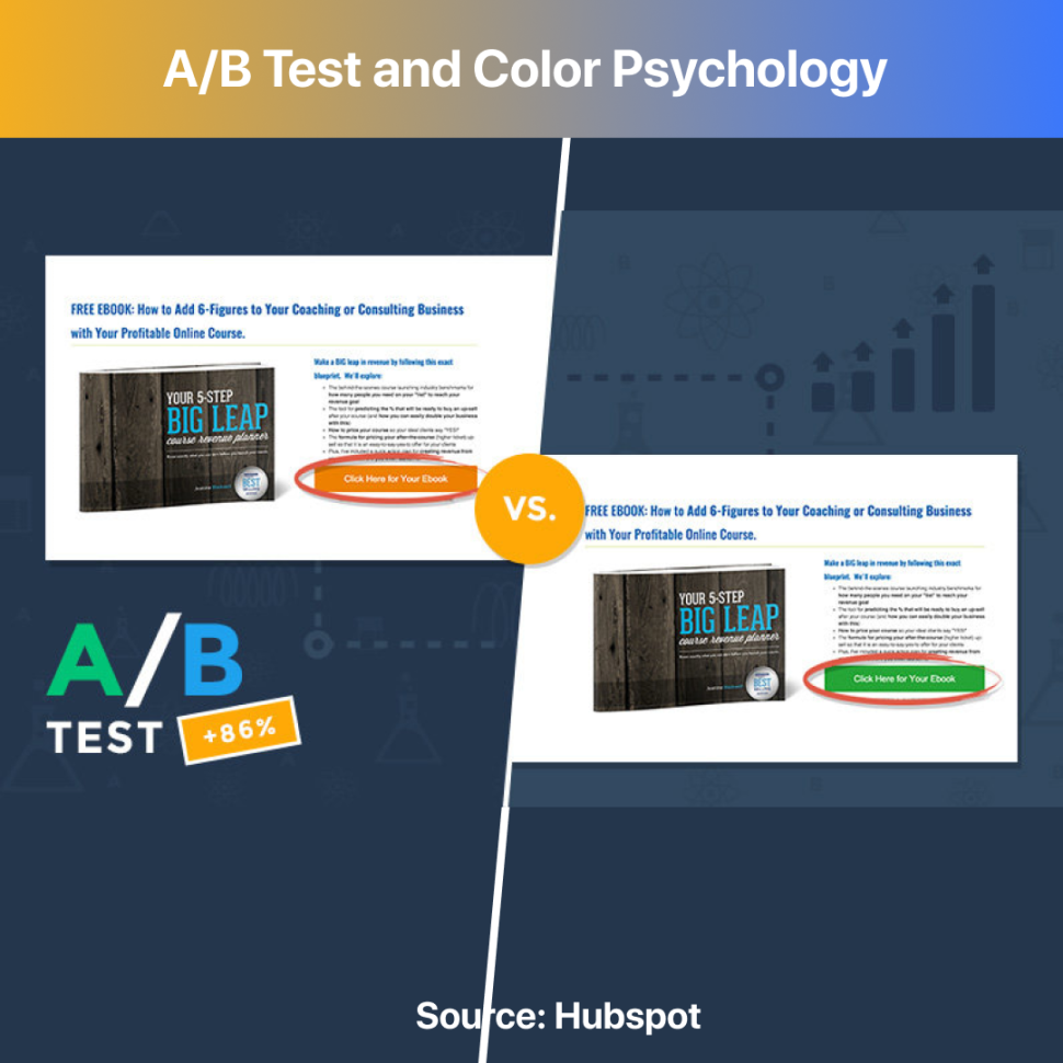
The button’s colour alone has very little to no impact. What operates on one website might not operate on another. There is no one optimal hue, therefore claiming that one converts better than another is simply false. There are, however, certain generalizations that might assist you in making the most of colour.
The average person spends only a few seconds on a website before deciding whether or not to stay. If you’re trying to sell something, it’s crucial to make sure that your website looks professional and well-designed with the use of business colour psychology. One way to do this is by testing the web design colours elements of your site to see which ones convert visitors into buyers.
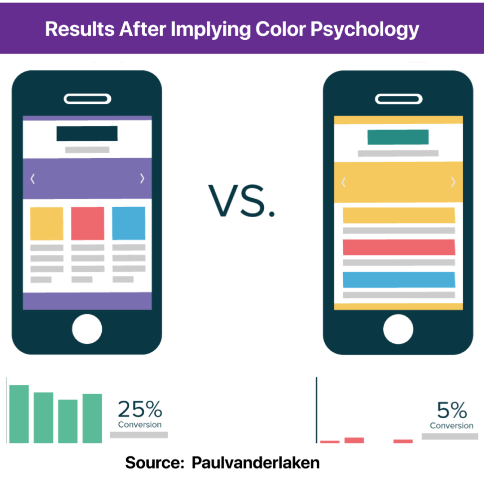
There are 3 reasons why you should test various colours and combinations on your website for conversion.
Choose your website colour scheme carefully. Test various options, play around with them, try to predict which colour scheme will work best based on your audience, and then A/B tests these ideas to make sure you’ve found the winning design.
In other words, use all the research at your disposal to inform your choices instead of taking a purely gut-based approach.
It’s important to keep in mind that the website colour psychology you use can strongly influence the mood and perception of visitors to your website. Colour affects how people feel and how they respond to elements on a web page.
So if you’re using colour to promote website conversion as a facet of psychology on websites, be sure to take the time needed to choose colours wisely on a project-by-project basis so that you can achieve your desired results.
The most important thing to remember is that each colour will have different effects on different individuals. That’s why understanding the psychology of colour and how they are perceived is so important. By incorporating certain colours, you can increase engagement and improve brand recognition.