AI Agent vs Chatbot: What’s the Difference for Your Store?
The final process in any consumer journey is the checkout procedure. Customer hesitation and uncertainty is the biggest killer of eCommerce conversion rates. If at any point a customer thinks, ‘maybe later’, that means there is a window of distraction that is destroying the transaction.
Many online marketers believe that a decline in conversion rate on the payment gateway and at ecommerce checkout page abandonment are inevitable parts of operating an online business. Here they are wrong. Marketers can help the customer improve conversion rate and get enough information to make an insightful, secure choice. This may assist users to increase traffic and conversion optimization on the checkout page. It is possible once you know the reason behind cart abandonment.
According to Baymard Institute, an eCommerce site can have a 35.26% increase in conversion rate with better checkout layout and design. It’s an easy approach to make sure that your online store does not become a grave for abandoned shopping carts.
The crucial thing to know is why abandonment rate increases and what is the consumer’s thought process during their checkout journey.
As we discussed earlier, cart abandonment is a problem. According to Barilliance, cart abandonment costs an average store about 75% of its sales.
According to Statista, a significant portion of online shopping orders in 2022 were abandoned. Meaning, that they were never turned for sale. Out of all assessed categories, websites having cruise and ferry travel services had the highest cart abandonment rate (98%.) Then came the mobile providers with 90.76%.
If you want to optimize the checkout process, then you should first understand the reasons why clients are leaving after adding products to their carts. So let’s look at some of the reasons listed below:
Unexpected delivery fees are one of the main reasons why shopping carts are getting abandoned. Due to the lack of eligibility of availing free shipping, or adding the products with at least ‘xx’ amount leading to free shipping, customers remove items from their carts as it causes a dilemma to users whether to add more than what is required just for shipping sake or not?
To better assist customers in making decisions, many consider that shipping and delivery costs should be displayed sooner in the checkout process. While there are numerous other causes of cart abandonment outside delivery problems, this shipping-related concern is by far the most common one which needs to be tackled to improve conversion rate.
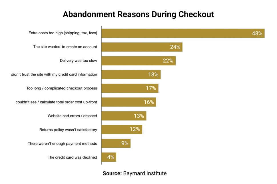
Here, the research on reasons for abandonment shown by Baymard Institute, states that within 3 months US online shoppers (58.6% of them) have abandoned their shopping cart. Amongst them, 48% left due to high extra costs like shipping, taxes, fee, and so on.
Have you ever come across a platform that forces you to either sign in or create an account? If yes, then you can understand the users’ situation in this. When it comes to checkout then make sure that users’ mind is calm and the website’s UX/UI is simple. Users should be given a choice to skip the procedure. It is useful for new customers who are not entirely ready to open an account.
The checkout experience is already complex and we do not want to delay the users’ order completion process by asking them to register confidential personal data to finish a transaction. Reducing the amount of time and effort for users is the primary objective while focusing on conversion optimization.
The checkout process is an important part of your business. It’s where customers get to know you, and it’s where they’ll make their final decision – whether or not to buy from your store. If you have an ineffective process like either the site is slow, or UX/UI is not upto the mark or the checkout process is complex, customers will leave without making a purchase.
When the site appears complex or untrustworthy, customers are least likely to entrust you with their bank account number and personal information, regardless of how safe your transaction procedures appear.
Online buyers prefer to finish their transactions using the ways of payment that are most suitable for them. Some customers may be content with the default selection, however, if you don’t offer their preferred method, such as PayPal, Digital Wallet, Cash on Delivery, or, pay later option, they may decide to quit your website entirely.
It’s all about the comfort and convenience that we are providing them for their purchase. Even if enough payment options are provided, make sure to clearly show them extra costs like taxes, shipping cost, and so on. This provides transparency amongst the users.
Some online stores fail to maintain the simplicity of their browsing, sign-up, and checkout page strategy. If we talk about developing the look of your website, simplicity is truly best, especially for your checkout page.
Adding too many items to a page without a solid layout strategy will make your visitors confused and actively tempt them to leave before making a purchase. They’ll probably be discouraged from going back in the future as a result.
Few customers like to explore the website by first checking the checkout page conversion procedure. If they find it complicated then they give up and leave the start before even exploring anything. Hence, it is advised to make the process as simple and as brief while offering all the potential alternatives for pickup and delivery.
Now that we have known the reasons for people abandoning carts. Let’s have a look at how the checkout process can be improved to avoid any complications.
We all know that the checkout process can be a major pain point for customers. If you’re struggling to keep up with the demands of your e-commerce business, it’s time to get serious about improving your checkout process.
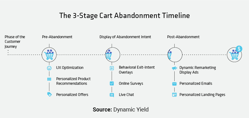
When it comes to cart abandonment, retailers can create segmented experiences and run customized campaigns on the three stages of the abandonment timeline. i.e., pre-abandonment, display of abandonment intent, and post-abandonment, through learning about the behavioural traits of each set of abandoners. Thus, here we are going to improve the checkout process by analyzing the behavioral characteristics of the first two timelines, i.e. pre abandonment and abandonment intent.
You can provide an amazing checkout experience for your customers by following these simple steps to improve checkout conversion.
You must review each stage of your customer’s journey to ensure a seamless user experience (UX), including the checkout page strategy, if you want to succeed in today’s eCommerce battlefield.
Customers frequently put high importance on trust while shopping. So, if your brand is seen as open and reliable, your customer base will increase and you will have to maintain the majority of them.
A modern retailer or owner of an e-commerce firm can use trust as a sustainable development tool by providing a variety of payment alternatives. Your customer will feel appreciated and protected if you consistently provide a variety of safe payment methods, and your sales will also increase as a result in increased web conversion.
Although processing credit and debit cards is a minimal need, providing your consumers with a variety of payment alternatives has various additional benefits for your business. You can draw in a larger audience by providing a variety of frictionless payment choices. Different payment options are used by various consumer demographics and generations.
While Gen X consumers prefer to use cards for purchases, Gen Z and young adults frequently favor online services like in-app purchases, mobile wallets, and mobile payments.
In most of the assessment of scalability of e-commerce, registration issues consistently come up. Shoppers have several reasons to hate or fear the site registration process.
After making a one-time purchase or a gift buy, they might not have any plans to visit the website again. They could dislike signing up in general and become annoyed with having to remember usernames and passwords for every website they visit.
Some customers think that once they register for a website, their personal information will be recorded even when they don’t want it to. Because many websites provide little pre-selected checkboxes to sign up for email newsletters, many consumers believe that registering will result in them receiving anonymous emails and messages.
Customers shouldn’t be forced to create accounts by filling out lengthy registration forms and paperwork if you want to lower the cart abandonment rate. It will be more challenging for you to acquire new customers the longer the procedure is stretched out. The increase in checkout conversion process will move quickly if a guest option is added. Additionally, you may always request that users complete their profiles after making a purchase.
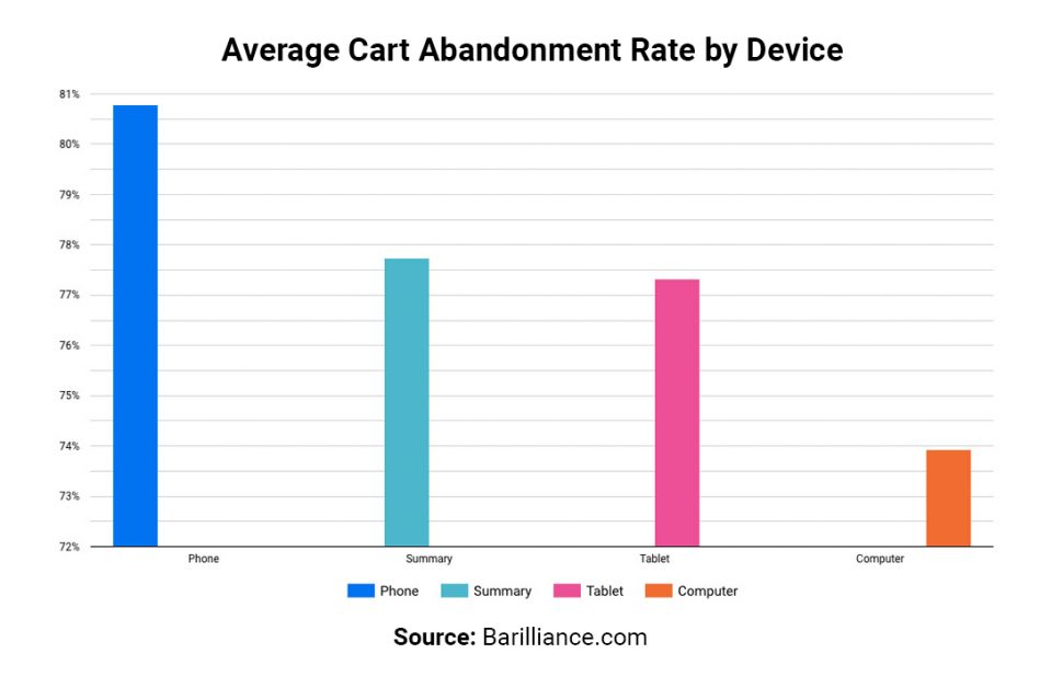
The data shown on the map for cart abandonment rate was divided up by device. Although the average for the world is 77.73%, segmenting the population reveals considerably more information. Cart abandonment rates on mobile devices increased to 80.79%. Sessions on desktops, however, only saw a 6.86 percent improvement in cart abandonment rate, to 73.93 percent!
The checkout form is a crucial part of your website. It’s the place where customers will make their final decision about whether to buy from you and if it takes too long for them to finish filling out their information, they’re likely to go elsewhere—which could cost you a lot of money.
The best way to reduce the length of your checkout form for a better checkout page conversion is by making sure that all of your fields are as clear as possible. Most brands don’t tend to offer extensive things and hide their discount field. Mostly small to medium businesses. So make sure that every field has a label clearly showing what it means and how it should be filled out.
If there’s any confusion or doubt about what an input field should look like, ask your customer to clarify. You can also consider using images instead of text fields when possible or adding comments sections at the end of each step so customers can ask questions if they need more help filling out the form or need more time than they had originally planned on spending on your site. Always remember time is money.
You can minimize the number of fields in your checkout form to Improve the conversion rate. Some ways to do that are:
You should only collect the data required to complete the checkout process to complete the order. For instance, client sales shouldn’t need to include a firm name. Nonetheless, certain nations could demand a national ID from the buyer. Each region has a certain regulatory regime. Learn more about the inappropriate collection and use of data. Use caution when managing the customer data you get. Your website’s primary goal should be not to collect improper or confidential user data. Make sure you’re getting the following guidelines:
● Collect personal data anonymously on a page that is SSL-protected, such as user credentials.
● Never sell the contact details of your clients.
● Never incorporate a customer’s private information or image without that customer’s permission.
What encourages customers to make purchases from you? Though there are dozens of complementary items on the market, then why should customers purchase from you? What distinguishes your brand and product from the competition? The value proposition is the solution to all your answers.
A value proposition describes the benefits that your consumers will receive from your business and product. It’s a value that your business provides to your users.
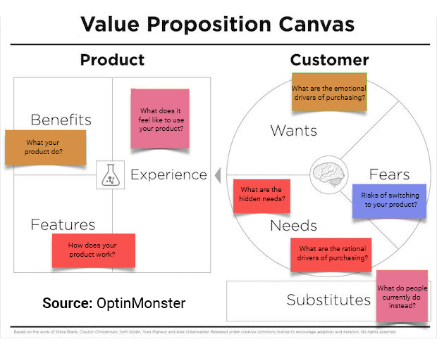
For example amazon prime gives next-day delivery, lenskart’s USP is its return policy. Businesses can increase their user confidence by increasing checkout conversion through value proposition.
Your checkout conversion rate rises if your value proposition is excellent.
The following elements must be present in the value proposition:
To increase your sales, it’s crucial to analyze the psychological factors that influence consumer purchasing decisions. Understanding the driving forces behind purchases can help you better target your marketing and increase your chances of boosting the checkout conversion rate.
Convincing prospective buyers that they require your goods rather than merely wanting them is one kind of motivation. If a consumer is unhappy right now, they could be trying to find a method to make things right. Your goal is to convince customers that buying your product or using your service would correct that wrong. Emphasize how straightforward your return procedure is or how much time your product has saved past buyers.
Any psychological discomfort a consumer feels while on a website at any point in the purchase cycle is anxiety. Anxiety prevents conversion action from happening. The eCommerce process will always have friction. So, the crucial question is: How can you lessen anxiety?
Use scarcity and urgency as effective marketing tools if you want to increase sales quickly. Customers are excited by them and are persuaded to make a purchase as soon as possible to take advantage of the chance. Consumer’s fear of losing out can have a significant impact. There is a chance that website visitors will put off making a purchase and try to put it off. It can be added to the cart to increase sales. This helps to improve the process for checkout.
The above is an example of Amazon’s product page, where they have shown the urgency to buy. As the deal is only limited for a day, the price is also reduced. If the consumer is interested in this product, they will buy looking at the urgency first.
Keeping your brand’s overall image consistent throughout the whole shopping experience is essential to improving the conversion rate on your checkout page. A positive and identifiable experience from beginning to end will give your prospects and visitors the impression that they are in good hands. According to the Edelman Trust Barometer Special Report, 70% of consumers with the same age group, gender, and income, agreed that to purchase a brand, trusting a brand is more important today than it used to be in the past.
You should think about the following to preserve brand consistency:
When it comes to checkout process optimization, the proverb “less is more” applies. To optimize your website, keep in mind that you should not divert your users with links or other components that can prevent them from achieving your site’s objective. It is important to remove distractions from the checkout page because it allows for a more focused, streamlined experience.
The checkout page can be overwhelming if customers are bombarded with information and options that they don’t need or want, and the more distracting elements on the page the more likely customers are to abandon their shopping cart and go elsewhere.
For example, on amazon during checkout, if there is a section or part where it shows “people also buy”, this is called a distraction. Since Amazon is a very big firm and for that it may not be that big, however for medium firms and small firms these types of suggestions are distractions that can let customers wander from one checkout page to another product page.
The most crucial elements of your business to improve checkout conversion are your eCommerce checkout page and checkout process. To get people to your checkout page, put a lot of time and work into it. When they are prepared to make a purchase, you should make the conversion process as easy as possible for them.
Complicated checkout procedures, unexpected prices, or substandard website design sometimes result in people leaving. Even while you might never be able to turn 100% of visitors into customers, you can improve your eCommerce checkout conversion rate optimization to lower cart abandonment rates by hiring conversion rate optimization agency or having your team that looks into it. Customers are more likely to buy on your website again if they enjoy it and find it quickly.