
SAADAA × OPTIPHOENIX: A SIZE SELECTION REDESIGN DROVE A 20% CONVERSION RATE UPLIFT
The ABFRL SuperApp is a unified fashion shopping platform that brings together brands including The Collective, Louis Philippe, Van Heusen, Allen Solly, Peter England, Pantaloons, American Eagle, and Forever 21 into one shopping experience. On the SuperApp’s mobile cart page, both Express Delivery and Standard Delivery products used the same color band. This made it difficult for users to quickly tell which items in their cart would arrive faster, leaving important shipping information less noticeable at checkout.

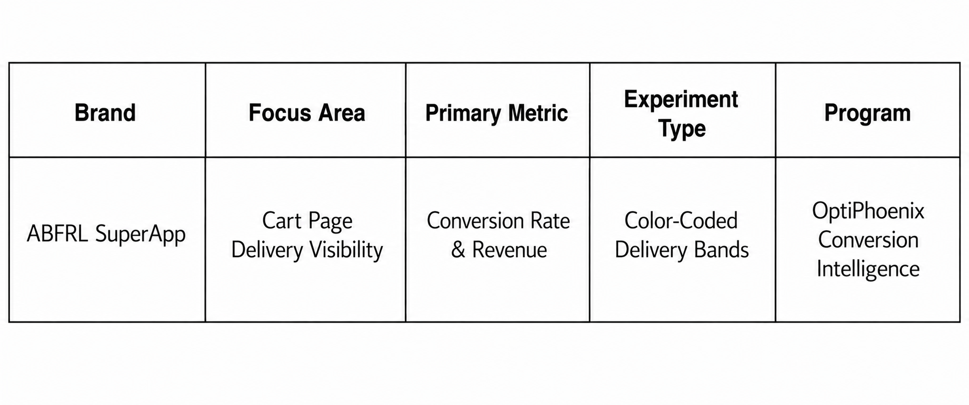
OptiPhoenix partnered with the ABFRL SuperApp team to test whether distinct, color-coded delivery bands would reduce that friction and improve conversion.
The delivery information was present on the page. It just did not look any different depending on what it was telling the user.
When Express and Standard Delivery products share the same visual treatment, a user has to read each line individually to understand what they are getting and when. That is extra effort at checkout, the exact moment where clarity matters most. The gap sat between delivery information that existed and delivery information that was actually easy to tell apart at a glance.
OptiPhoenix proposed that introducing distinct color-coded bands for Express and Standard Delivery products would let users visually distinguish shipping methods immediately, reducing ambiguity during checkout. This was expected to improve delivery clarity and drive a higher conversion rate.

OptiPhoenix ran a controlled A/B test on the SuperApp’s mobile cart page.
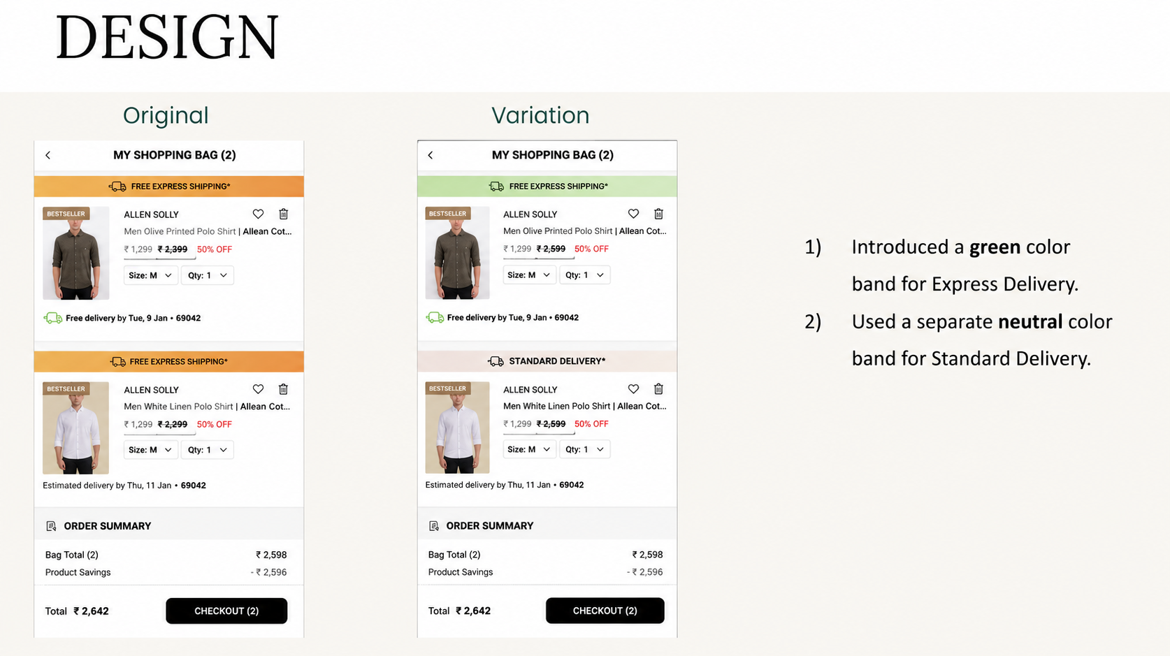
Variant A (Control): The original cart page, using the same color band for both Express Delivery and Standard Delivery products.
Variant B (Test): A green color band introduced for Express Delivery products, with a separate neutral color band used for Standard Delivery products.
Metrics measured: Conversion Rate, Revenue, and order behavior by delivery type.
Making delivery types visually distinct moved more users toward completing their purchase.

Conversion Rate rose from 19.08% to 19.53%, a 2.38% increase, reaching 86% statistical significance. Revenue rose 4.41% over the same test. Express Delivery orders rose 6.67%, and revenue from Express Delivery products rose 19.35%.
Color coding turns a reading task into a recognition task. Once Express and Standard Delivery had distinct bands, users no longer needed to read each line to understand their shipping options. That reduction in effort showed up most clearly in Express Delivery orders and revenue.
Small visual distinctions can shift purchase mix, not just conversion. The largest gain in this test was not the 2.38% overall Conversion Rate uplift, it was the 19.35% increase in revenue from Express Delivery products, suggesting the change helped users notice and choose faster shipping once it was visually clear.
Checkout clarity carries weight even in small doses. This test did not touch pricing, product information, or the checkout flow itself. It only changed how delivery type was displayed, and that alone was enough to move both conversion and revenue.
SuperApp shoppers were not ignoring delivery information because they did not care about it. They were missing it because Express and Standard Delivery looked identical at a glance. By giving each delivery type its own color, OptiPhoenix closed that gap, and shoppers found and chose the shipping option that mattered to them more easily.

