
SAADAA × OPTIPHOENIX: A SIZE SELECTION REDESIGN DROVE A 20% CONVERSION RATE UPLIFT
Allen Solly is one of the brands available through the ABFRL SuperApp, a unified fashion shopping platform that brings together brands including The Collective, Louis Philippe, Van Heusen, Allen Solly, Peter England, Pantaloons, American Eagle, and Forever 21 into one shopping experience. On Allen Solly’s mobile navigation menu, categories were displayed as text only. On smaller mobile screens, this made it harder for users to quickly recognize categories and find relevant products.

OptiPhoenix partnered with Allen Solly to test whether adding visual cues to the navigation menu would reduce that friction and improve conversion.
A category name in text tells a user what a section is called. It does not show them what is inside it.
On a small screen, scanning a list of text labels takes more effort than recognizing a familiar image. A user looking for a specific type of product has to read and interpret every label before deciding where to tap, rather than simply recognizing the right category at a glance. The gap sat between a navigation menu that only described categories and users who would recognize them faster if they could see them.
OptiPhoenix proposed that adding product thumbnails alongside category names in the mobile navigation menu, along with a clearer visual hierarchy, would let users identify categories faster and navigate more intuitively. This was expected to improve product discovery and drive a higher conversion rate.

OptiPhoenix ran a controlled A/B test on Allen Solly’s mobile navigation.
Variant A (Control): The original navigation menu, displaying category names as text only.
Variant B (Test): Product thumbnails added beside each category name in the mobile navigation menu, with visual cues introduced to improve category recognition.
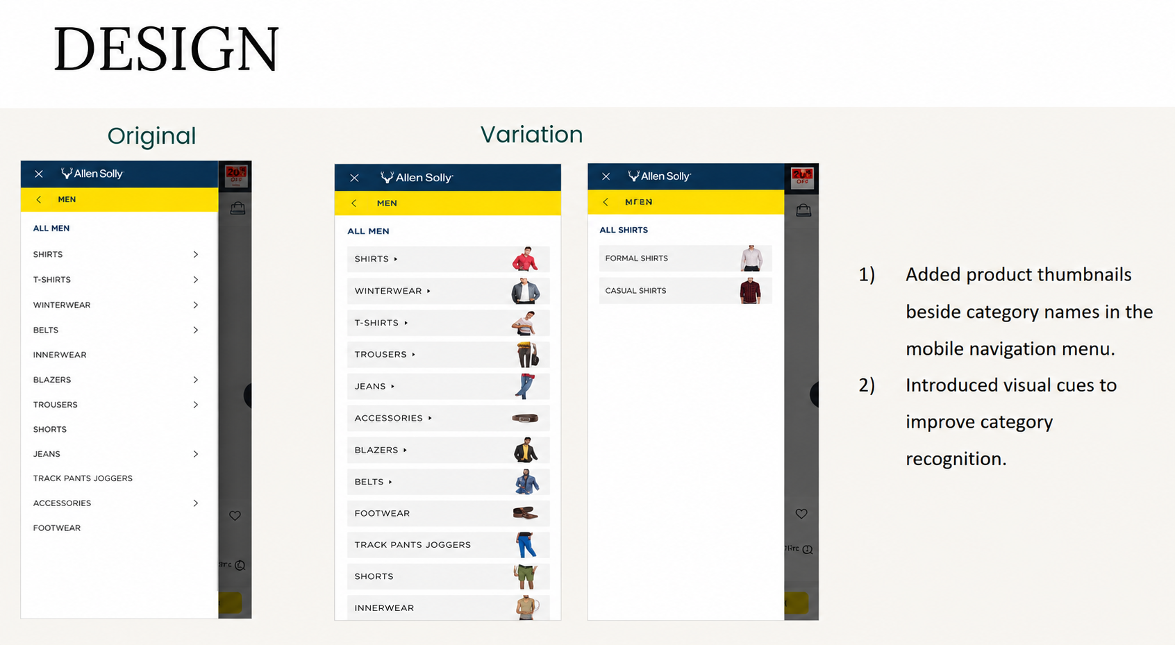
Metrics measured: Conversion Rate and Revenue.
Giving categories a visual identity, not just a label, moved more users toward a purchase.
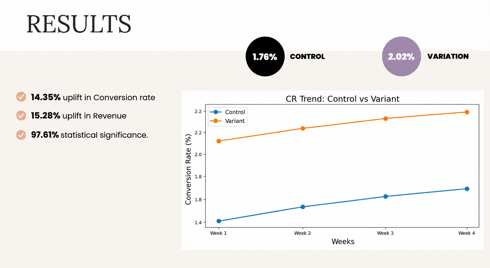
Conversion Rate rose from 1.76% to 2.02%, a 14.35% increase, reaching 97.61% statistical significance. Revenue rose 15.28% over the same test.
Recognition is faster than reading. Adding a product thumbnail let users identify a category by sight instead of interpreting text, which is why a change this small to the navigation menu produced a double-digit conversion lift.
Small mobile screens amplify text-only friction. The original menu’s text labels were accurate, but on a constrained screen, reading and comparing several labels takes real cognitive effort. Removing that effort, rather than adding new categories or content, drove the result.
Visual hierarchy matters as much as visual content. The test paired thumbnails with a clearer overall hierarchy in the menu, showing that presenting an image is only part of the fix, organizing it clearly matters just as much.

Allen Solly’s mobile shoppers were not failing to find categories because the categories were missing. They were failing because a text-only menu asked them to read and interpret before they could recognize. By adding product thumbnails and a clearer visual hierarchy, OptiPhoenix closed that gap, and users found their way to relevant products faster.

