
SAADAA × OPTIPHOENIX: A SIZE SELECTION REDESIGN DROVE A 20% CONVERSION RATE UPLIFT
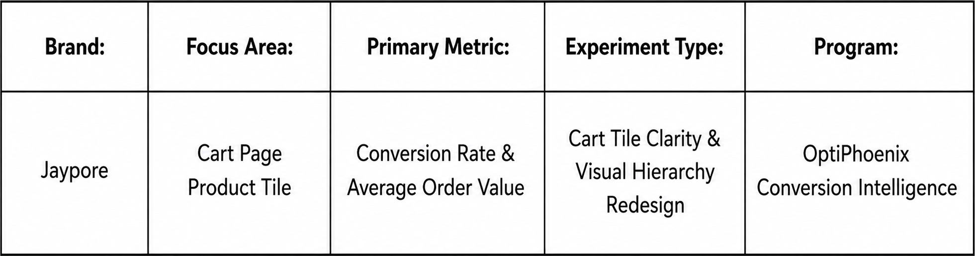
Jaypore is a premium lifestyle brand under the Aditya Birla Fashion & Retail (ABFRL) ecosystem. It celebrates India’s craft heritage through handcrafted apparel, jewellery, and home products from artisans across the country. On Jaypore’s cart page, the product tile lacked clarity around key details like size and quantity. Important elements were not visually distinct. This made the layout feel cluttered and inconsistent, and low visual hierarchy made it harder for users to quickly review what was in their cart.

OptiPhoenix partnered with Jaypore to test whether a clearer, more structured cart product tile would reduce that friction and improve conversion.
A cart is where a user does one last check before committing to a purchase. If size and quantity are not immediately clear at that moment, the user has to work to confirm what they are actually buying.
An inconsistent layout adds to that effort. When key elements are not visually distinct, users cannot scan the cart quickly. Instead, they have to read it carefully, which slows down a step that should feel like a formality. The gap sat between a user ready to confirm their order and a cart tile that made confirming it harder than it needed to be.
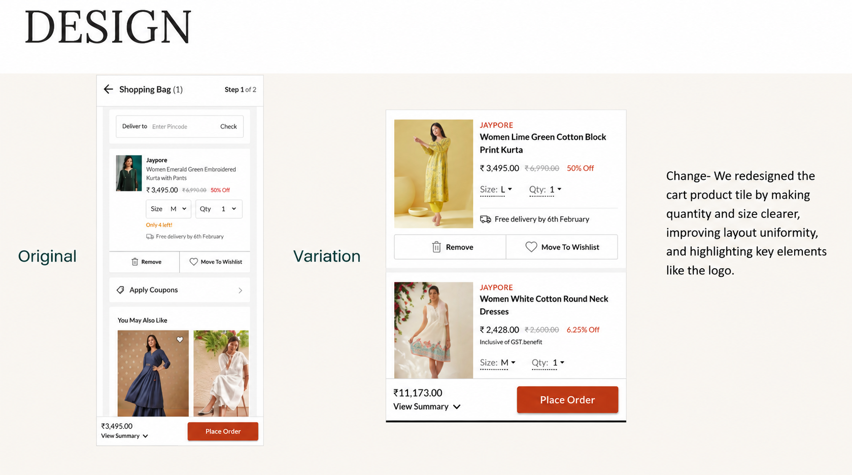
OptiPhoenix proposed three changes: clearer size and quantity indicators, a more uniform and structured layout, and highlighted key elements like the product tile and brand logo. Together, these were expected to reduce cognitive load and improve trust, creating a smoother cart experience and driving a higher conversion rate.

OptiPhoenix ran a controlled A/B test on Jaypore’s cart page.
Variant A (Control): The original cart product tile, with unclear size and quantity indicators and an inconsistent, low-hierarchy layout.
Variant B (Test): A redesigned cart product tile with clearer size and quantity indicators, a more uniform layout, and key elements such as the product tile and brand logo highlighted for visibility.
Metrics measured: Conversion Rate, Average Order Value, and progression from Cart to Order Confirmation.
Making the cart easier to scan and confirm moved more users toward completing their purchase.
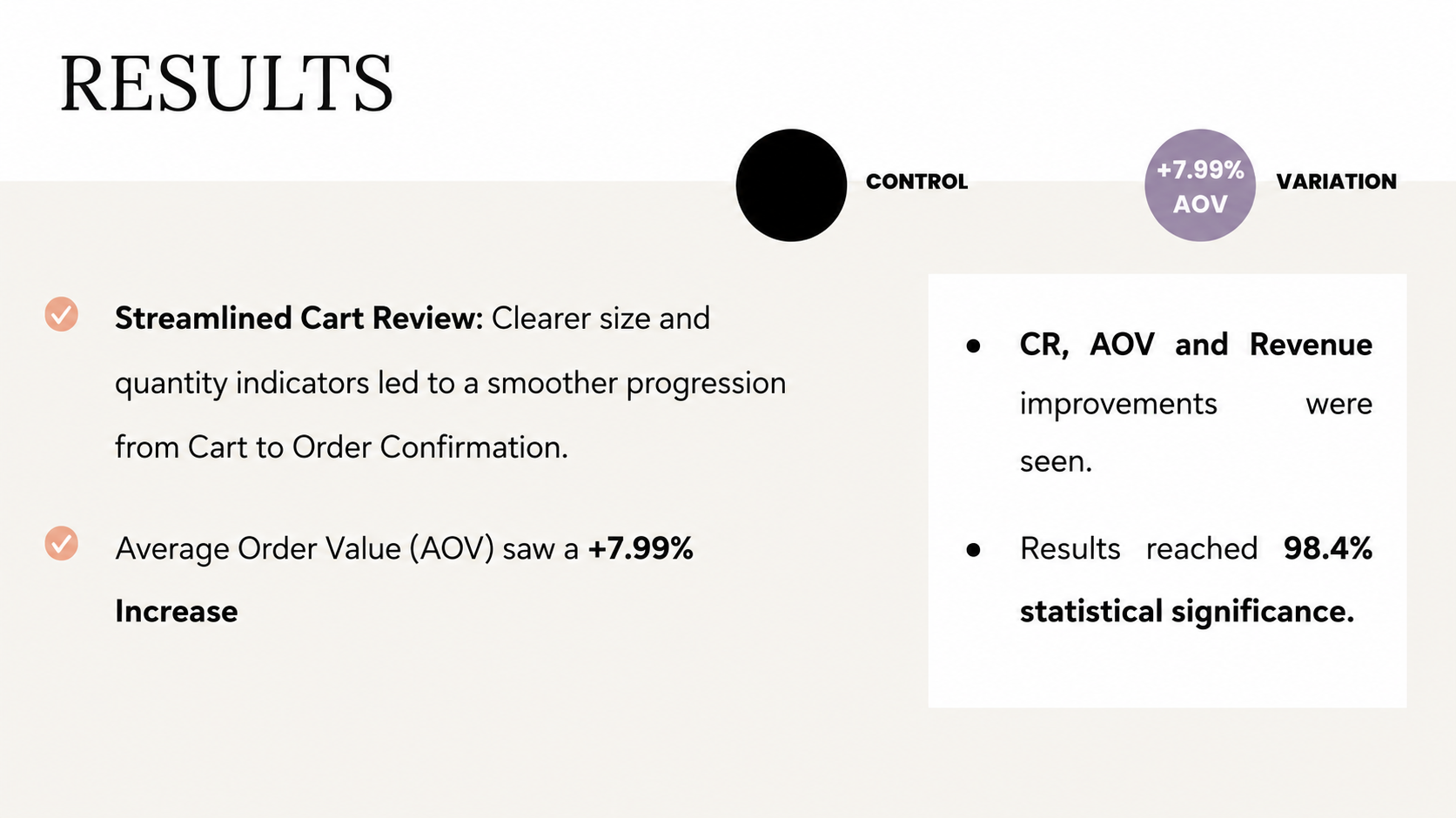
Conversion Rate rose 7.08%. Average Order Value rose 7.99%, reaching 98.4% statistical significance. Progression from Cart to Order Confirmation also became smoother. Clearer size and quantity indicators reduced hesitation at this step.
Clarity at the confirmation step carries more weight than it appears to. The cart is not where users discover products, it is where they double-check a decision they already made. Removing ambiguity around size and quantity meant that check took less effort. Fewer users hesitated as a result.
Visual hierarchy is a trust signal, not just a design preference. Highlighting the product tile and brand logo did not add new information to the cart. It made existing information easier to trust at a glance.
Small structural fixes can move Average Order Value as much as Conversion Rate. The 7.99% AOV increase shows this change did more than get users to check out. It also shaped what and how much they were confident purchasing once the cart felt clear.
Jaypore’s shoppers were not abandoning their carts because they had changed their minds. They were slowed down by a cart tile that made a simple check, size, quantity, and what they were about to order, harder than it needed to be. By redesigning that tile for clarity and hierarchy, OptiPhoenix closed that gap. The final step before purchase became the formality it was meant to be.

