
SAADAA × OPTIPHOENIX: A SIZE SELECTION REDESIGN DROVE A 20% CONVERSION RATE UPLIFT
Ride on Toys is a children’s toy store that provides educational toys and activities for children of all ages. They have designed and curated a variety of high-quality toys to stimulate learning and discovery among children. Their toys range from classic for infant development to outdoor science and adventure gear for older children.
The company has been assisting parents in offering their children age-appropriate, wholesome, high-quality playthings for years now, with a supply of a large variety of products such as ride-on toys, scooters, quad bikes, and electric bikes, alongside a wide range of indoor toys that include arts and crafts, STEM toys, and other games.
Prior to hiring Optiphoenix, the company Ride on Toys did not run any type of experimentation on the site. Although most of the traffic was coming to the website through mobile devices, still mobile conversion rates were lower compared to desktop.
Understanding their requirement, we at Optiphoenix came across the issues by interacting with customers and conducting several surveys. We came to know that the issue was on the check out page. To tackle this challenge, we made sure to first get the customer’s point of view while they are using the mobile device.
Our team for the project included Senior CRO Specialist, Senior UX Designer, Quality Analyst, Developer, and Associate Optimizer who identified conversion opportunities on site.
As a part of the survey, we asked the users a question- Is there anything holding you back?
In return, we got responses mainly around delivery and charges.
Below are the most common responses that we got from users.
Our team conducted expert evaluations to identify conversion bottlenecks, set up analytics targets, added event tracking, and conducted usability tests on the site throughout the research phase.
We identified various conversion rate opportunities on the site and its different marketing campaigns. We also began handling the conversion list after prioritizing it by designing fresh designs and testing them against the existing site. Our project helped to bridge the gap between scrolling and viewing products to the final checkout.
We made changes to the checkout page to answer the user’s request and eradicate any complicated design from the website; while increasing the conversion rate.
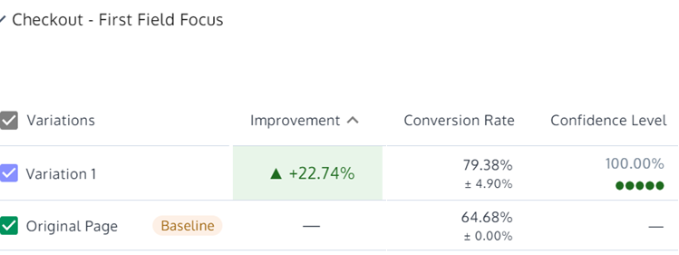
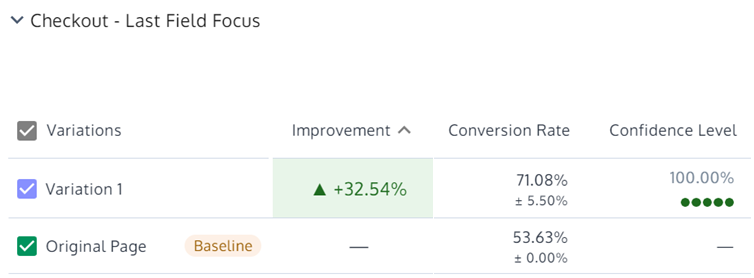
After selecting the product and proceeding to checkout, earlier there was no option or information about delivery methods and charges. But now, after making changes in design and pushing up a new variation we found that there was more than 30% increase in interaction with the first form field. Around 90% of users completed the last form field after starting interaction with the first field.
When it came to funnel progression then, in the second variation, around 80% of the users in variation clicked on Next CTA and we saw a 20% improvement in checkout step 2 visit.
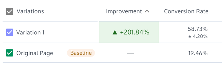
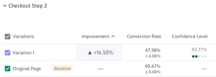
Based on the learnings from these tests, Optiphoenix identified a need to optimize the checkout page experience. Earlier the converted visitors were stuck on the checkout page, unable to complete the procedure. Thus, we came up with new and better ways to provide visitors information about the delivery fare. Hence, we saw a 13% increase in overall conversion rate and the AOV also improved by 25%.
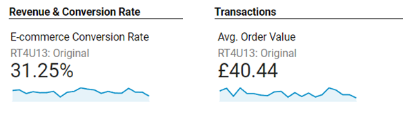
Also, based on the AOV of £50.47, we forecasted an additional revenue of £6,489 per month, which will lead to an additional revenue of £78,950 annually.
