
SAADAA × OPTIPHOENIX: A SIZE SELECTION REDESIGN DROVE A 20% CONVERSION RATE UPLIFT
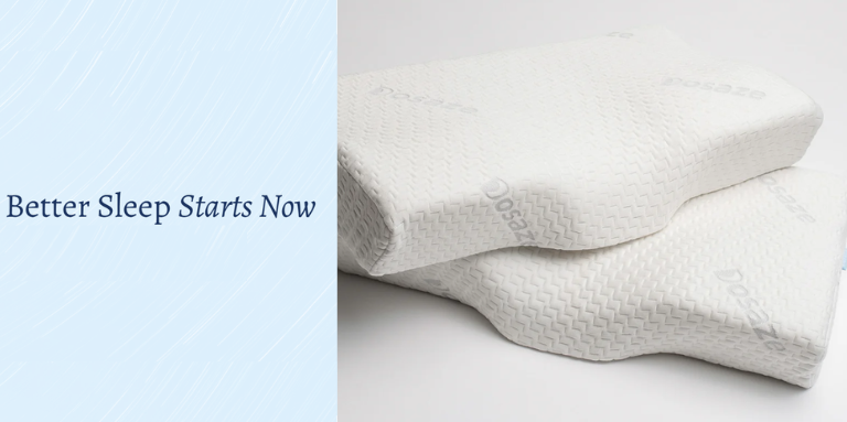
Dosaze sells ergonomic pillows in two size options. Two choices sounds simple. But for a product where fit depends on body type, height, and sleeping position, even a binary decision carries real uncertainty.
Heat map and behavioral data on the PDP showed the cost of that uncertainty. Add-to-Cart interaction on the page was low at 5%. Users were engaging with the product – the hero image section alone captured 40% of user interactions – but that engagement wasn’t converting into purchase progression at the rate the traffic justified.
The size selector was a functional element but not a decision-support one. It presented two options without telling users which one was right for them. For a health and sleep product, that ambiguity was slowing decisions and depressing conversion.
OptiPhoenix partnered with Dosaze to test whether restructuring the size selector into a guided decision module would reduce friction and increase the number of users moving from the PDP into the purchase funnel.
The problem wasn’t that users didn’t want to buy. It was that the page wasn’t giving them confidence to choose.
Survey data confirmed the pattern: 24% of survey responses cited product effectiveness uncertainty, and a meaningful share of users were hesitating at the size selection step rather than proceeding to cart. The existing selector offered no cues about who each size was best suited for, no indication of which option most buyers chose, and no visual reference for what the physical difference between options looked like.
For a sleep product, the size question is also a personal one. Users want to know they’re choosing correctly for their body, not just picking arbitrarily. Without that reassurance built into the selector, the decision stalled.
If the size selector is restructured to include clear guidance on who each size suits (based on height and sleep position), highlights the most commonly selected option, displays a visual pillow profile with dimension indicators, and adds a short decision tip and quiz feature link, users will make faster and more confident size selections, leading to higher add-to-cart rates and reduced decision friction.
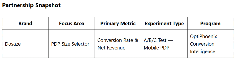
OptiPhoenix designed an A/B/C test with two variations against the original size selector on mobile PDPs.
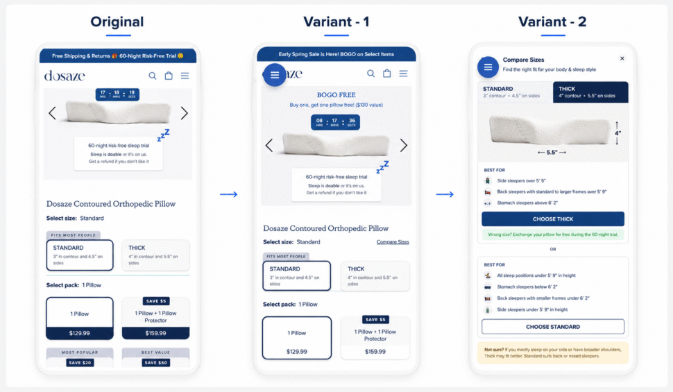
Control: Standard size selector – two options displayed without contextual guidance, no visual reference, no indication of most popular choice.
Variation 1: Redesigned single module with decision cues embedded in each option – who the size suits (height and sleep position), a highlight indicating the most common choice, a pillow profile visual with dimension indicators, and a short decision tip with a quiz feature link for additional reassurance.
Variation 2: Similar guided format but with greater emphasis on the quiz feature as the primary decision path.
Platform: Intelligems (primary), GA4 (funnel analysis) Duration: April 7 – April 20, 2026 (14 days, ongoing)
Segment: Mobile users Traffic Split: ~5,300–5,500 users per variant Primary Metrics: Conversion rate, orders, net revenue, revenue per visitor, profit per visitor, AOV
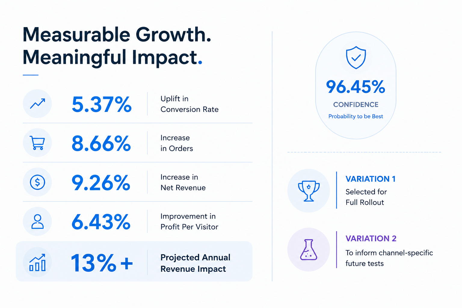
Variation 1 was the clear winner across every primary metric.
GA4 funnel analysis confirmed the improvement extended across the full purchase journey. Variation 1 led add-to-cart progression at 18.06% versus the control’s 17.11%, with 96.45% probability to be best. Full-funnel CVR (PDP to purchase) reached 10.35% for Variation 1, an 11.53% uplift versus control, also at 96.45% confidence.
Variation 2 outperformed the control as well, with +2.30% CVR and the highest AOV – but lagged Variation 1 on conversion volume. The quiz feature embedded in Variation 2 saw only 0.53% engagement from PDP visitors, and while users who started the quiz showed reasonable downstream progression (46% reached add-to-cart, 50% of those purchased), the low adoption volume meant the quiz contributed minimal overall business impact.
Channel-level data added an important nuance: Variation 1 performed strongest in Paid Search (CVR 11.88%), while Variation 2 outperformed in Paid Social (CVR 4.33%, +42% uplift), suggesting different decision styles across traffic sources.
At current traffic levels, rolling out Variation 1 is projected to deliver a increase in annual revenue versus control, representing a 13% uplift.
Users want fast, simple guidance – not longer decision flows. Variation 1 embedded decision cues directly in the selector, reducing the cognitive work required to choose. Variation 2 directed users toward a multi-step quiz, which most didn’t start. The simpler path won on volume by a significant margin.
Decision support and conversion are the same problem. The size selector wasn’t a UX detail – it was a conversion bottleneck. Transforming it from a functional element into a guidance tool produced a measurable uplift across every downstream metric.
The quiz has real potential, but placement and entry need work. Among the small share of users who engaged with the quiz, downstream conversion was strong. The feature isn’t broken – it’s just not being discovered. Improving its placement and CTA before judging its full value is the right next step.
Channel-level behavior differs. High-intent Paid Search users responded to Variation 1’s clean, direct guidance. Paid Social users, earlier in the consideration cycle, showed more appetite for the guided quiz format. Future tests can exploit this split.
Dosaze had traffic and product interest. What the PDP lacked was a size selector that behaved like a decision aid rather than a form field. When the two options were given context – who they suit, what they look like, which one most buyers choose – users moved through the funnel faster and with higher intent. A change to a single PDP module, grounded in behavioral data and a structured hypothesis, is projected to add nearly $700K in annual revenue at current traffic levels.
The experiment confirmed something OptiPhoenix observes consistently: when users are genuinely uncertain, the page’s job is to resolve that uncertainty, not wait for the user to figure it out.
