
SAADAA × OPTIPHOENIX: A SIZE SELECTION REDESIGN DROVE A 20% CONVERSION RATE UPLIFT
Euronics is the largest electrical buying group in Europe, operating across 30 member countries and 11,000 specialist stores. For a retailer selling home appliances and electronics at price points like £549 for a washing machine or £729 for a tumble dryer, the cart page carries significant revenue weight – both in transaction completion and in the add-on services that accompany large appliance purchases.
Those add-on services – installation, disconnection, removal and recycling of old appliances, packaging disposal – are genuinely valuable to buyers. They represent real post-purchase convenience that a significant share of appliance buyers would want. Yet heatmap data showed that only 2.7% of cart page users were interacting with the Additional Services section at all.
Survey responses revealed why: most users were unclear about what the services actually were. The section existed on the page but was not prominent enough to register, and its content wasn’t clear enough to prompt action even among users who did notice it.
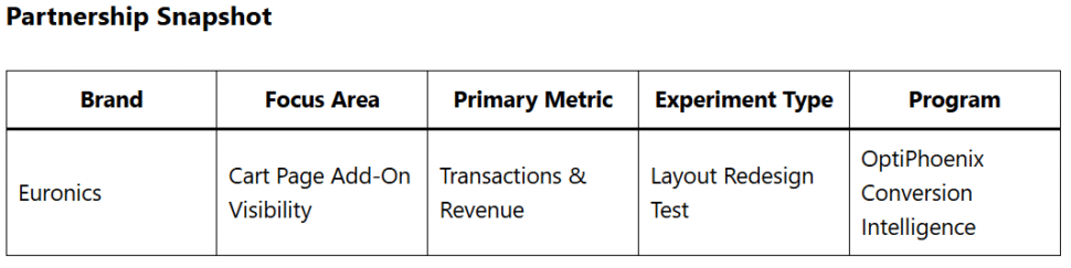
OptiPhoenix partnered with Euronics to test whether increasing the visual prominence of the Additional Services section and restructuring the cart layout for clearer information consumption would change how users engaged with these add-ons.
The services themselves were not the problem. Installation, disconnection, and appliance removal are exactly the kinds of frictions that appliance buyers face in the physical world – and services that remove those frictions carry genuine value at the point of purchase.
The cart page was failing to communicate that value. The Additional Services section was buried within the product row, displayed with limited visual distinction from surrounding cart elements, and labeled in a way that left users uncertain about what they were being offered. A buyer looking at a washing machine listing had no clear reason to engage with a section they couldn’t quickly parse.
Two changes were needed: make the section visible enough to be noticed, and make the layout clear enough for users to understand and act on what it contained.

If the Additional Services section is prominently highlighted on the cart page and the layout is restructured to separate product information from the order summary into two distinct columns, users will more easily identify and engage with available services, leading to higher add-on selection and improved transaction rates.
Variant A (Control): Original cart page – Additional Services displayed inline within the product row with low visual prominence; product information and order summary presented in a single-column layout.
Variant B (Test): Redesigned cart layout – Additional Services section prominently highlighted as a distinct, clearly labeled module; product information and order summary bifurcated into two columns for easier parallel consumption of relevant information. Services listed individually with pricing: Disconnection (+£10), Remove All Packaging (+£5), Installation (+£25), Remove & Recycle (+£20).
Duration: 5 weeks Primary Metrics: Transactions, revenue, annual revenue impact

The redesigned cart layout produced consistent improvement across the full five-week test period.
Transactions increased by 13.6%. Revenue grew by 15%. At the run rate observed during the test, the variation projects to increase 20% in additional yearly revenue.
The improvement in transactions alongside the larger revenue uplift indicates that users were both completing more purchases and adding services that increased their order values.

Clarity is a prerequisite for engagement. Users cannot add a service they don’t understand. Survey data confirmed the confusion directly – most users didn’t know what the Additional Services section was offering. Making the section prominent and its content legible resolved the engagement gap at its actual source.
Layout structure shapes what users perceive as important. When product information and order summary competed for attention in a single-column layout, Additional Services were visually subordinate to both. Separating the layout into two columns gave each element its own zone of attention, making the services easier to locate and evaluate.
Add-on services need to be sold, not merely listed. Labeling services clearly with individual pricing and distinct entries – rather than grouping them in a small, dense block – treated each service as a product decision rather than a footnote. That framing change was enough to shift engagement from 2.7% to a level that produced a 13.6% transaction increase.
High-consideration purchases create receptivity for relevant add-ons. A buyer purchasing a £549 washing machine is already in a committed, high-investment mindset. An installation service priced at £25 is a proportionally small addition to a decision they’ve already made. The friction wasn’t price – it was visibility and comprehension.
Euronics had a revenue opportunity sitting on its cart page that 97.3% of users were scrolling past without noticing. The services existed. The demand for them existed. What was missing was a layout that made them visible and a presentation that made them understood. A restructured cart – with the Additional Services section given prominence and the page split into two readable columns – produced a 15% revenue increase from a single page-level change.
