
SAADAA × OPTIPHOENIX: A SIZE SELECTION REDESIGN DROVE A 20% CONVERSION RATE UPLIFT
For a proprietary trading firm, the path from the landing page through registration to the app dashboard is where a curious visitor becomes an active user. Funding Pips was losing people along that path.
The existing hero banner and primary CTA did not make a clear case for progressing through the buy challenge. Users landed, read a headline that did not push them forward, and a meaningful share left before signing up or logging in.
OptiPhoenix partnered with Funding Pips to test whether sharper hero messaging and a more action-oriented CTA would move more users from the register page to the dashboard.
The drop-off was motivation at the first screen.
A visitor needs a reason to take the next step, and the hero was not giving one. The banner and CTA stated what the firm was without making the next action feel worth taking. A multi-variant test isolated the lever: the version that changed only the CTA copy, making the next step clearer and more active, performed best, which showed the barrier was the prompt to act rather than the surrounding design.
If the hero banner messaging is updated and the primary CTA is made more action-oriented, more users will be motivated to continue, increasing movement from the register page to the app dashboard.
OptiPhoenix ran a multi-variant test on the hero and primary CTA:
Variant A (Control): The original hero banner and primary CTA.
Variant B (Winner): A variation that modified only the CTA copy to be clearer and more action-oriented, holding the rest of the hero constant.
Device: mobile. Metrics measured: funnel progression, registration conversion rate.

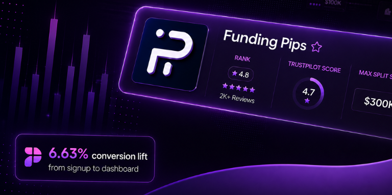
The sharper CTA moved more users through. Conversion from signup to dashboard rose 6.63% at 99.97% confidence, comfortably above the 95% threshold. Traversal from the landing page to the signup page rose 5.85%, and the change was estimated to bring roughly 5,958 additional users to the app dashboard each month.
A clearer, more active CTA lifted signup-to-dashboard conversion by 6.63% at high confidence.

Copy can be the whole lever. The winning variant changed only the CTA wording, which isolates the prompt to act as the barrier and the fix.
Isolate before you conclude. Running the change as a multi-variant test is what let the result point cleanly at the CTA rather than a bundle of edits.
Motivation belongs at the first screen. The gap was not later in the funnel, it was the reason to take the first step.

Funding Pips’ visitors were not uninterested, they were not being told why to take the next step. Sharpening the CTA copy gave them the push the original hero withheld, at the screen where the journey either starts or ends.
