
SAADAA × OPTIPHOENIX: A SIZE SELECTION REDESIGN DROVE A 20% CONVERSION RATE UPLIFT

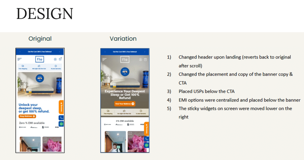
Flo Mattress is a D2C sleep and bedding brand from India, focused on delivering high-quality, comfortable sleep solutions by blending thoughtful engineering with customer-centric design. The brand re-engineers traditional mattress supply chains to remove unnecessary middlemen and pass cost savings directly to customers. On Flo Mattress’s homepage, the banner copy and CTA were not prominent, sandwiched between the USP section and EMI options. As a result, users interacted more with the USPs and EMI information than with the CTA itself, producing dead clicks. Only 6 to 7% of users interacted with the CTA and moved on to the Product Listing Page.

OptiPhoenix partnered with Flo Mattress to test whether restructuring the homepage’s first fold would reduce that friction and improve conversion.
A homepage’s first fold has one job: get the visitor to the next step. When the CTA is boxed in by competing information, visitors interact with whatever is most visible, not necessarily what moves them forward.
Users clicking on USPs and EMI options instead of the CTA were not confused about what Flo Mattress offered. They were responding to what the layout made most prominent, which was not the path to product discovery. The gap sat between a homepage full of relevant information and a first fold that did not clearly point visitors toward the next step.
OptiPhoenix proposed that making the banner copy and CTA experience-based and visually prominent, while placing the USP and EMI information closer to the CTA but positioned below it, would increase clicks on the CTA and improve product discovery. This was expected to drive a higher conversion rate.

OptiPhoenix ran a controlled A/B test on Flo Mattress’s homepage first fold.
Variant A (Control): The original homepage, with the banner copy and CTA sandwiched between the USP section and EMI options, reducing their visual prominence.
Variant B (Test): A redesigned first fold with a header that changed upon landing and reverted after scroll, repositioned and rewritten banner copy and CTA, USPs placed below the CTA, centralized EMI options placed below the banner, and sticky widgets moved lower on the screen.
Metrics measured: Conversion Rate, CTA clicks, and bounce rate.
Giving the CTA visual priority moved more visitors toward product discovery.
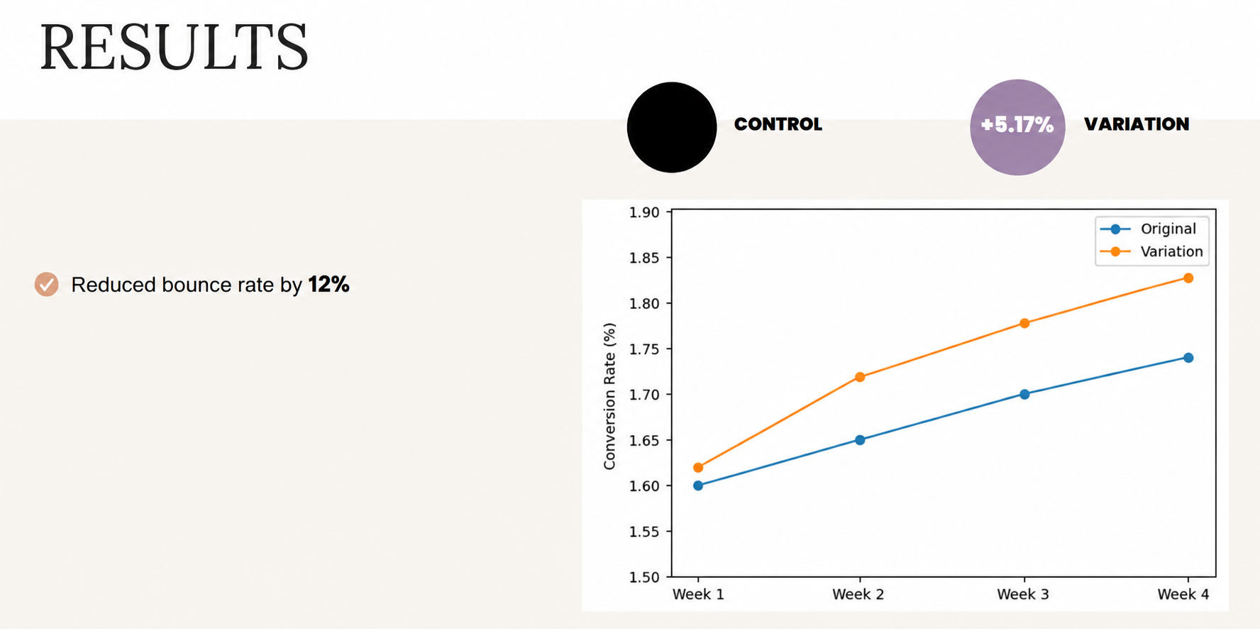
Conversion Rate rose 5.17%. CTA clicks rose 88%. Bounce rate fell 12% over the same test.
Visual prominence determines what gets clicked, not just what is present. The USPs and EMI options were not the problem, they were simply competing with the CTA for attention. Once the CTA had clear visual priority, clicks followed it instead of the surrounding information.
An 88% jump in CTA clicks against a 5.17% Conversion Rate uplift shows discovery and purchase are different problems. Fixing the first fold got far more users to the Product Listing Page than it converted directly, which means the layout fix solved a discovery problem, and further gains likely depend on what happens after that click.
Reducing dead clicks reduces bounce. A 12% drop in bounce rate alongside an 88% CTA click increase suggests users were previously landing, engaging with the wrong elements, and leaving. Redirecting that engagement toward the CTA kept more of them on the site.
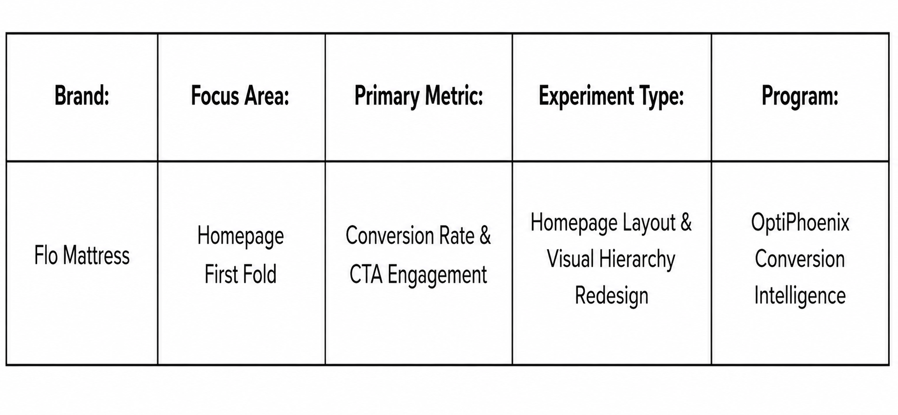
Flo Mattress’s homepage visitors were not disengaged, they were engaging with the wrong elements because the layout did not make the CTA the obvious next step. By redesigning the first fold around clear visual hierarchy, OptiPhoenix closed that gap, and visitors moved toward product discovery instead of dead-ending on USPs and EMI details.
