LOUIS PHILIPPE × OPTIPHOENIX: QUICK FILTERS ON THE PRODUCT LISTING PAGE DROVE A 15.15% CONVERSION RATE UPLIFT
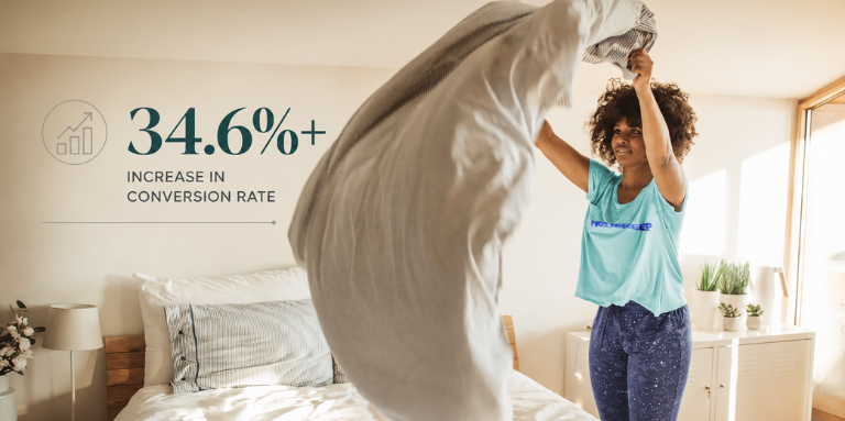
The one-off cleaning quote form is where a Housekeep visitor turns interest into a booking. It asks for clean type, property details, and time, and every question a user cannot confidently answer is a reason to leave.
The friction was information, not effort. Users reaching the form did not have a clear, in-context way to check what each cleaning type actually covered. A deep clean and an end-of-tenancy clean differ in ways that matter to the person paying, and without that detail at hand, some users hesitated or dropped rather than guess.
OptiPhoenix partnered with Housekeep to test whether surfacing service detail inside the form, without sending users away to find it, would reduce that hesitation.
The drop-off was a confidence gap at the point of selection.
A user choosing a cleaning type wants to know what they are committing to before they proceed. When that detail lived elsewhere, checking it meant leaving the form, and leaving the form meant many never came back. Giving users the answer in place, through a “What’s Included” pop-up that opened without navigation, removed the reason to exit.
If key service information is surfaced in a convenient pop-up on the one-off cleaning form, users will feel clearer and more confident about their selection, reducing hesitation and drop-offs and improving form completion.
OptiPhoenix ran a controlled A/B test on mobile:
Variant A (Control): The original one-off cleaning form, with service detail not accessible in context.
Variant B (Test): A redesigned first fold with a “What’s Included” CTA that opened a pop-up detailing what each cleaning service covered, keeping the user inside the form.
Duration: 38 days, from 10 January. Device: mobile. Metrics measured: interaction with form elements, form completion, transactions, revenue.
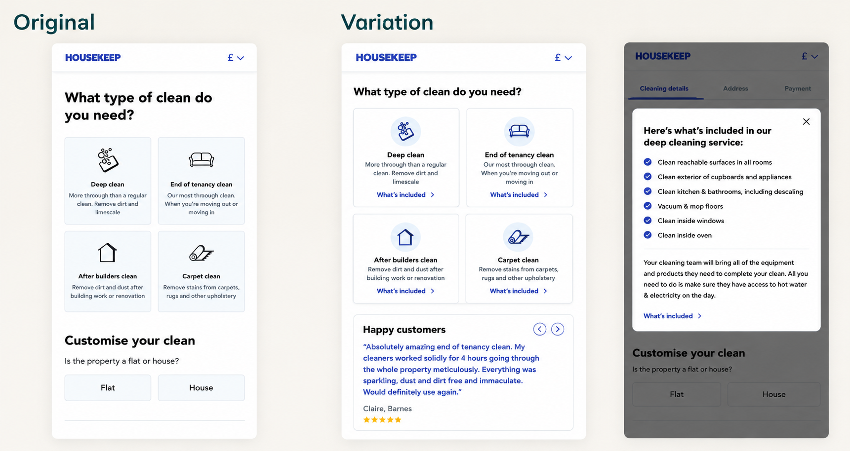
Surfacing the detail in place moved more users through the form. Form completion rose 34.68%. In the funnel, 6.7% more users progressed to the payment step, and of those who advanced, more went on to finish. The result tracked at 94% statistical confidence, below the conventional 95% threshold, so this reads as a strong directional result rather than a settled one, and the test was still running at the time of this data.
Adding in-context service detail to the form lifted completions by 34.68%, with the caveat that the result had not yet cleared 95% confidence.
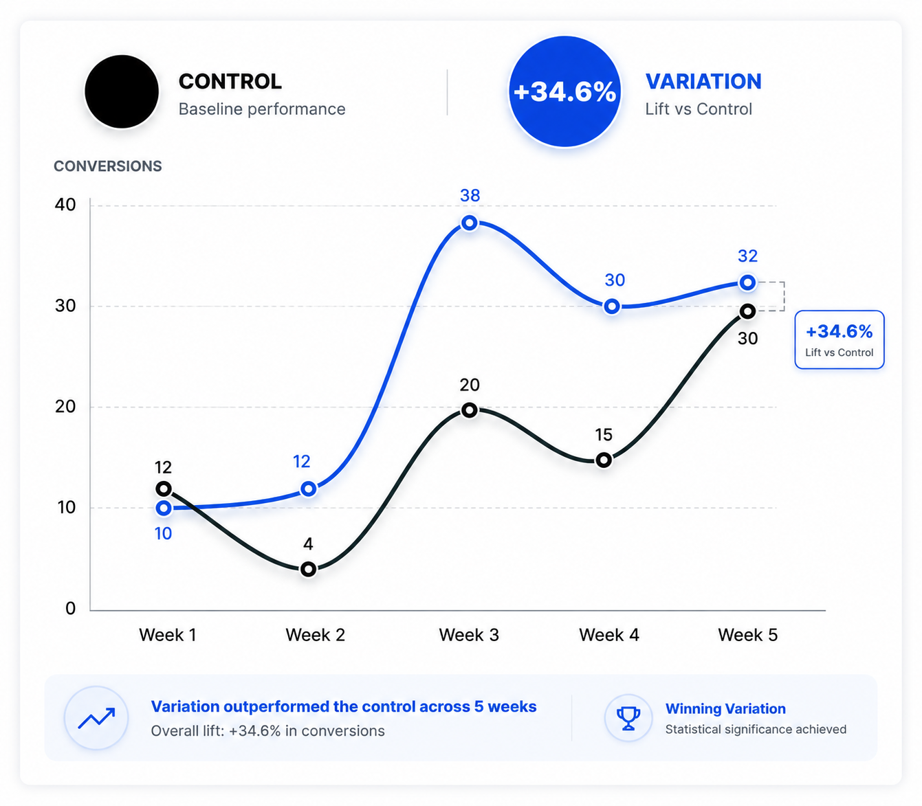
Answer the question where it is asked. Users did not lack interest, they lacked detail at the point of selection. Delivering it in place kept them in the flow.
Navigation is a cost. The value of the pop-up was that it required no exit. The same information behind a link would have carried the drop-off it was meant to prevent.
Report the confidence, not just the lift. At 94%, this is a promising direction that warrants continuation to significance, not a closed case.

Housekeep‘s users were not unwilling to book. They were unsure what they were booking and had no way to check without leaving. Putting the answer inside the form, one tap away, closed the gap where it opened.