
SAADAA × OPTIPHOENIX: A SIZE SELECTION REDESIGN DROVE A 20% CONVERSION RATE UPLIFT
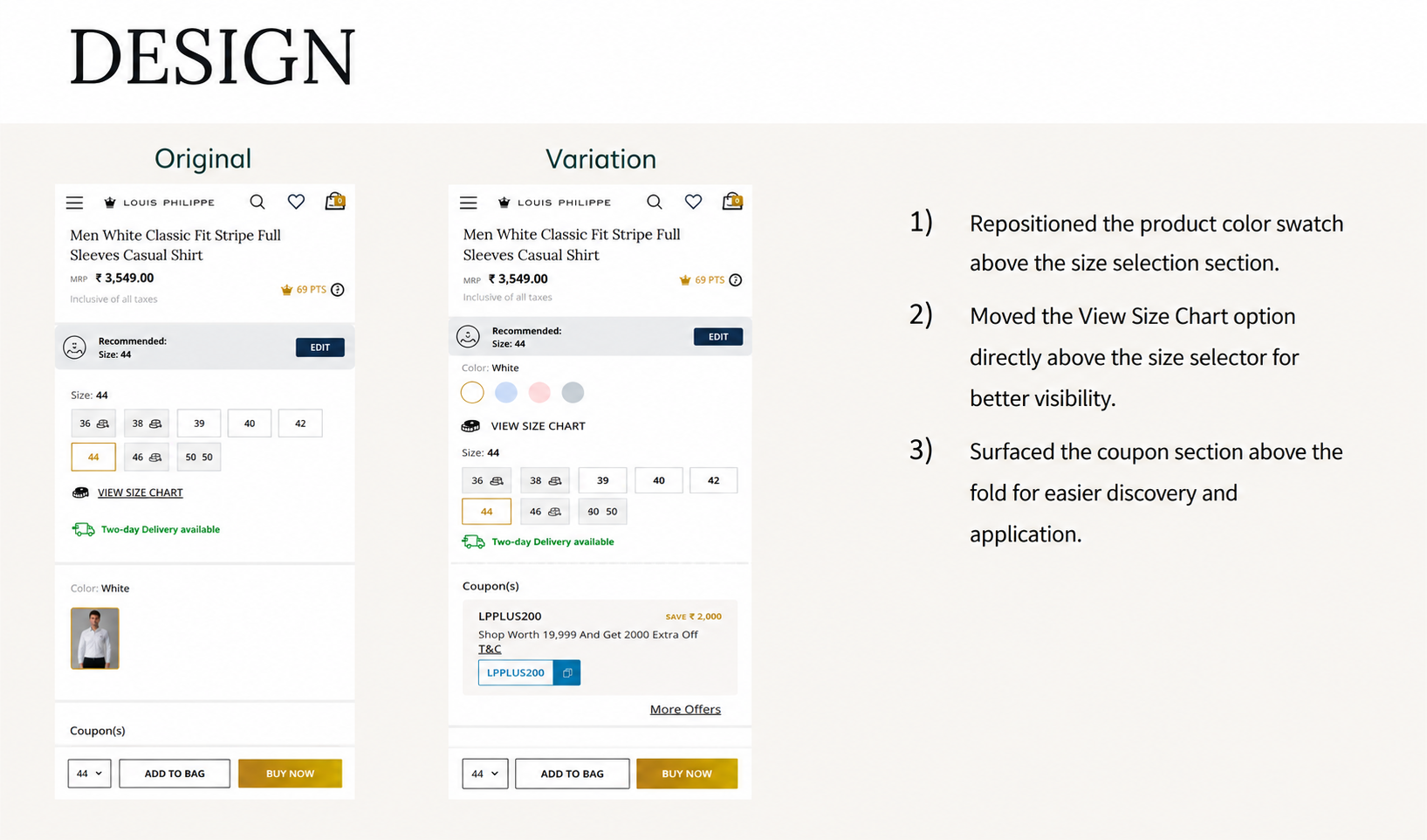
Louis Philippe is one of the brands available through the ABFRL SuperApp, a unified fashion shopping platform that brings together brands including The Collective, Louis Philippe, Van Heusen, Allen Solly, Peter England, Pantaloons, American Eagle, and Forever 21 into one shopping experience. On Louis Philippe’s Product Detail Page, the product color swatch took up significant space, pushing key purchase elements further down the page. Users had to scroll after selecting a size just to locate available coupons, and the View Size Chart option was separated from the size selector, adding friction during the purchase decision.

OptiPhoenix partnered with Louis Philippe to test whether reorganizing the PDP layout would reduce that friction and improve conversion.
The information a shopper needed to complete a purchase was on the page. It just was not within reach at the moment they needed it.
A shopper deciding on a size wants the Size Chart right there, not somewhere below the fold. A shopper deciding whether to buy wants to know if a coupon applies before committing, not after scrolling further to find one. The gap sat between purchase-critical information and a layout that pushed that information out of the way in favor of the color swatch.
OptiPhoenix proposed that repositioning the color swatch above the size section, placing the View Size Chart directly above the size selector, and surfacing the coupon section within the first fold would let users verify sizing, discover discounts, and make purchase decisions with minimal scrolling. This was expected to drive a higher conversion rate.
OptiPhoenix ran a controlled A/B test on Louis Philippe’s PDP.
Variant A (Control): The original layout, with the color swatch given significant space above the fold, coupons requiring a scroll to locate, and the View Size Chart option separated from the size selector.
Variant B (Test): The color swatch repositioned above the size selection section, the View Size Chart option moved directly above the size selector, and the coupon section surfaced above the fold.
Metrics measured: Conversion Rate, Revenue, Size Chart interaction, and Coupon Section interaction.
Bringing purchase-critical information into view moved more users toward a purchase.
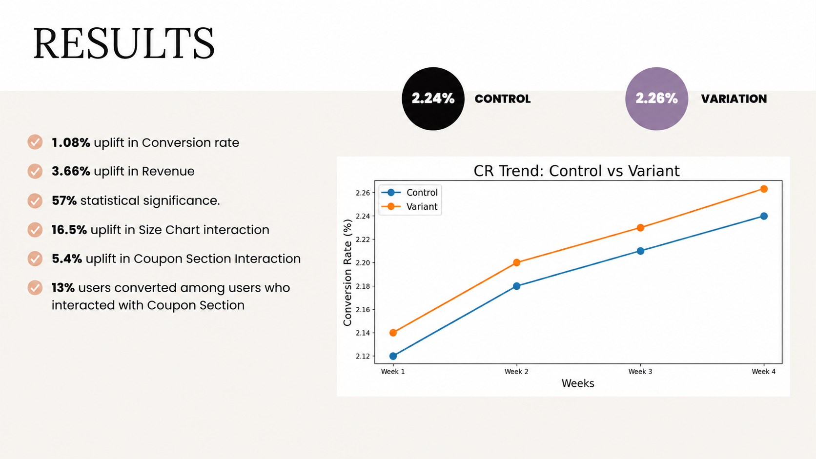
Conversion Rate rose from 2.24% to 2.26%, a 1.08% increase, reaching 57% statistical significance. Revenue rose 3.66% over the same test. Size Chart interaction rose 16.5%, and Coupon Section interaction rose 5.4%. Among users who interacted with the Coupon Section, 13% converted.
Page hierarchy is a purchase decision tool, not decoration. The color swatch was not the problem on its own, but the space it occupied kept sizing and discount information further from view than it needed to be. Moving it made room for the elements users actually needed to decide.
Coupon visibility converts. The 13% conversion rate among users who engaged with the Coupon Section, against a 2.26% baseline, shows that discount visibility does more than inform, it moves users directly toward checkout.
This result carries lower confidence than the other tests in this program. At 57% statistical significance, the 1.08% Conversion Rate uplift falls well below a standard confidence threshold. The Revenue, Size Chart interaction, and Coupon Section interaction gains are directionally consistent with the hypothesis, but the primary metric should be treated as an early signal rather than a settled result until further testing confirms it.
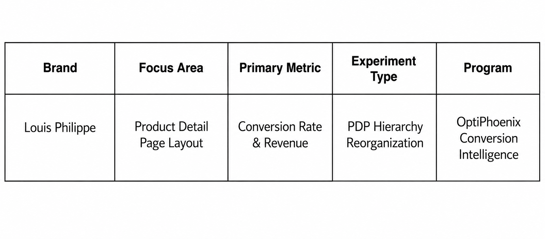
Louis Philippe shoppers were not struggling to find sizing and discount information because it was missing from the page. They were struggling because the layout put a lower-priority element ahead of it. By reorganizing the PDP around what shoppers actually needed to decide, OptiPhoenix moved purchase-critical information back into view, though the modest statistical significance here means this is a result worth validating further before treating it as conclusive.
