
SAADAA × OPTIPHOENIX: A SIZE SELECTION REDESIGN DROVE A 20% CONVERSION RATE UPLIFT
The Collective is India’s premier luxury fashion destination, offering a curated portfolio of global designer and premium lifestyle brands across apparel, footwear, accessories, and beauty categories, operated by Aditya Birla Fashion and Retail Limited (ABFRL). On mobile, the navigation menu occupied limited screen space, which restricted how much a shopper could browse at once. It also carried no visible service-related assurances, missing a chance to reinforce confidence while shoppers explored categories.
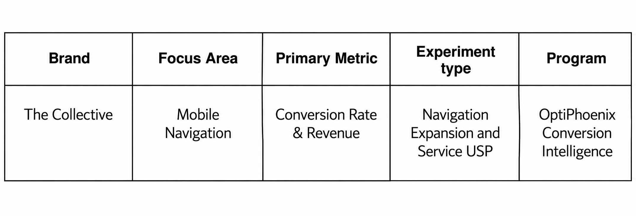
OptiPhoenix partnered with The Collective to test whether a larger, more informative navigation menu would give shoppers a more comfortable browsing experience and drive higher conversion.
A cramped menu does two things at once. It limits how much a shopper can see, and it says nothing about why they should trust the brand while deciding where to go next.
For a luxury retailer, browsing confidence matters as much as browsing space. A shopper scanning categories on a small, tightly packed menu is working harder than they should be, and a menu with no service reassurances leaves trust-building entirely to later stages of the journey. The gap sat between a shopper exploring categories and a menu that gave them neither room nor reason to feel confident along the way.
OptiPhoenix proposed that expanding the mobile navigation to use the full screen height and a larger share of the viewport width, while surfacing key service USPs within the menu, would let shoppers browse more comfortably and shop with greater confidence. This was expected to improve navigation and drive higher conversion.
OptiPhoenix ran a controlled A/B test on The Collective’s mobile navigation.
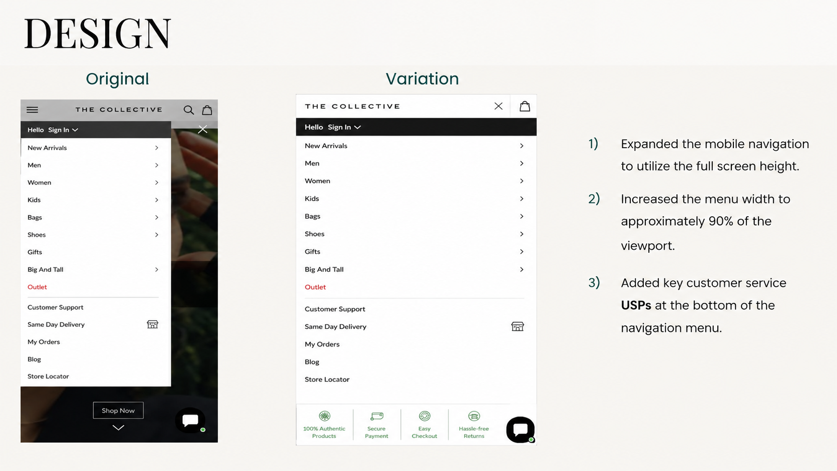
Variant A (Control): The original mobile menu, occupying limited screen space with no visible service USPs.
Variant B (Test): The navigation expanded to use the full screen height and approximately 90% of the viewport width, with key customer service USPs added at the bottom of the menu.
Metrics measured: Conversion Rate, Revenue, Order Rate, and Cart Visits.
Giving the navigation more room, and giving shoppers a reason to trust it, moved more of them toward a purchase.
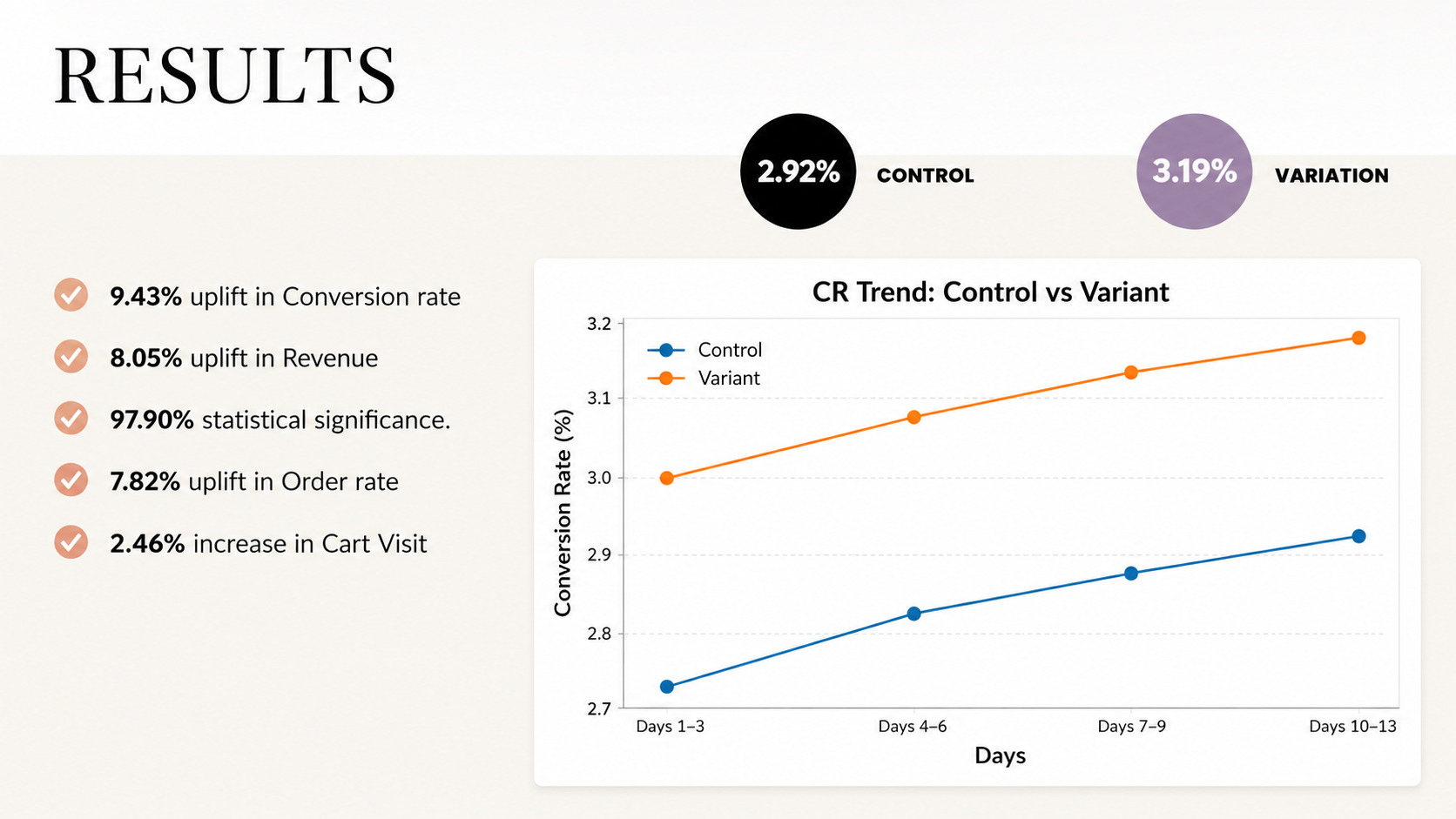
Conversion Rate rose from 2.92% to 3.19%, a 9.43% increase. Revenue rose 8.05% over the same test, reaching 97.90% statistical significance. Order rate rose 7.82%, and cart visits increased 2.46%.
A larger, more informative navigation menu gave shoppers room to browse and reasons to trust what they found.
Screen space is browsing capacity. Expanding the menu to use the full height and most of the viewport width gave shoppers more to see at once, which is why order rate and cart visits moved alongside conversion.
Trust signals belong where the decision is being made. Placing service USPs inside the navigation menu itself, rather than leaving shoppers to find them later, reinforced confidence at the exact point shoppers were choosing where to go next.
A structural change can outperform a content change. No new categories or products were added. The menu simply gave shoppers more room and more reassurance, and both revenue and order rate followed.
The Collective’s mobile shoppers were not struggling to find categories because the categories were missing. They were struggling because the menu gave them too little room and too little reason to feel confident along the way. By expanding the navigation and placing trust signals where shoppers were already deciding, OptiPhoenix closed both gaps at once, and conversion followed.
