
SAADAA × OPTIPHOENIX: A SIZE SELECTION REDESIGN DROVE A 20% CONVERSION RATE UPLIFT

Palmonas’ collection pages were seeing active filter engagement. Users were using category filters to narrow their product exploration – a strong signal of purchase intent. The problem was structural: every time a user scrolled down to browse the product grid, the filter and sort controls disappeared from view. Accessing them again required scrolling back to the top of the page.
For a mobile shopper working through a jewellery collection, this friction accumulated across every filtering action. Users who wanted to switch between categories or refine their sort had to interrupt their browsing to do so. A behavior that should have been frictionless ; filtering – carried a consistent penalty.
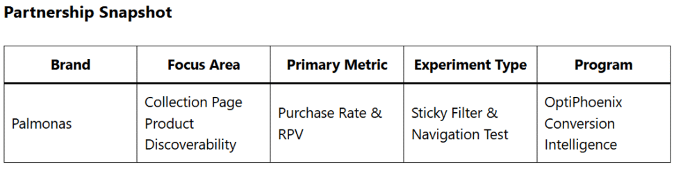
OptiPhoenix partnered with Palmonas to test whether making filters persistently accessible, and surfacing categories upfront alongside them, would improve product discoverability and drive more users through to purchase.
The data showed filter engagement was already happening. Users were motivated to use these tools – they were just being penalized for it by a layout that required unnecessary scrolling to re-access them.
The opportunity was not to create new behavior. It was to remove the cost of existing behavior. Users who filtered and sorted were already on a path toward purchase. Making that path frictionless was the lever.
If filter and sort options are made sticky so they remain accessible as users scroll, and a category selector is added alongside them for upfront category visibility, users will be able to explore products faster and with less effort, leading to higher interaction with product cards and increased purchases.
Variant A (Control): Original collection page – filter and sort options positioned at the top of the page only, requiring users to scroll back up to re-access after browsing.
Variant B (Test): Redesigned collection page – filter and sort options made sticky, remaining accessible throughout the scroll experience. A category option added alongside the sticky bar, allowing users to view and navigate all categories without leaving the page.
Segment: All users Primary Metrics: Revenue per visitor (RPV), purchase rate, annual revenue impact

Making filters and categories persistently accessible produced a significant purchase lift.
Purchase rate increased by 14.3%. RPV grew by 2.24%. At current traffic levels, the improvement projects to approximately 5.1% in additional yearly revenue.
Users who already had the intent to filter and browse were completing more purchases when the act of filtering cost them nothing.

Friction in a repeated action compounds. Filtering is not a one-time action on a collection page – users filter, browse, refine, and browse again. Every instance of needing to scroll back to the top was a small friction that, accumulated across a session, was reducing completion rates measurably.
Sticky UX elements earn returns proportional to how often they are used. Controls that users access repeatedly – filters, sort, category switching – are the highest-leverage candidates for sticky behavior. Making them persistent doesn’t add to the page; it removes a recurring cost.
Upfront category visibility accelerates product discovery. Displaying all categories from within the sticky bar meant users could switch context without abandoning their browsing flow. Fewer interruptions meant more time in the product grid.
The behavior this experiment targeted was already present. Palmonas users were filtering – they were just being slowed by a layout that asked them to scroll back to the top to do it again. Removing that friction, and pairing it with upfront category visibility, produced a 14.3% purchase increase from users whose intent was already there.
