
SAADAA × OPTIPHOENIX: A SIZE SELECTION REDESIGN DROVE A 20% CONVERSION RATE UPLIFT
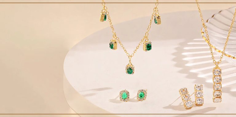
Salty is an Indian D2C jewellery and accessories brand catering to everyday shoppers. On mobile, the hamburger menu is the primary navigation gateway – the first decision point between a user landing on the site and finding a product they want to buy.
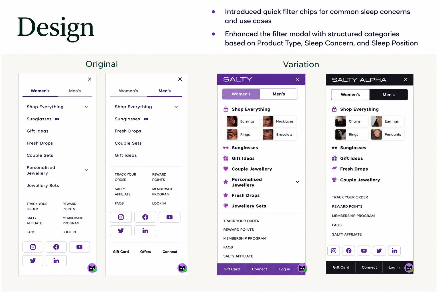
The original menu presented a long, undifferentiated list of categories. Every item – from top-level categories to secondary links like “Refund Policy” and “FAQ’s” – was given roughly equal visual treatment. Users opening the menu were confronted with a wall of text with no hierarchy, no visual cues, and no indication of where to begin. The cognitive cost of parsing that list was being paid before a single product was viewed.
OptiPhoenix identified the menu as a funnel entry point worth restructuring – not because the categories were wrong, but because the presentation was doing nothing to guide users into them.
The problem was not category breadth or catalog depth. It was visual hierarchy. When everything in a menu looks the same, users either pick arbitrarily or close the menu and leave.
For a jewellery brand where Earrings, Necklaces, Rings, and Bracelets are the high-intent entry points, the menu needed to present those categories with enough visual distinction that users could identify and select their category in a single glance. Secondary items – support links, affiliate programs, social links – were taking up equal real estate and adding noise to a decision that should have been effortless.
If the hamburger menu is redesigned to add product images and unique icons for each category, establish a clear visual hierarchy between primary and secondary items, and make secondary links sticky at the bottom, users will navigate to PLPs and PDPs more frequently and progress further through the purchase funnel.
Variant A (Control): Original hamburger menu – flat text list with equal visual weight across all items, no images, no icons, no hierarchy between shopping categories and utility links.
Variant B (Test): Redesigned menu – category images added alongside top-level items (Earrings, Necklaces, Rings, Bracelets displayed with photo thumbnails), unique icons added per category for visual differentiation, primary shopping categories given clear prominence, secondary utility links moved to a sticky bottom element.
Sample size: ~28,300 users per variant
Primary Metrics: Conversion rate, funnel progression to purchase
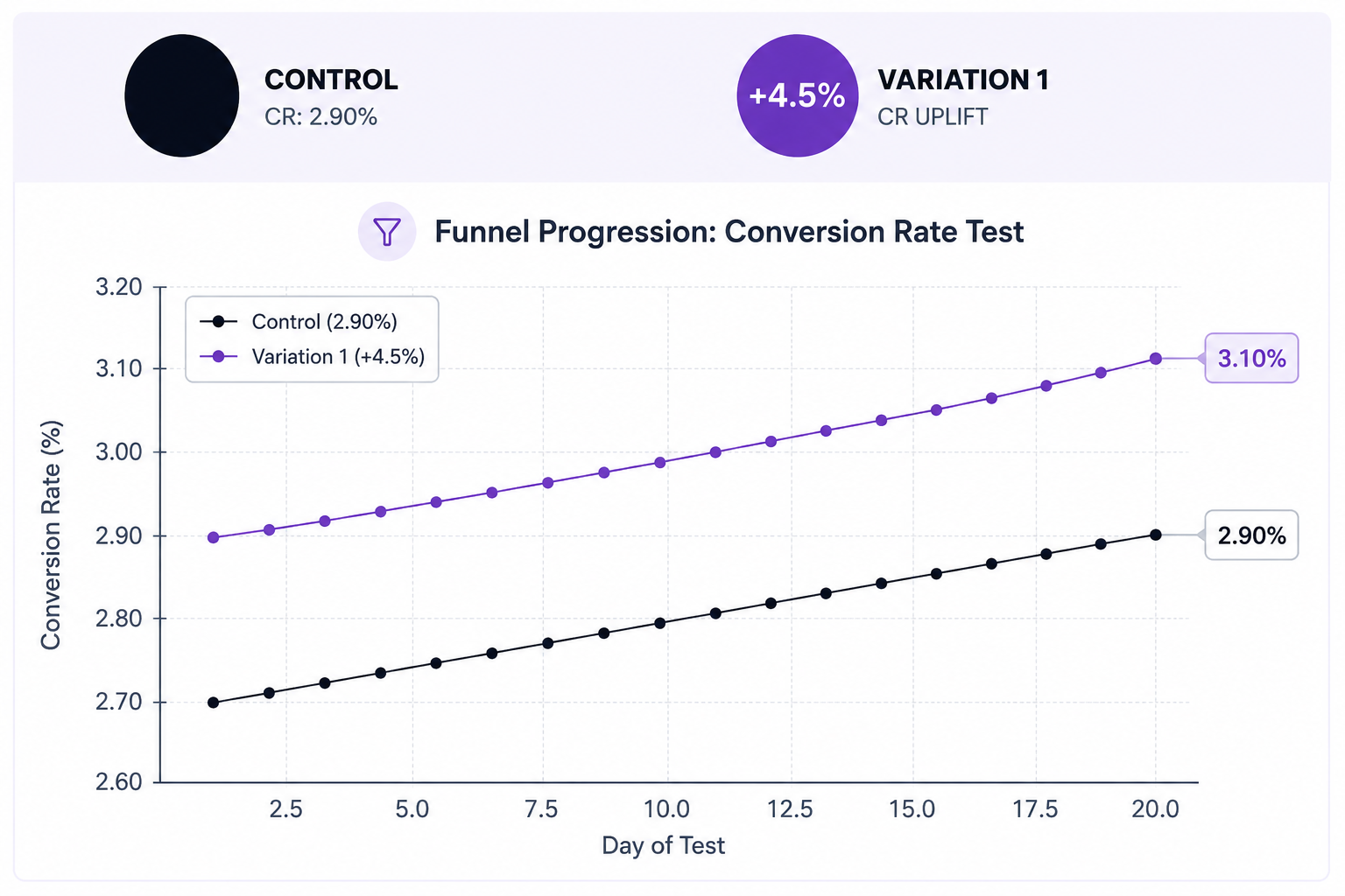
Statistical confidence: 89.86% probability to be best
Control conversion rate: 2.964%. Variation conversion rate: 3.148%. Uplift: 6.9% more funnel progressions to purchase, with 89.86% probability to be best and an expected loss of only 1.77% versus 6.79% for the control.
The improvement projects to approximately 2.3% of Salty’s annual revenue in additional yearly impact at current traffic levels.
Images in navigation are functional, not decorative. For a jewellery brand, category thumbnails allow users to recognize their intended destination by sight rather than reading through a list. Recognition is faster than recall and produces higher engagement.
Visual hierarchy in menus is a conversion variable. When primary shopping categories are visually distinct from utility links, users spend less cognitive effort on navigation and more on browsing. Reducing that overhead at the very first step of the session compounded across the full funnel.
Sticky secondary items free up primary real estate without removing utility. Moving support and policy links to a sticky bottom position removed them from the scanning path without making them inaccessible. Users who needed them could still find them.
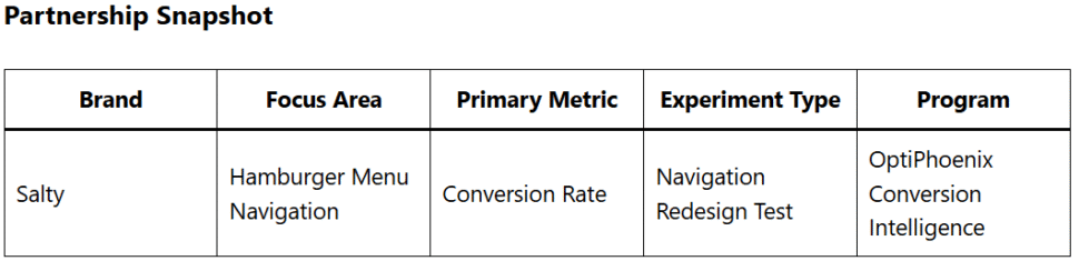
Salty’s product catalog was not the obstacle. The entry point into it was. By adding visual differentiation to the categories users were most likely seeking and pushing utility links out of the scanning path – the redesigned menu converted more users from navigation into browsing, and from browsing into purchase.
