
SAADAA × OPTIPHOENIX: A SIZE SELECTION REDESIGN DROVE A 20% CONVERSION RATE UPLIFT
Van Heusen is one of the brands available through the ABFRL SuperApp. The SuperApp is a unified fashion shopping platform that brings together brands including The Collective, Louis Philippe, Van Heusen, Allen Solly, Peter England, Pantaloons, American Eagle and Forever 21. On Van Heusen’s mobile Product Detail Page, size options and size measurements appeared separately. The View Size Chart link also had low visibility. As a result, shoppers had to put in extra effort to find sizing information before they could pick a size.

OptiPhoenix partnered with Van Heusen to test whether grouping this information in one place would reduce that effort and improve conversion.
Choosing a size is one of the last steps before a purchase. So any doubt at this step can stop a shopper from buying.
When sizing details are spread across the page, a shopper has to piece them together. They may also miss the Size Chart link altogether. Because of that, the information existed, but it did not feel easy to find. The gap sat between a shopper ready to choose a size and a page that made them hunt for the details behind that choice.
OptiPhoenix proposed grouping the Size Chart and size measurements inside a dedicated tile. The team also planned to make the View Size Chart link more prominent. Together, these changes were expected to make sizing information easier to access, reduce purchase uncertainty, and drive a higher conversion rate.
OptiPhoenix ran a controlled A/B test on Van Heusen’s mobile Product Detail Page.
Variant A (Control): The original layout. Size options and measurements were displayed separately, and the View Size Chart link had low visibility.
Variant B (Test): A dedicated size tile that grouped the size measurements and the Size Chart together. The View Size Chart link was also made more visible.
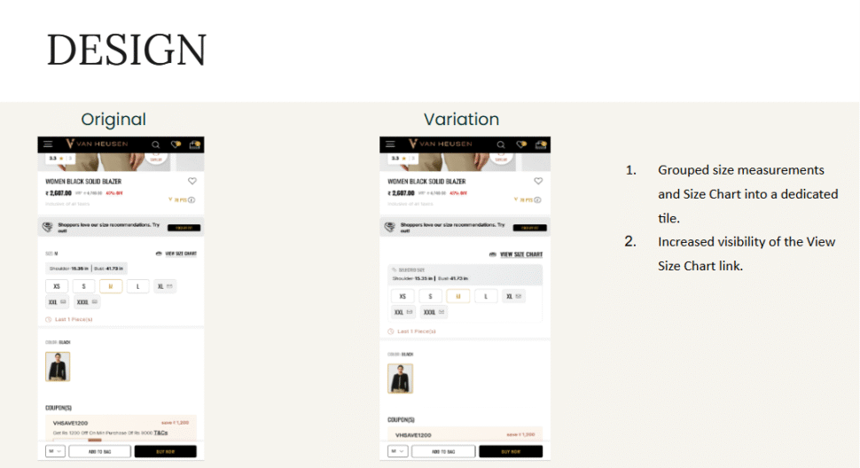
Metrics measured: Conversion Rate and orders from size interactions.
Bringing sizing details together moved more shoppers toward a purchase.
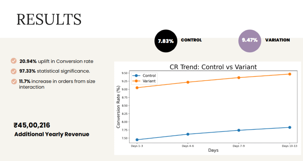
Conversion Rate rose from 7.83% to 9.47%, a 20.94% increase. The result reached 97.33% statistical significance. Orders from size interactions also rose 11.7%.

Sizing information works best in one place. The details were already on the page. But grouping them in a single tile meant shoppers no longer had to search for them. That change alone produced a 20.94% lift.
Visibility matters as much as content. The View Size Chart link existed in both versions. However, making it more prominent helped more shoppers use it. So a small change to a single link can carry real weight.
The result is well supported. At 97.33% statistical significance, the lift is unlikely to be due to chance. As a result, the same grouping approach is a good candidate to test on other product pages.
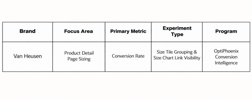
Van Heusen shoppers were not unsure about the product. They were unsure about the size, and the page made that answer hard to piece together. By grouping sizing details in one tile and making the Size Chart link easier to see, OptiPhoenix closed that gap. So shoppers chose their size with more confidence.

