LOUIS PHILIPPE × OPTIPHOENIX: HAPTIC FEEDBACK ON ADD TO BAG DROVE A 16.95% UPLIFT IN BUY NOW CONVERSION

SAADAA is a fashion brand selling everyday apparel such as kurtas and pants. On its mobile Product Detail Page (PDP), sizes appeared as round buttons labelled only with letters such as S, M, L, and XL. The measurements behind each size sat in a separate size chart. A shopper who was unsure of their size had to open that chart and match it to the options. Choosing a size is the last decision before Add to Bag, so any doubt at this point can stall a purchase.

OptiPhoenix partnered with SAADAA to test whether a clearer size selector would help shoppers choose with more confidence and convert more often.
A letter size means different things on different garments. Shoppers know this, so many check the size chart before they commit.
That check adds a step. The shopper leaves the selector, reads the chart, and returns to pick. Some will make that trip, and some will hesitate or leave. So the gap sat between a shopper ready to add a product to the bag and a selector that did not show what each size meant.
OptiPhoenix proposed redesigning the size selector so each size showed its measurement in inches. Shoppers could then judge fit at the point of selection, without relying only on the size chart. This was expected to build sizing confidence and lift the conversion rate.

OptiPhoenix ran a controlled A/B test on SAADAA’s mobile Product Detail Page for all users. The test ran for 7 days, from 14 August to 21 August.
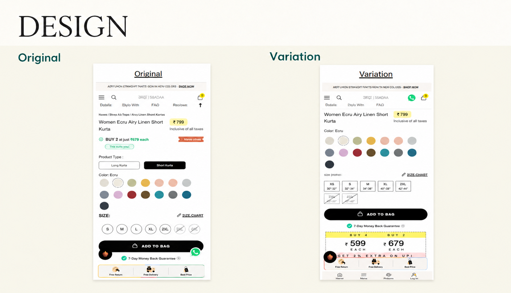
Variant A (Control): The original PDP, with round size buttons showing letters only (S, M, L, XL, 2XL). Unavailable sizes were crossed out.
Variant B (Test): A redesigned size selector with rectangular size tiles. Each tile showed the size and its measurement range in inches, under a “Size (inches)” label, with the Size Chart link kept alongside. Unavailable sizes stayed crossed out.
Metrics measured: Conversion Rate and Revenue.
Showing what each size meant at the moment of choosing moved more shoppers to buy.
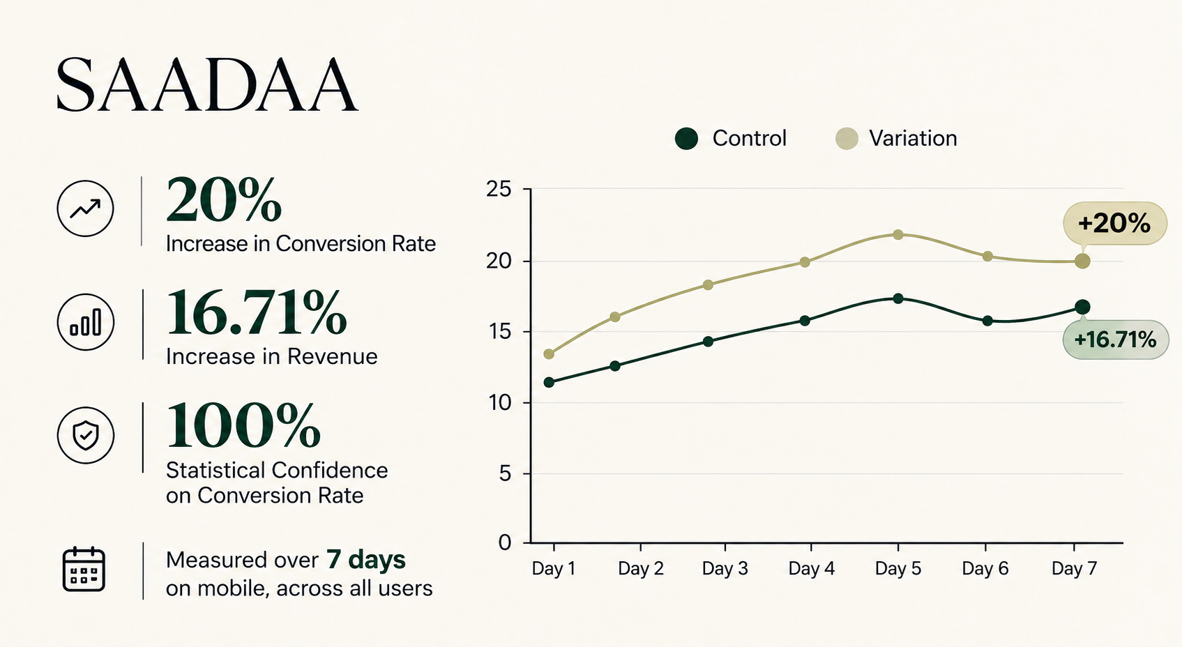
Conversion Rate rose 20%, with 100% statistical confidence on conversion rate. Revenue rose 16.71% over the same test.
Put the answer where the question arises. Shoppers wonder what a size means while they choose it. Showing measurements on the size tiles answered that question without a trip to the size chart.

Small selector changes can move conversion. The test changed how an existing choice was presented, and conversion rose 20%.
Sizing clarity supports revenue as well. Revenue rose 16.71%, close to the conversion gain, which suggests the lift came from more completed purchases and not from a change in who visited.
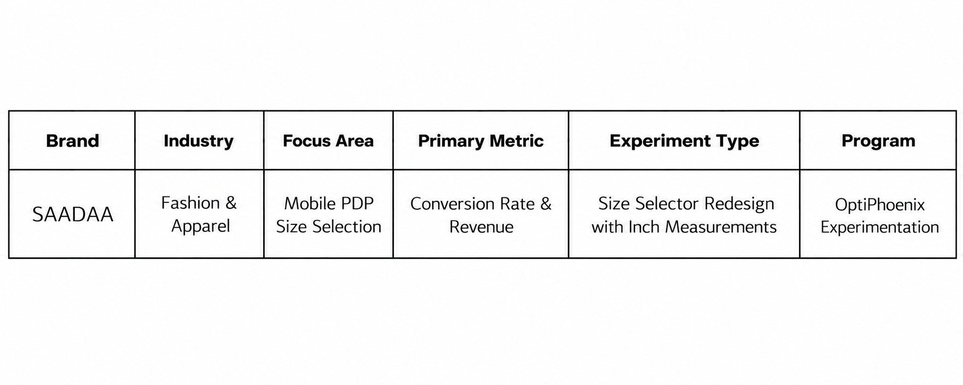
SAADAA‘s shoppers were not unsure about the product. They were unsure about the fit. By redesigning the size selector to show measurements on each size, OptiPhoenix put the answer at the point of choice. Conversion Rate rose 20% and Revenue rose 16.71%.