
SAADAA × OPTIPHOENIX: A SIZE SELECTION REDESIGN DROVE A 20% CONVERSION RATE UPLIFT
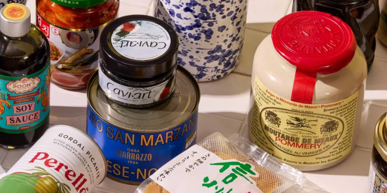
Sous Chef is a UK-based family-run specialty food retailer selling international cooking ingredients, cookware, and tableware. Their checkout flow followed a four-step path: Add to Cart → Side Cart → Cart Page → Checkout. At 32% cart abandonment, the data was pointing clearly to a specific bottleneck.
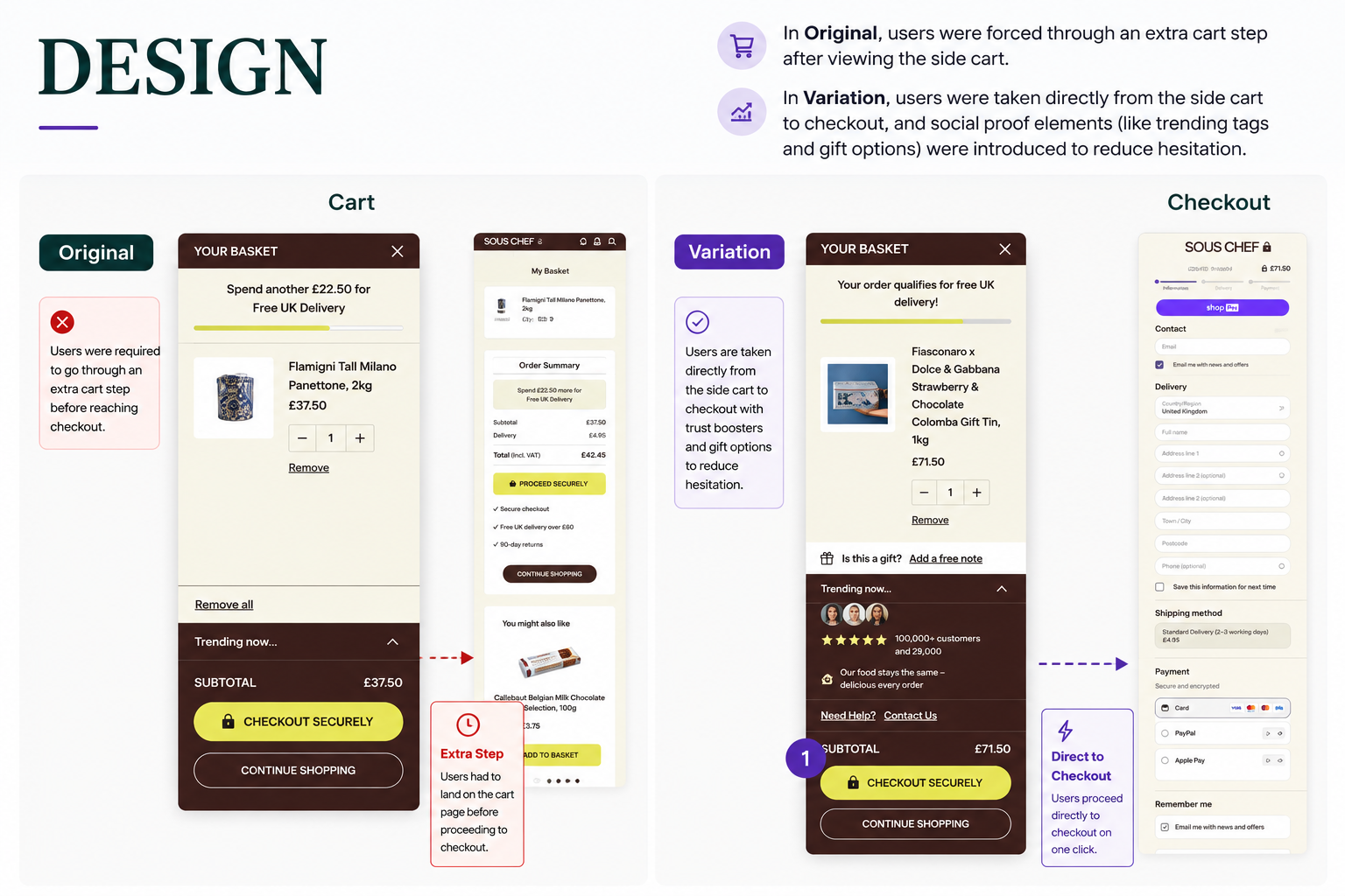
The side cart – a slide-out panel that appeared immediately after adding a product – already showed the user their basket, confirmed their item, and offered a “Checkout Securely” button. Users who saw that panel and clicked through were then taken to a full cart page, where they saw the same items again before finally reaching checkout.
The cart page was doing the same job the side cart had already done – but slower, and one step later.
Funnel data made the sequential drop-off visible. Of all users who started at the homepage, 65.4% reached a PLP or PDP. Of those, 20.3% added to cart. Of those, 68.3% completed the cart page step and proceeded to checkout – meaning 31.7% were abandoning at that single transition.
Users who had already seen their basket in the side cart were being shown it again on the cart page. For a buyer who had already decided to purchase, this was an additional click with no new information. For a buyer with any residual hesitation, it was one more opportunity to leave.
The side cart was the natural handoff point to checkout. The cart page was interrupting a decision that had already been made.
If the checkout flow is modified so that clicking “Checkout Securely” in the side cart takes users directly to checkout – bypassing the cart page – and the side cart is enriched with social proof, gifting options, and a contact help link to address any pre-checkout hesitation, cart abandonment will decrease and conversion will increase.
Variant A (Control): Original four-step flow – Add to Cart → Side Cart → Cart Page → Checkout.
Variant B (Test): Three-step flow – Add to Cart → Enriched Side Cart → Checkout. The side cart was enhanced with a free delivery threshold indicator, a gifting option (“Is this a gift? Add a free note”), a “Trending now…” social proof section, a trust statement (100,000+ customers and 29,800 reviews), and a “Need Help? Contact Us” link. Clicking “Checkout Securely” routed directly to checkout without passing through the cart page.
Duration: 5 weeks
Primary Metric: Funnel progression to purchase, conversion rate
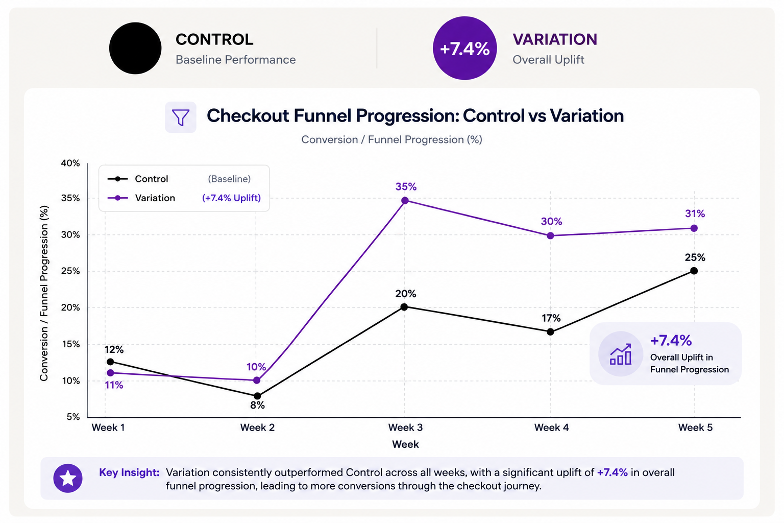
The variation produced consistent improvement across the full five-week test period.
7.4% more users who reached the mini cart completed a purchase in the variation. The improvement projects to approximately 0.67% of Sous Chef’s annual online revenue in additional yearly impact.
A step that repeats information already shown is not a safety net – it’s a leak. The cart page showed users what the side cart had already shown them. For users with purchase intent, that repetition added no value. For users with hesitation, it gave them an exit. Removing it tightened the funnel without removing any functionality users needed.
When removing a step, add the value in the step that replaces it. The variation didn’t just bypass the cart page. It enriched the side cart with the trust elements – social proof, gifting, help access – that might otherwise have justified a dedicated cart page. The step was removed, but the job it needed to do was preserved at the handoff point.
Funnel analysis reveals where decisions are actually being reversed. The 31.7% abandonment at the cart page was the diagnostic. Once the bottleneck was identified as a structural one – not a messaging or pricing problem – the fix was structural. Removing the step rather than redesigning it was the correct intervention.
| Brand | Focus Area | Primary Metric | Experiment Type | Program |
|---|---|---|---|---|
| Sous Chef | Checkout Funnel Simplification | Conversion Rate & Funnel Progression | Checkout Flow Test | OptiPhoenix Conversion Intelligence |
Sous Chef‘s cart abandonment wasn’t a messaging problem or a trust problem. It was an architecture problem. Users who had already decided to buy were being asked to confirm that decision a second time on a page that added nothing to their experience. Removing that step – and placing trust signals where users were already making their purchase decision – reduced friction at the exact moment it was costing the most.
