
SAADAA × OPTIPHOENIX: A SIZE SELECTION REDESIGN DROVE A 20% CONVERSION RATE UPLIFT
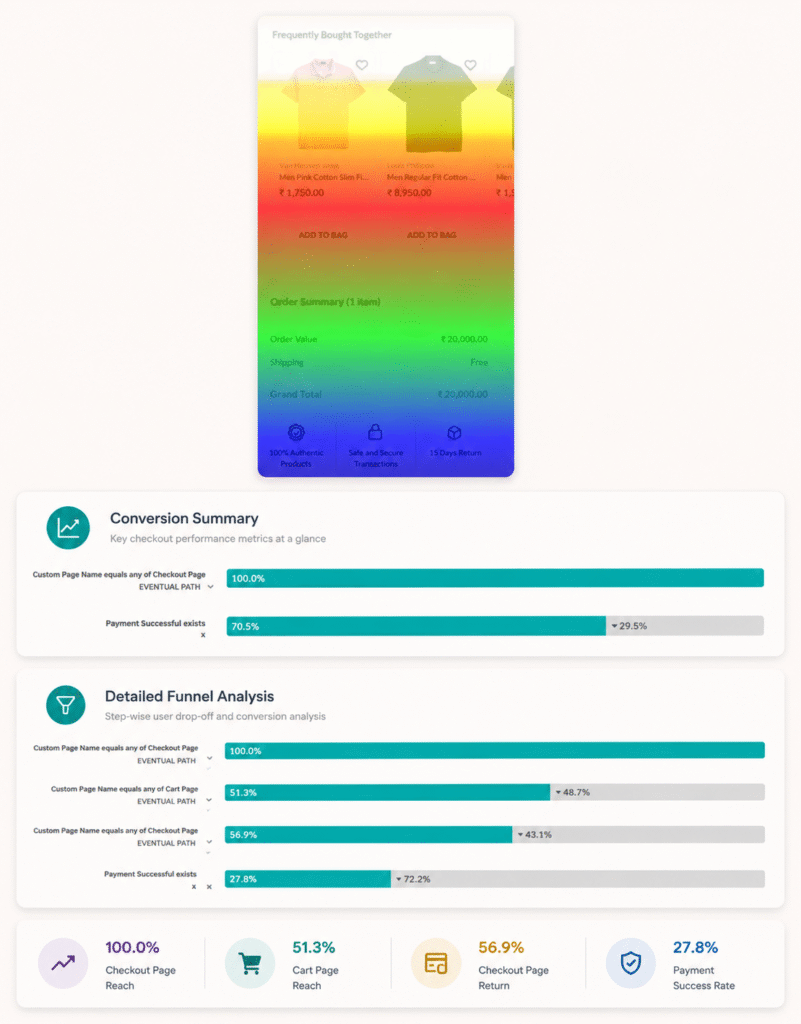
Across The Collective’s checkout funnel, users were dropping off at two specific points. Only 30% of cart page visitors progressed to checkout. Of those who reached checkout, another 30% abandoned before completing payment. Analytics also showed frequent toggling between cart and checkout – a behavioral signal that users were moving back and forth without acting.
Scrollmap data pointed to a likely cause: fewer than half of cart page users were reaching the order summary section at the bottom of the page, where price and savings details were displayed. The discount information was there. Most users never saw it.
OptiPhoenix partnered with The Collective to test whether making savings more visible earlier in the checkout experience would reduce abandonment and improve completion rates.
For luxury shoppers, a meaningful discount is not just a financial incentive. It is a confidence signal. It reframes the purchase from “spending a lot” to “getting real value.”
When that signal sits in a section most users never reach, it does no behavioral work. The ₹5,688 saving on a ₹11,375 order is a persuasive number – but only if the buyer sees it before they exit.
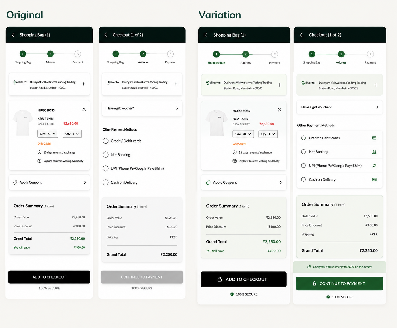
If total savings are displayed prominently and persistently above the sticky CTA on both the cart and checkout pages, more users will feel confirmed in their purchase decision and proceed to payment.
OptiPhoenix designed an A/B test targeting savings visibility across the checkout flow:
Variant A (Control): Savings information displayed in the order summary section at the lower portion of the cart and checkout pages.
Variant B (Test): Total savings displayed prominently above the sticky CTA on both the cart and checkout pages, visible without scrolling.
All other page elements remained unchanged.
Duration: 5 weeks
Metrics Measured: Checkout page movement, conversion rate, average order value, revenue
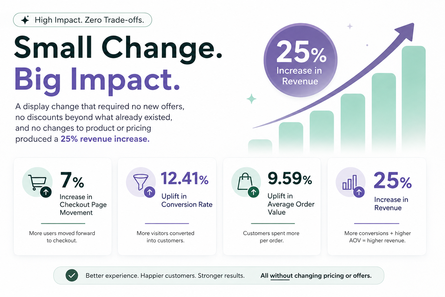
Moving the savings display to a persistent, above-the-fold position produced consistent improvement across the full funnel.
Checkout page movement increased by 7%. Conversion rate rose by 12.41%. Average order value grew by 9.59%. Revenue increased by 25%.
Users who could see what they were saving at the moment of commitment proceeded to purchase at a measurably higher rate.
A display change that required no new offers, no discounts beyond what already existed, and no changes to product or pricing produced a 25% revenue increase.
Value messaging only works when it’s visible. Savings that sit below the fold are functionally invisible to the majority of shoppers. Placement determines whether a persuasive message has any persuasive effect.
The sticky CTA is prime real estate. It is the most consistently visible element during checkout. Content placed adjacent to it benefits from that visibility across every stage of the user’s scroll.
Confirmation reduces abandonment. Users who can see their financial benefit at the moment of commitment are less likely to second-guess and exit.

The savings already existed. The discount was already applied. The only thing missing was a layout that let buyers see it clearly at the moment it mattered most. This experiment demonstrated that in high-value e-commerce, the difference between a purchase completed and a cart abandoned can come down to whether a user sees one number before they decide to leave.
