
SAADAA × OPTIPHOENIX: A SIZE SELECTION REDESIGN DROVE A 20% CONVERSION RATE UPLIFT
The Pant Project is a D2C fashion brand specializing in ready-to-wear and custom-made pants, offering a range of styles for different occasions and preferences.
On mobile, the hamburger menu used a text-heavy navigation structure. Users had to open parent categories before they could access specific product categories, adding extra steps to the product discovery journey.

The opportunity was to simplify navigation by making key product categories more visible and introducing visual cues, helping users understand the available options and reach relevant products with fewer interactions.
The navigation already contained the product categories users needed.
The friction came from how those categories were presented.
Users had to open parent categories to get to specific products, creating additional interactions before they could begin exploring the relevant product category.
The test focused on making important categories easier to scan and reducing the number of interactions needed for product discovery.
Making key product categories more visible through visual category tiles, while simplifying the menu hierarchy, would help users discover products faster.

Expanding “Ready to Wear Pants” by default would also remove an additional interaction from the discovery journey.
The original mobile navigation was tested against a variation designed to make product categories more accessible.
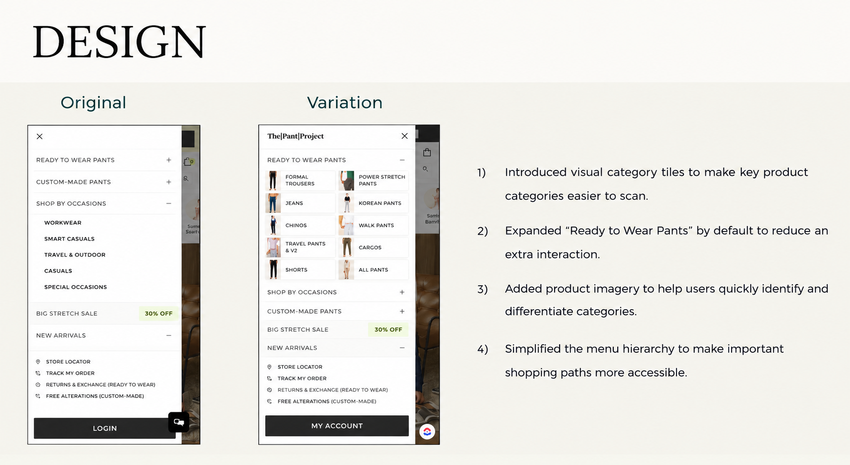
The variation introduced:
The variation increased the Conversion Rate:
Uplift: 8.43%
Variation: 7.22%
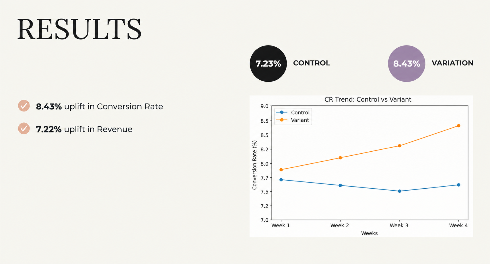
The simplified mobile navigation helped make product categories more visible and reduced the steps required to discover products.
8.43% Conversion Rate uplift
7.22% Revenue uplift
Make important categories easy to scan.
Visual category tiles gave users a quicker way to understand the available product categories.
Remove unnecessary interactions.
Expanding “Ready to Wear Pants” by default reduced the need for an additional interaction before users could explore the category.
Use imagery to support discovery.
Product imagery helped users identify and differentiate categories more quickly.
Simplify the hierarchy.
Making important shopping paths more accessible addressed the additional steps created by the original menu structure.
Brand: The Pant Project
Industry: D2C Fashion
Focus Area: Mobile Navigation
Primary Metric: Conversion Rate
Experiment Type: Navigation Simplification & Visual Category Discovery
Program: OptiPhoenix Experimentation
The Pant Project already had the product categories users were looking for. The friction was in getting to them. By simplifying the mobile navigation, introducing visual category tiles, and making key shopping paths more accessible, the experiment helped improve product discovery and delivered a reported 8.43% Conversion Rate uplift

