
SAADAA × OPTIPHOENIX: A SIZE SELECTION REDESIGN DROVE A 20% CONVERSION RATE UPLIFT
The mid-fold plan comparison chart is where a Funding Pips user chooses which challenge to buy. The original chart presented several options with technical naming and dense information, and that density created friction exactly where a decision was needed.
Users had to spend real effort working out what each plan offered and how the challenge types differed. Terms like “Funding Pips Pro” did not communicate the structure, so the chart asked users to decode before they could choose.
OptiPhoenix partnered with Funding Pips to test whether clearer naming and highlighted value points would ease that decision and lift plan selection.
The friction was comprehension, not price.
A user comparing plans needs to understand the differences quickly, and opaque naming slowed that down. Renaming plans to describe their structure, for example “2-Step Pro” instead of “Funding Pips Pro,” emphasising the key value points, and cutting competing information reduced the cognitive load that was stalling the choice.
If plan naming is made clearer and key value points are highlighted within the comparison chart, users will understand the options faster, reducing cognitive load and increasing plan selection and conversion.
OptiPhoenix ran a controlled A/B test on the plan comparison chart:

Variant A (Control): The original chart, with technical plan naming and dense, competing information.
Variant B (Test): A simplified chart with structural naming conventions, emphasized value propositions, and reduced clutter.
Metrics measured: plan-selection conversion, funnel progression to dashboard.
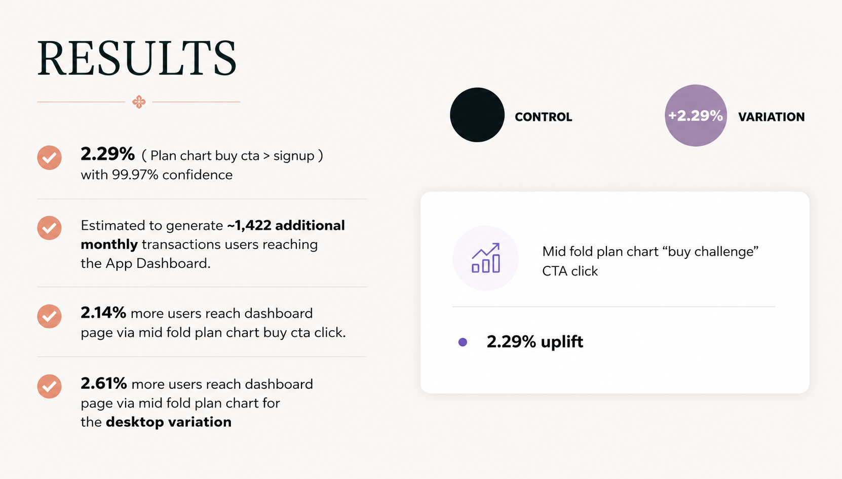
Clearer plans moved more users to select. Conversion from the plan chart’s buy CTA to signup rose 2.29% at 99.97% confidence, above the 95% threshold. Progression to the dashboard via the mid-fold buy CTA rose 2.14% overall and 2.61% on the desktop variation, with an estimated 1,422 additional monthly transitions to the dashboard.
Clearer naming and value cues lifted plan-selection conversion by 2.29% at high confidence.
Names carry information. A plan called “2-Step Pro” tells the user its structure; one called “Funding Pips Pro” does not. The rename did work the layout could not.
Less competing information helps a decision. Cutting clutter from the chart let the value points register.
Small percentages compound at scale. A 2.29% lift reads modest until it becomes roughly 1,422 more users a month reaching the dashboard.

Funding Pips‘ users were not indecisive, they were decoding. Naming the plans for what they were, and clearing the clutter around them, let users choose without the work the original chart demanded.
