FLOORET × OPTIPHOENIX: 12.76% SAMPLE KIT REVENUE UPLIFT AND 11.27% MORE PURCHASERS THROUGH A REDESIGNED PDP
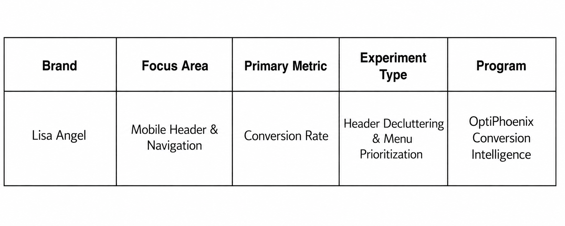
Lisa Angel is a UK-based lifestyle and jewellery brand known for personalized gifts, handmade jewellery, and homeware. Founded in Norwich in 2004, the brand has grown from a small venture into an internationally recognized name, selling through its own website, stores, and third-party platforms. On mobile, Lisa Angel’s header was cluttered. Core navigation elements competed for space, and the hamburger menu, meant to be the primary path for navigation and product discovery, was underused as a result. The login icon sitting in the header added to the clutter rather than serving a clear purpose there.

OptiPhoenix partnered with Lisa Angel to test whether simplifying the header would reduce that visual noise and improve conversion.
A cluttered header does not just look busy, it competes with the actions users actually came to take. When the hamburger menu, the main gateway to navigation and product discovery, sits among several other competing elements, it loses the visual priority it needs to get used.
The login icon compounded this. Placed directly in the header, it took up space without supporting the primary task most visitors have, which is browsing and finding products, not logging in. The gap sat between a header trying to do too much at once and users who needed a clear, prioritized path into the site.
OptiPhoenix proposed that simplifying the header, prioritizing the hamburger menu, and moving the login icon out of the header and into the menu would improve navigation flow, boost product engagement, and drive a higher conversion rate.

OptiPhoenix ran a controlled A/B test on Lisa Angel’s mobile header.
Variant A (Control): The original header, with the hamburger menu, login icon, and other elements competing for space and attention.
Variant B (Test): The hamburger menu moved to the left of the header, and the login and signup icon relocated out of the header and into the menu itself.
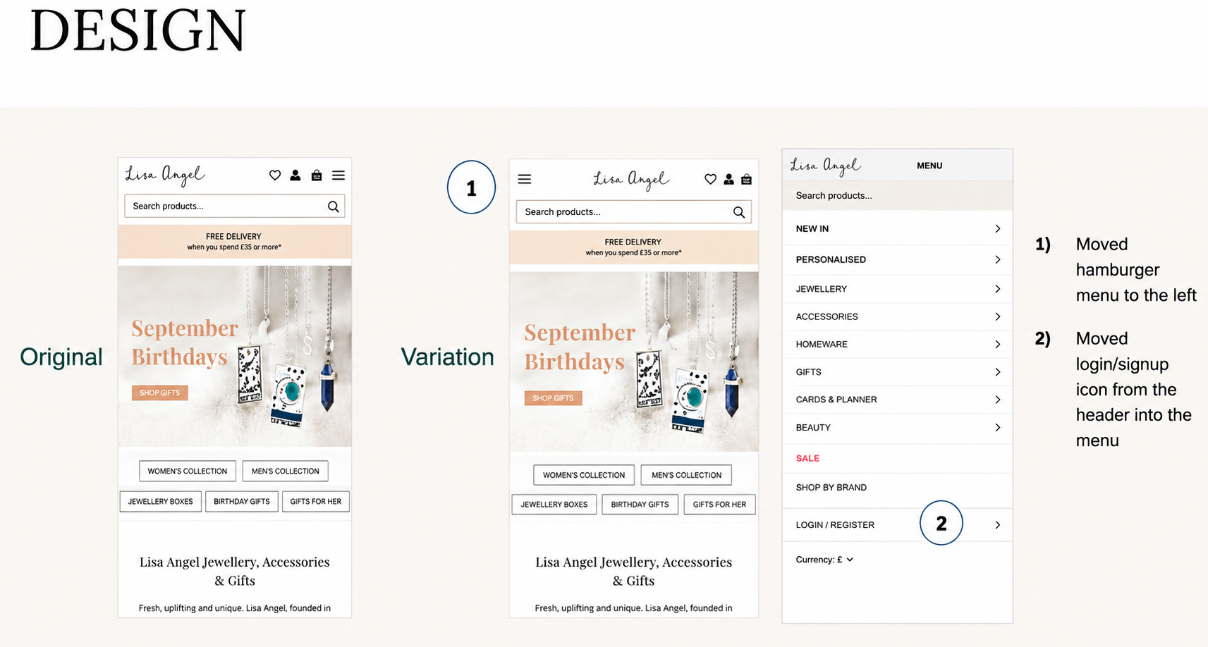
Metrics measured: Conversion Rate, hamburger menu and sub-menu clicks, and Add to Cart rate.
Giving the hamburger menu clearer priority, and removing a competing element from the header, moved more users toward a purchase.
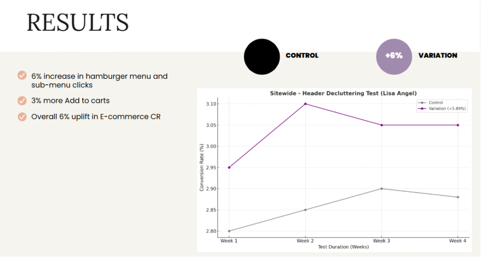
Hamburger menu and sub-menu clicks rose 6%. Add to Cart rate rose 3%. Overall, Conversion Rate rose 6% across the site.
Primary navigation needs visual priority to get used. The hamburger menu was always functional, but a cluttered header kept it from standing out as the clear starting point for browsing. Giving it space and position, not new functionality, was enough to lift engagement with it.
Not every element belongs in the header. The login icon was not the problem on its own, but its position in the header was competing with elements users needed more often. Moving it into the menu let the header focus on what most visitors were actually there to do.
A cleaner layout can move the full funnel. This test only touched the header, yet the effects showed up in menu engagement, Add to Cart rate, and overall Conversion Rate, suggesting the change reduced friction at the very first step of the visit.
Lisa Angel’s mobile visitors were not struggling to find the menu because it was missing, they were struggling because it had to compete with other elements for their attention. By decluttering the header and giving the hamburger menu clear priority, OptiPhoenix closed that gap, and browsing became the obvious first step again.