
SAADAA × OPTIPHOENIX: A SIZE SELECTION REDESIGN DROVE A 20% CONVERSION RATE UPLIFT
Salty’s mobile header was carrying more than it needed to. Icons for wishlist account, search and cart were clustered together alongside the brand logo and persistent “Women | Men” gender navigation tabs all competing for attention in a small strip of screen real estate that every user saw on every page.
The data revealed a specific problem. Search had a 7% conversion rate among users who interacted with it a high-performing path to purchase. Yet fewer than 2% of mobile users were actually visiting search results pages. A feature that converted well was barely being used, because it was visually subordinate to surrounding header elements.
Meanwhile, the persistent “Women | Men” tabs were drawing consistent clicks but those clicks weren’t improving conversion. Users who navigated to the Men’s section were not converting at the rate that justified the header space the tabs occupied permanently.
The header problem had two interlocking components. Persistent “Women | Men” tabs occupied space on every page at every scroll depth, even after a user had already chosen their section and was deep in browsing. They were optimized for a user who hadn’t made a gender selection yet – but most users had already done that by the time the tabs were visible again.
Search, by contrast, was available but not prominent. A path with a 7% conversion rate was less visible than navigation that wasn’t producing equivalent results. The fix was to make gender navigation context-aware and give the freed real estate to a tool that was actively converting.
If header icons are uniformly rearranged to reduce visual clutter, and the Women/Men CTA is repositioned to hide while scrolling and reappear on scroll-up rather than persisting at all times, users will navigate with higher intent and convert at a higher rate.
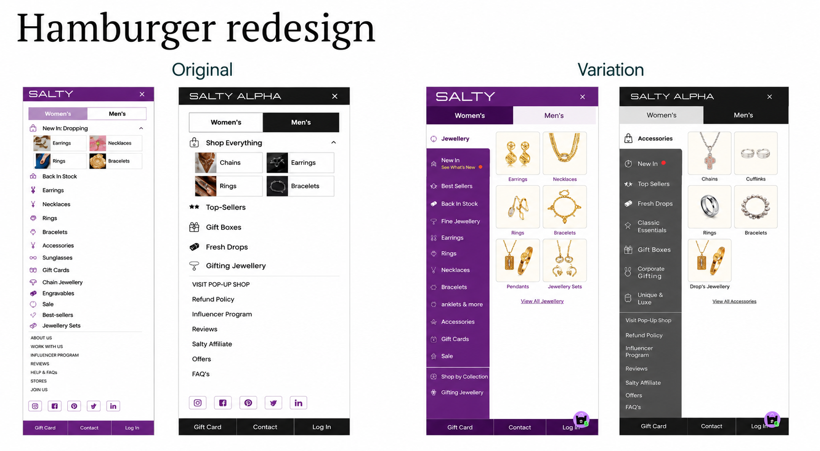
Variant A (Control): Original header – “Women | Men” tabs persistent at all scroll depths, icons clustered with varying sizes and positions, search available but visually de-emphasized.
Variant B (Test): Redesigned header – icons uniformly arranged for visual clarity, Women/Men CTA made context-aware (disappears on scroll-down, reappears on scroll-up), header real estate freed for cleaner presentation.
Sample size: ~190,000–254,000 users per variant
Primary Metrics: Conversion rate, funnel progression to purchase
Statistical confidence: 100% probability to be best
Control conversion rate: 1.371%. Variation conversion rate: 1.874%. Uplift: 16.67% more funnel progressions to purchase, with 100% probability to be best and 0% expected loss – the strongest statistical result across Salty’s experimentation program.
The behavioral signal from the results was specific: users who saw the header change navigated with higher intent and didn’t click elements simply because they were permanently visible – a direct reference to the Men’s CTA behavior observed in the control.

The improvement projects to approximately 13.1% of Salty’s annual revenue in additional yearly impact at current traffic levels.
Persistent navigation elements train users to click them, not necessarily to use them. The always-visible “Women | Men” tabs were generating clicks without driving conversion improvement. Making them context-aware removed a navigation path that was producing behavior without intent.
Header clutter suppresses high-converting features. Search converted at 7% among users who engaged with it but was being used by fewer than 2% of mobile visitors. The crowded header was a visibility problem for the site’s most effective navigation tool.
Uniformity reduces cognitive load. Rearranging header icons into a consistent layout removed micro-decisions users were making about where each element was. Reducing that friction at the top of every page had a compounding effect across the full session.

The header is the most consistently viewed element on a mobile commerce site. Every user sees it on every page at every scroll depth. When that element creates visual noise and surfaces navigation that users are clicking without intent, the cost is distributed across the entire session for every visitor. Cleaning up the header – by making gender navigation context-aware and uniform the icon layout – produced a 16.67% conversion uplift with 100% statistical confidence, and a projected ~13.1% annual revenue impact from a single structural change for Salty.
