
Your Audit Is Done. Now What Do You Test First?

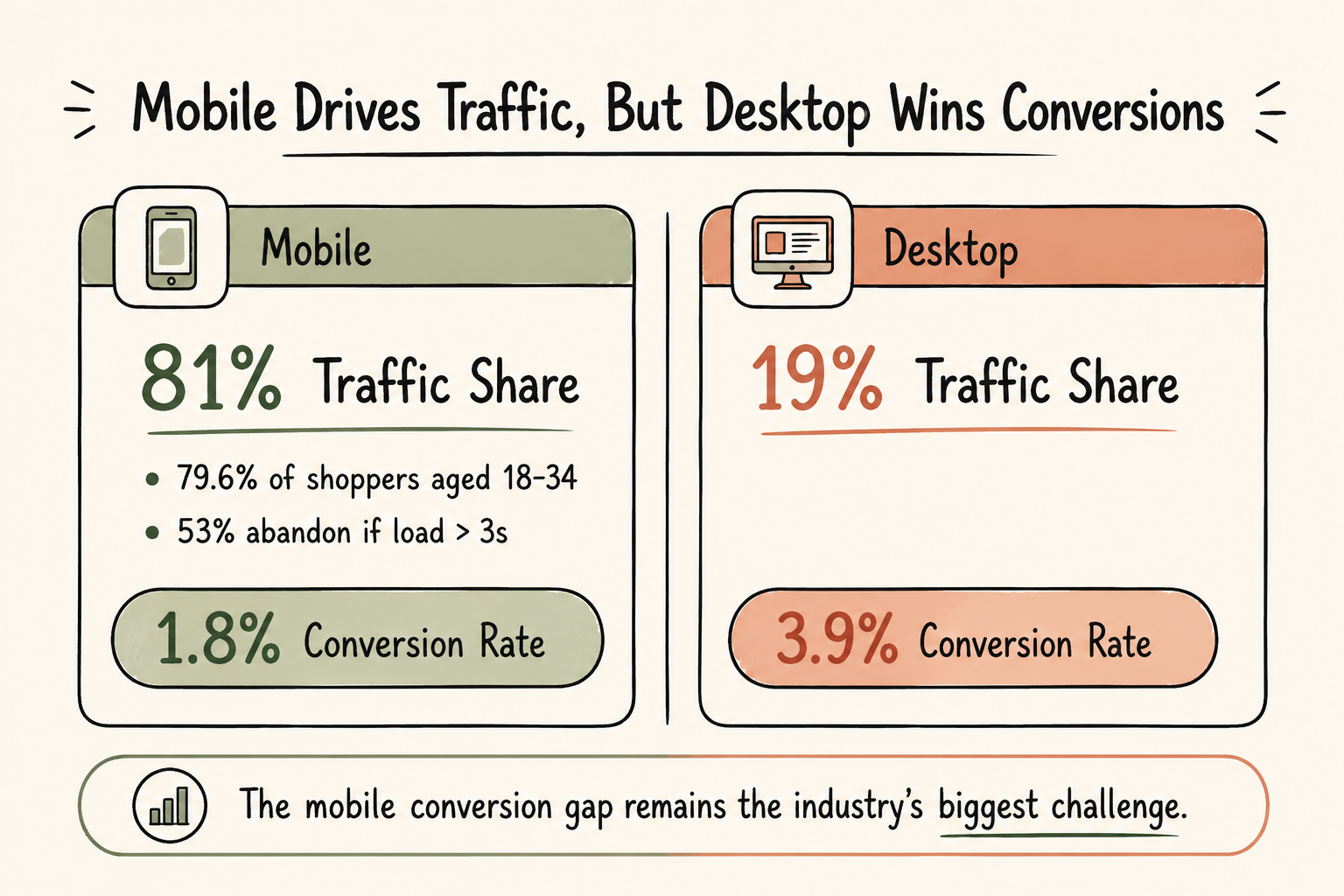
Most of your traffic walks in through the mobile door. Most of your revenue still comes out of the desktop one. That gap is not a coincidence and it is not a traffic quality problem. It is what happens when a site is built and tested for a screen fewer people use, then patched afterward for the screen most people are actually on. Mobile experience optimization is the work of closing that gap: finding exactly where mobile users hesitate, drop off, or give up, and fixing those specific points instead of redesigning the whole site and hoping the numbers move.
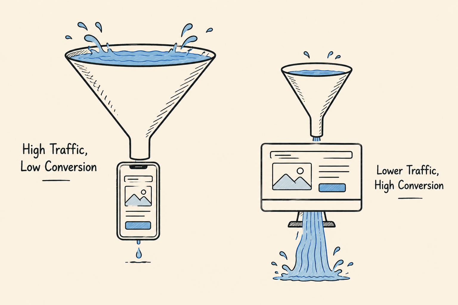
Here is the part that should bother any team looking at their own analytics. According to Baymard Institute’s research across 145 e-commerce sites, mobile sessions convert at an average of 2.2%, compared to 3.9% on desktop, even though mobile accounts for the majority of sessions on most sites today. You are getting more visitors through the door and losing more of them before they buy. (Source)
Cart abandonment tells the same story from a different angle. Baymard’s research puts mobile cart abandonment between 76% and 80%, against roughly 66% on desktop.(Source)
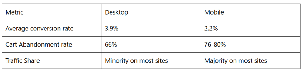
Sources: Advergize, citing Baymard Institute; DBB Software, citing Baymard Institute
The traffic is there. In most cases the intent is there too, since nobody adds an item to cart by accident. What is missing, on a large share of sites, is a mobile experience that carries that intent through to a completed purchase instead of losing it somewhere between the product page and the confirmation screen.
This is worth sitting with for a moment, because the instinct is to treat mobile underperformance as expected. It is not automatic. It is the direct result of specific, fixable friction points that most teams have never mapped in detail.
Mobile experience optimization is not “make the site responsive” and it is not “run a mobile speed test once a quarter and call it done.” Both of those are useful, but neither tells you where your specific site is losing specific visitors.`
The actual work is structured and ongoing: mapping the mobile journey stage by stage, finding where mobile behavior diverges from desktop behavior, and testing fixes at those exact points rather than applying general best practices and hoping they apply to your traffic.
That distinction matters more than it sounds. Most teams already know mobile underperforms. What they do not have is a clear, evidence-based answer to why, on their own site, for their own audience. A general instruction to “improve mobile UX” does not tell a designer what to change first. A mobile UX audit that maps real friction points does.

Three areas account for most of the damage and they are rarely diagnosed or fixed together, which is part of why the problem persists.
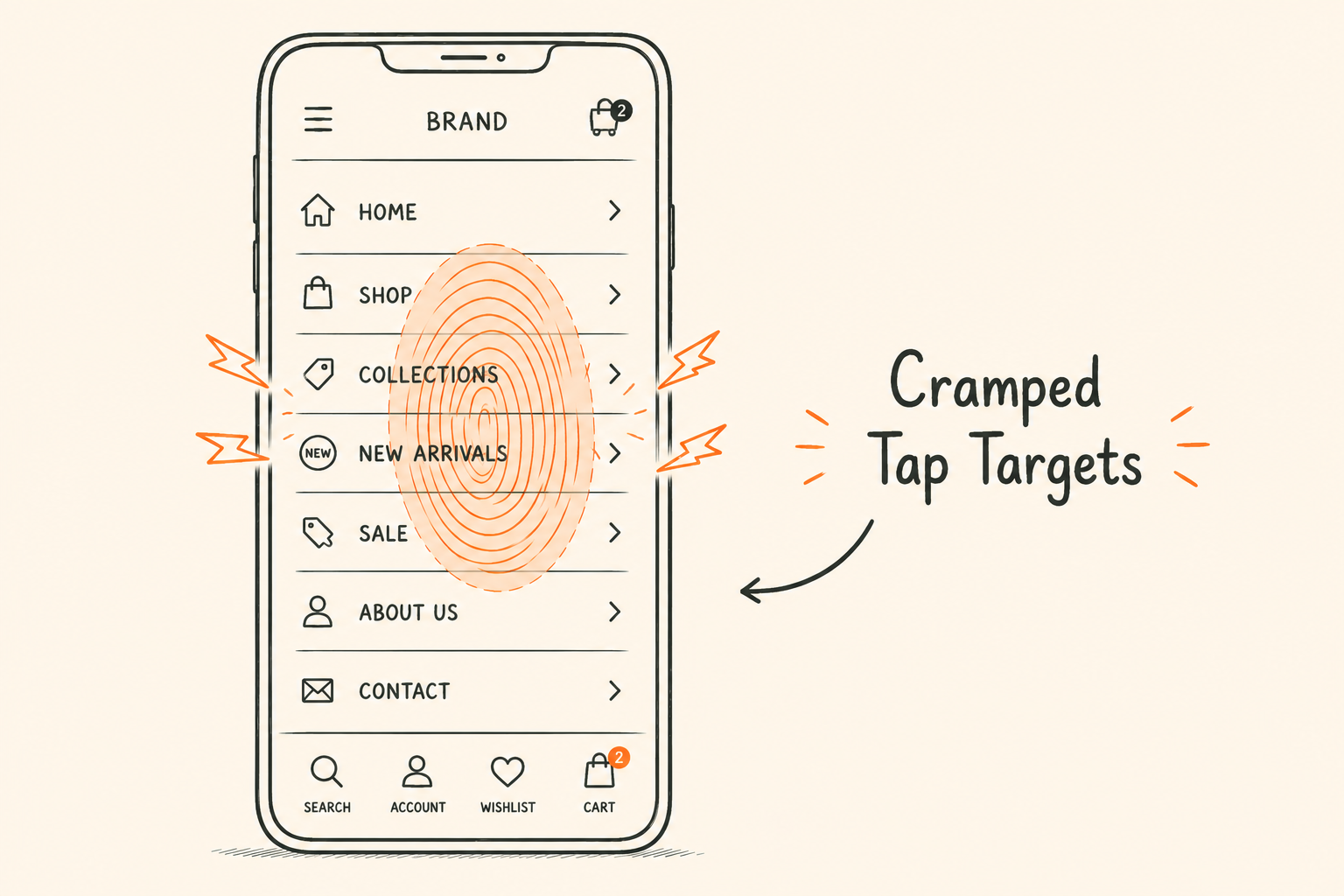
Menus, filters and page layouts built with a mouse cursor in mind do not translate cleanly to a thumb on a five to six inch screen. Buried filters, cramped tap targets, and navigation that takes several steps to reach a product or service page all create hesitation. A visitor rarely leaves because they are uninterested. More often they leave because finding what they came for took more effort than they were willing to give it.
This shows up clearly in session recordings as repeated scrolling, mis-taps on the wrong element, and backtracking through menus. None of that appears in a standard analytics dashboard. It only becomes visible when someone actually watches mobile sessions.
Mobile networks are slower and considerably less consistent than the office wifi most internal testing happens on. A page that loads acceptably in a controlled test environment can lag noticeably on a mid-range Android device on a real 4G connection, which describes a large share of actual mobile traffic. Every additional second of load time is another point where attention, and the intent behind it, can drop off before the page even finishes rendering.
Teams that only test speed on flagship phones over wifi are testing a best-case scenario that a meaningful share of their visitors never experience.
This is where the damage compounds the most, because checkout is the point of highest intent and the point where friction costs the most. Long forms, forced account creation, and shipping costs that appear late in the process are tolerable annoyances on a laptop with a full keyboard. On a phone, with an on-screen keyboard covering half the visible page, they are frequently the reason a completed cart never becomes a completed order. For a full breakdown of checkout friction points, the same principles apply across devices, though mobile amplifies each one.
Baymard’s research also shows that checkouts with a higher than average number of form fields see meaningfully lower completion rates, and that reducing unnecessary fields improves completion. On mobile, every additional field is a larger obstacle than it looks like in a desktop mockup, because typing itself is harder and errors are more common on small touch keyboards. None of these three areas gets solved by a single redesign pass. Each one needs to be diagnosed, tested, and fixed on its own terms.
The instinct when mobile conversion looks weak is to rebuild the mobile experience. New layout, cleaner visual design, sometimes a new checkout flow. It often produces a small improvement and rarely fixes the underlying issue, because a full redesign is a guess dressed up as a finished solution. It changes many variables at once, so when conversion moves afterward, nobody can say with confidence which change actually caused it. When it does not move, nobody knows which part of the redesign failed or why.
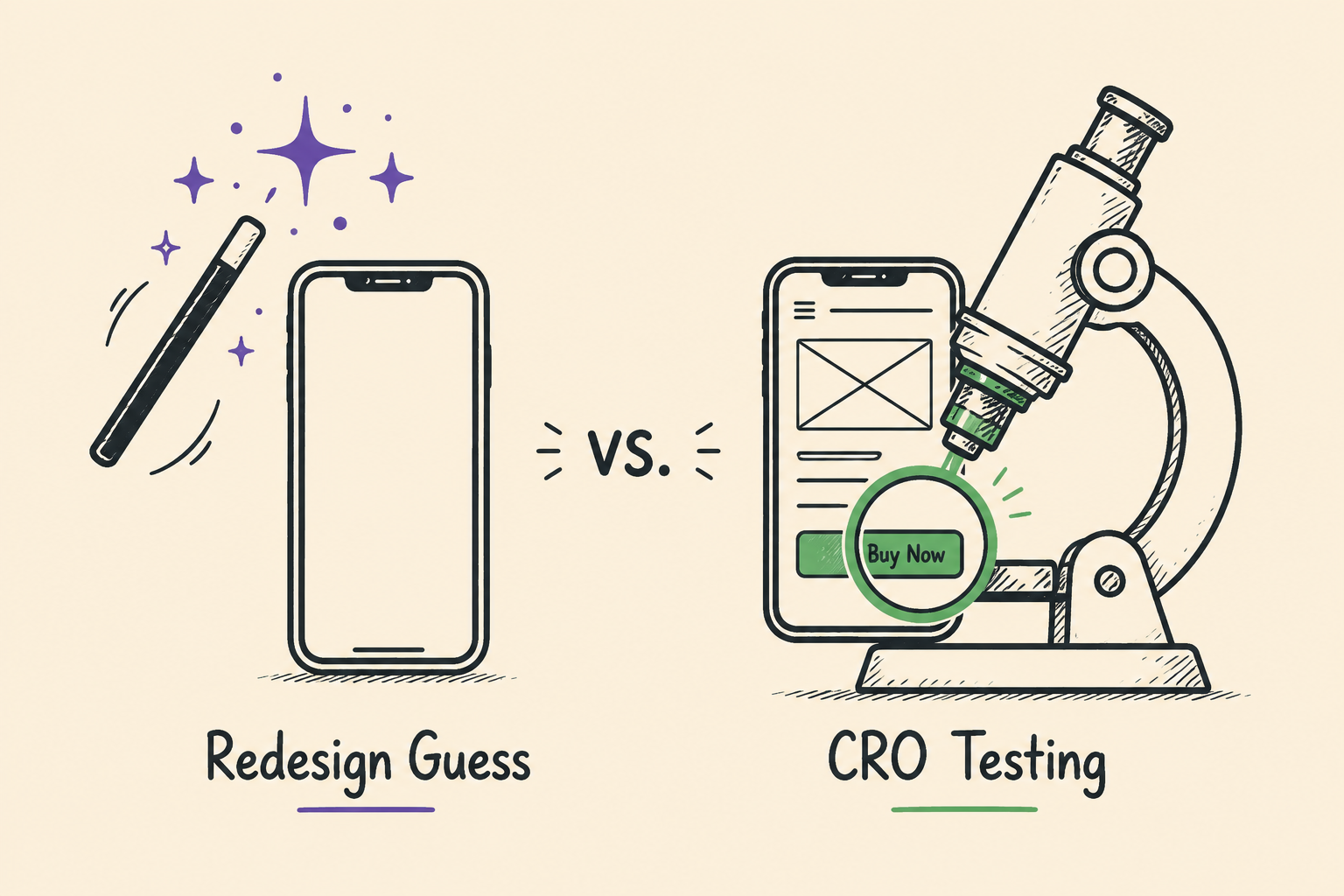
This is really a question about the relationship between design decisions and CRO: design shapes what a page looks like, but only testing tells you whether that design actually moves behavior.
Mobile CRO treats every layout and flow decision as a hypothesis to be tested, not a finished answer to be shipped. A claim like “reducing checkout form fields will improve mobile completion” gets tested against the current version, on real mobile traffic, before it gets rolled out everywhere. That approach is slower than a full redesign. It is also the only way to know a change actually worked, rather than assuming it did because the new version looks cleaner on a desktop screen during review.
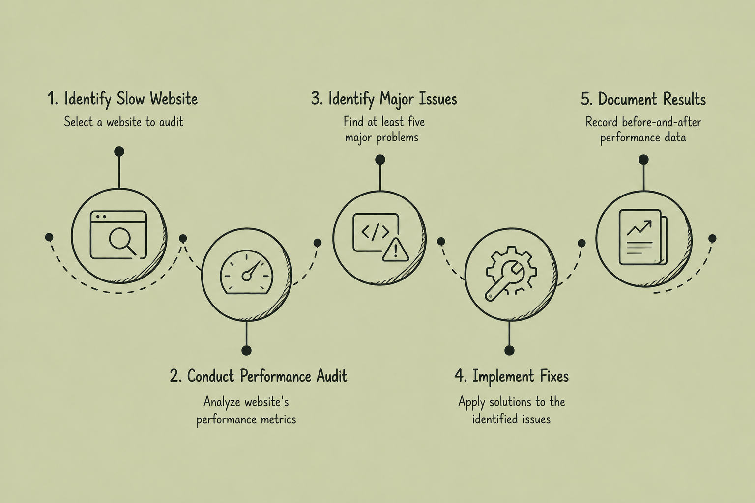
A mobile UX audit is the starting point for any real mobile experience optimization work. It is not a checklist review of design trends. It is a structured investigation into where actual mobile visitors hesitate, scroll back, or exit, using their real behavior as the evidence.
The output of this process should be a ranked, specific list of friction points, each one testable on its own. Not a general sense that “mobile needs work,” which is where most audits stop short.
A single audit fixes what is visible today. A mobile CRO program keeps finding what breaks next, because mobile devices, network conditions, and visitor behavior keep shifting over time. That means treating mobile experience optimization as a standing part of the experimentation roadmap, not a project that only gets revisited when conversion drops noticeably enough to trigger concern. This sits inside our broader CRO playbook for 2026, where mobile is one channel among several that need their own testing cadence rather than a shared, blended approach.
In practice, that means running structured A/B tests specifically on mobile segments rather than assuming a change tested on desktop performs the same way on a phone, tracking mobile-specific conversion metrics separately rather than folding them into a blended number, and reviewing mobile session data on a set, recurring schedule instead of only when something looks visibly broken.
OptiPhoenix has run this kind of mobile-specific audit and testing work across more than 150 brands spanning D2C, retail, SaaS, BFSI, and aviation, treating each mobile friction point identified through audit as a hypothesis to test rather than a redesign to guess at.
It is the process of identifying and fixing the specific points where mobile visitors hesitate, drop off, or abandon a purchase, using data and structured testing rather than a full redesign based on assumption.
Primarily due to navigation and layout built with larger screens and pointer input in mind, slower and less consistent load speeds over mobile networks, and checkout flows carrying more friction than a small screen and touch keyboard can comfortably absorb.
A structured review of mobile-specific analytics, session recordings, and funnel data that identifies exactly where and why mobile visitors are leaving, ranked by traffic and revenue impact so fixes can be prioritized.
A redesign changes the mobile experience all at once based on assumptions about what will work better. Mobile CRO tests individual changes against real mobile traffic before rolling them out, so any resulting improvement can be attributed to a specific, identifiable fix.
On a regular, recurring cadence, not only when conversion visibly drops. Device usage patterns, network conditions, and mobile visitor behavior shift often enough that a one-time audit becomes outdated.