AI Agent vs Chatbot: What’s the Difference for Your Store?
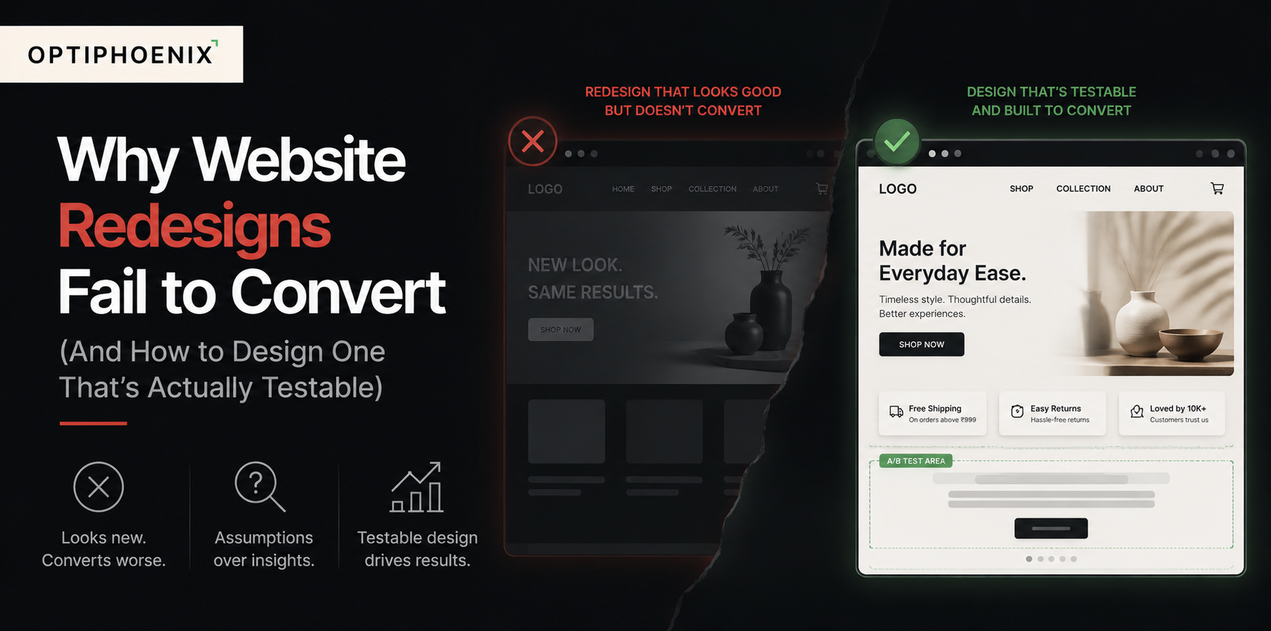
The new site launches. The typography is cleaner. The photography is sharper. Stakeholders are pleased with how it looks in the boardroom. Three months later, someone pulls the conversion report, and the number is exactly where it was before the launch. Sometimes it’s lower.

This isn’t rare. It’s the default outcome for redesigns that treat conversion as a byproduct of good design rather than something that has to be engineered and verified on purpose. A team can do everything right on craft: typography, spacing, brand consistency. The site can still perform identically to the one it replaced, because craft was never the variable holding conversion back in the first place.
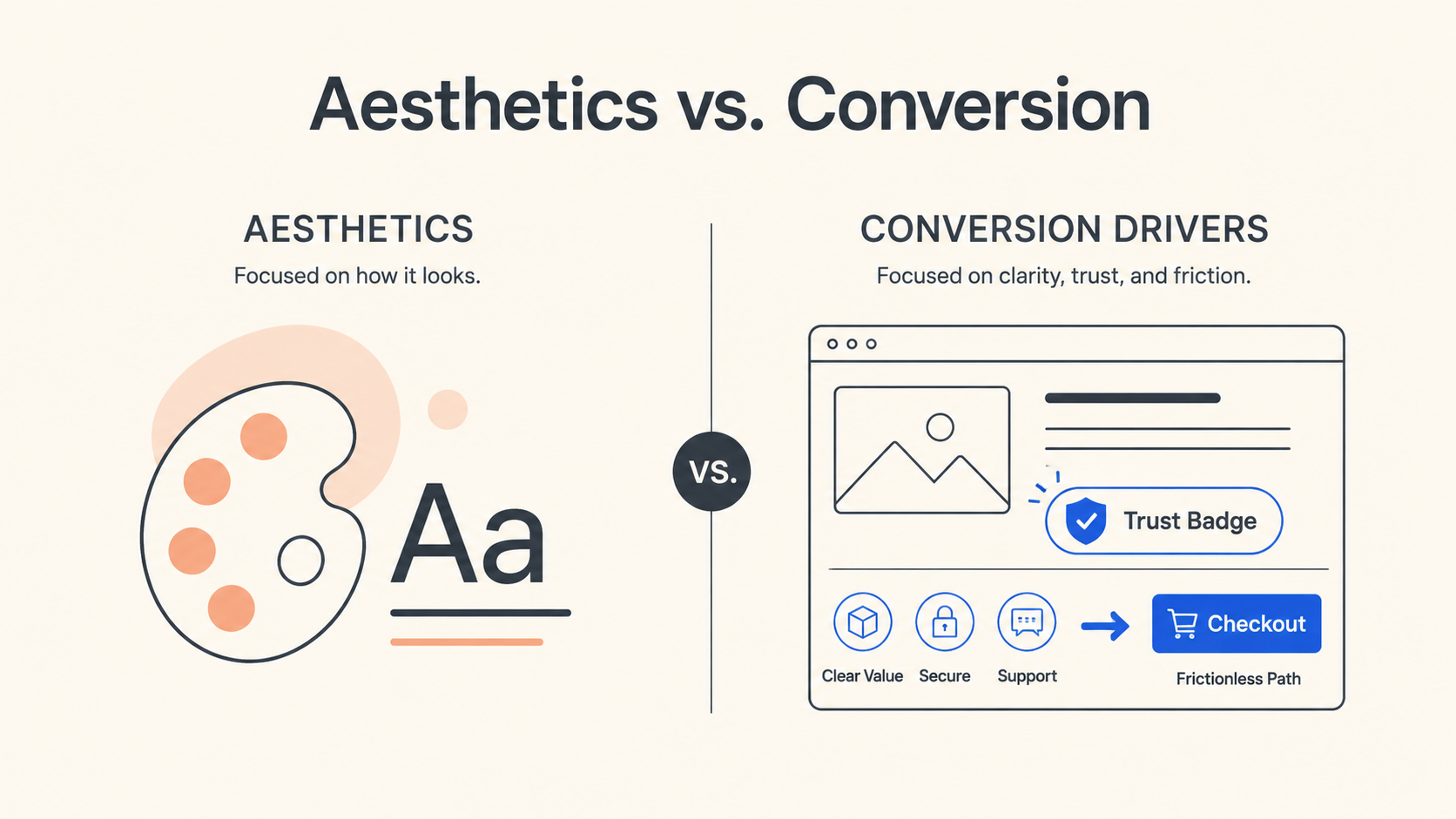
Most teams write redesign briefs around aesthetics: modernize the look, refresh the brand, clean up the navigation. Those are legitimate goals. None of them are conversion goals.
Clarity, trust, and friction drive conversion. A visitor needs to understand what the page is offering within seconds. They need to believe the site is credible enough to act on. And they need to move through the fewest possible steps to complete that action. A redesign can improve all three of these, or it can leave them untouched while making the page look significantly better. Visually, the second outcome looks like success. On the conversion report, it looks like nothing changed.
This is also why redesigns sometimes make conversion worse, not just flat. A new layout can bury a CTA that used to sit above the fold. A cleaner, more minimal design can accidentally remove a trust signal, like a security badge or a review count, that was quietly doing work. A rewritten headline optimized for tone can lose the specificity that told visitors exactly what they were getting. None of these are visible in a design review. They only show up once real traffic hits the page, which is usually a few weeks after it’s too late to catch them cheaply.
The common advice here is to avoid full redesigns altogether and stick to small, incremental changes. That’s reasonable advice for a site that’s performing well and just needs refinement. It’s not realistic advice for a site that’s outdated enough to need a genuine overhaul, has accumulated years of inconsistent patterns, or is migrating to a new platform.

The more useful fix is building testability into the redesign process itself, instead of treating testing as something that happens after launch, if there’s time. Plan a redesign this way, and you validate individual components first. The hero section, the checkout flow, the pricing layout: you test each one against the current site before bundling them into a single big-bang launch. This does two things a traditional redesign process doesn’t. It catches conversion problems while they’re still cheap to fix. And it produces evidence for which specific changes actually helped, instead of a single before-and-after number that can’t tell you why it moved.
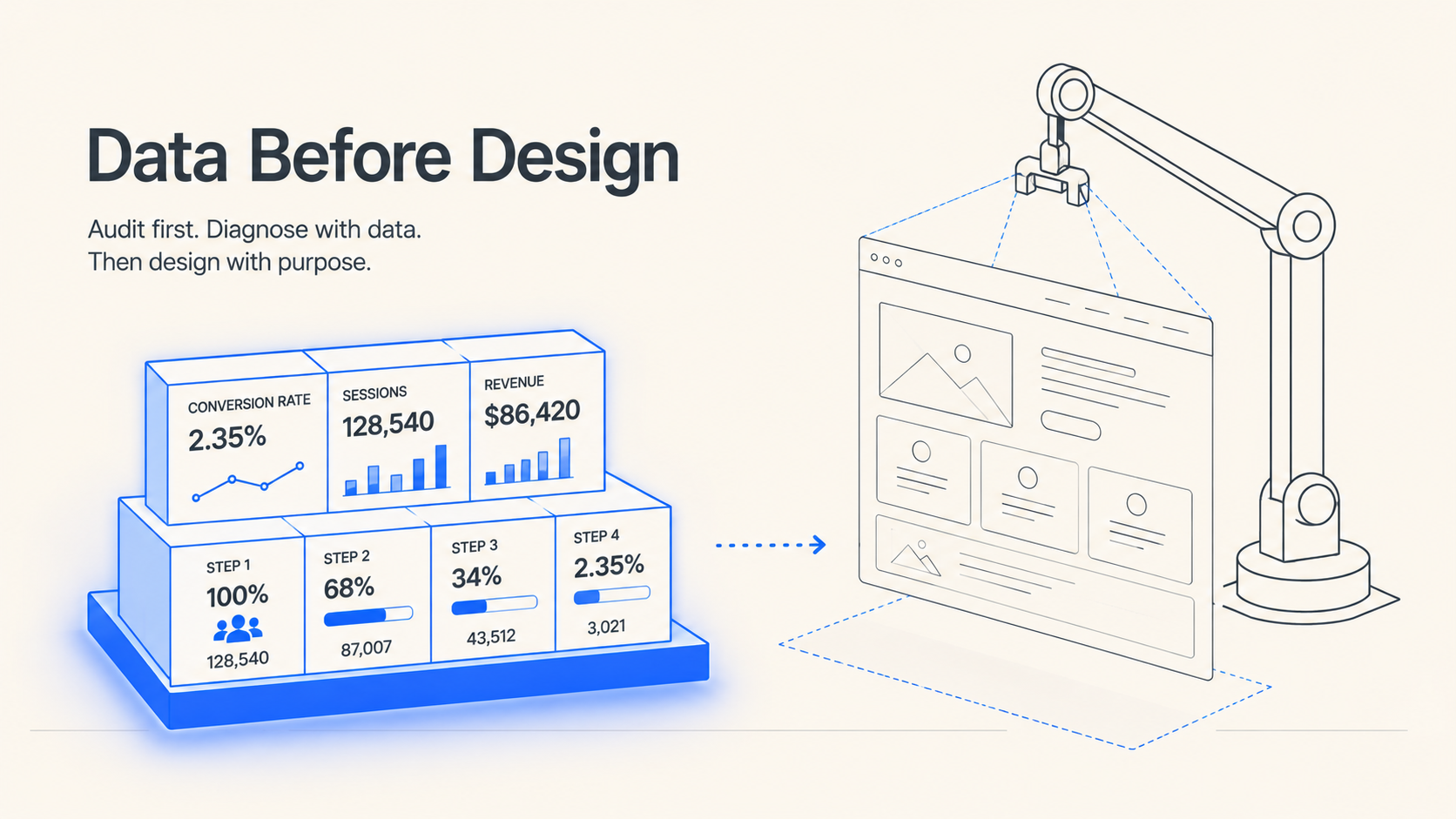
Before any design work begins, know three things: your current conversion rate, your funnel-stage drop-off points, and which pages carry the most traffic and revenue. Redesign effort should go where the data says it matters, not where the team’s instinct says the site looks dated. A structured conversion rate audit is the right starting point for this, since it gives you the diagnosis before anyone touches a wireframe.
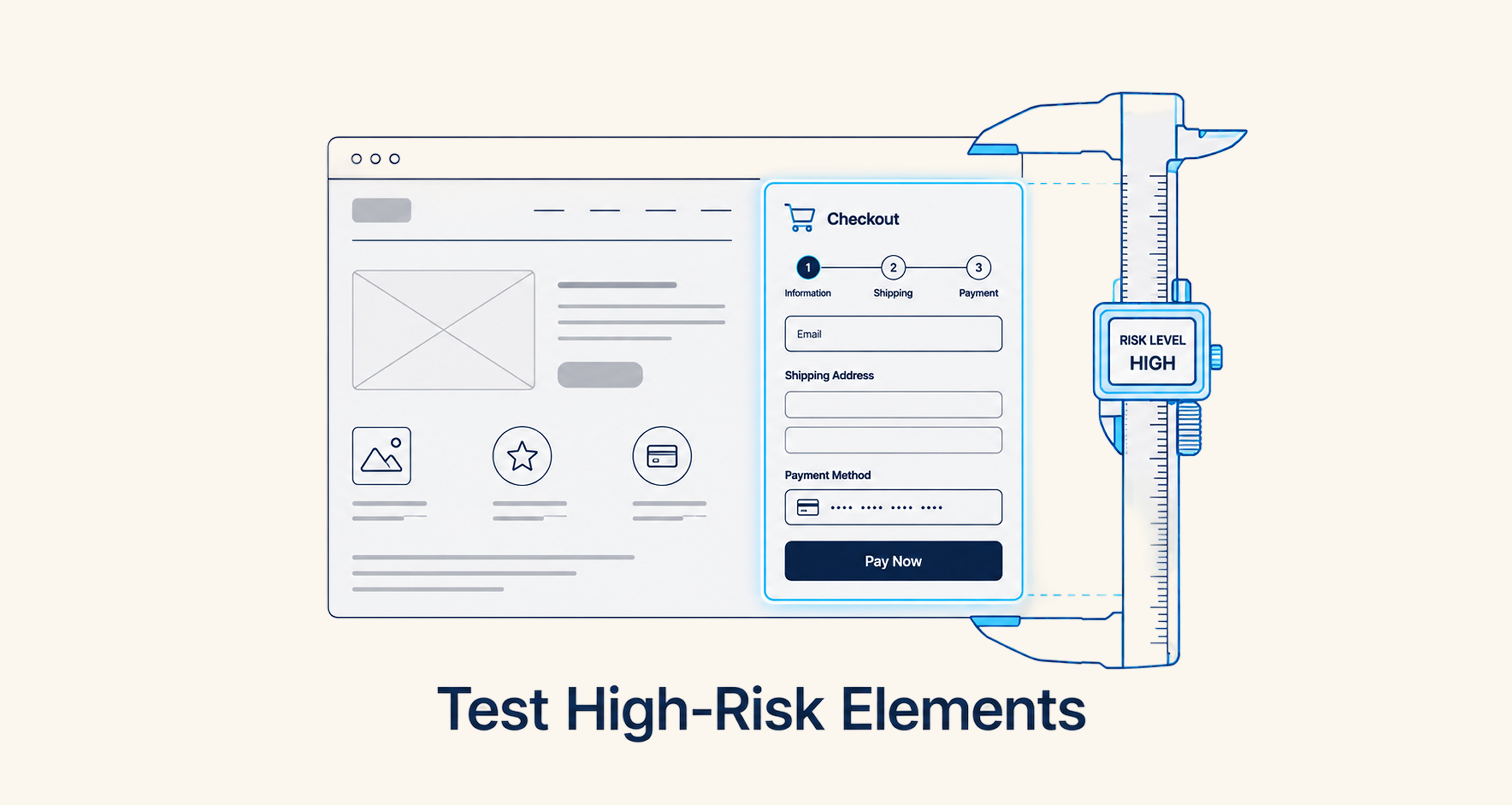
Not every element of a redesign carries equal risk. A new color palette is low risk. A restructured checkout flow or a rewritten value proposition on the homepage is high risk, and high-traffic pages amplify that risk further. Build interactive prototypes for these first and test them against the current live experience before committing engineering time to the full build.
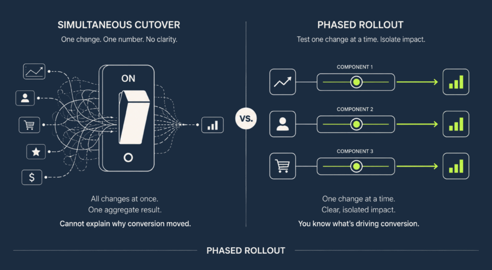
Test individual components, the hero, the navigation, the checkout, against the current site before combining them into the full new design. This isolates which specific changes are helping and which are quietly working against the redesign. A full simultaneous relaunch collapses all of that into one number that can’t tell you which of twenty changes moved it.
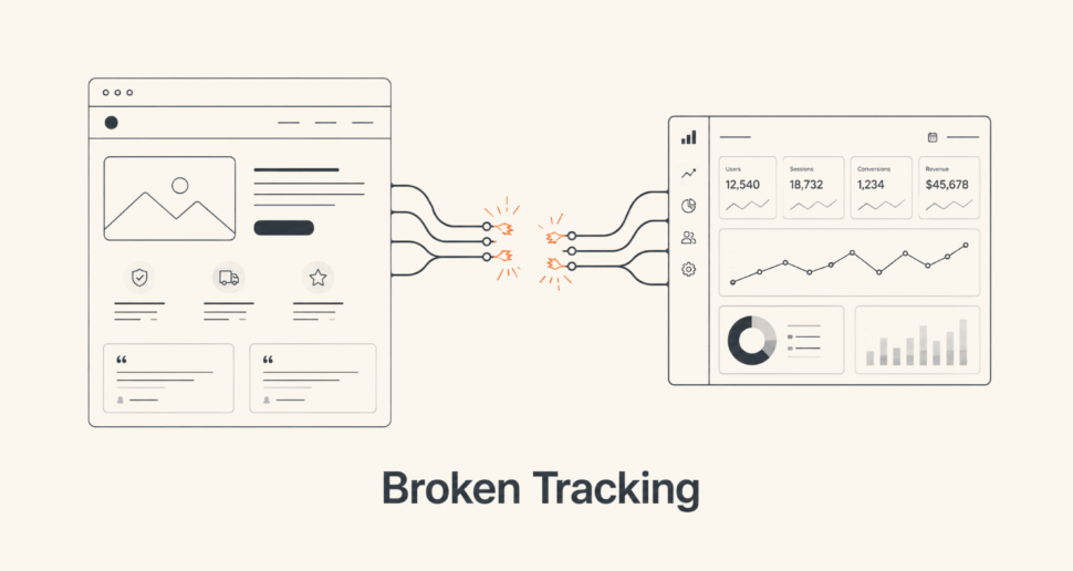
A redesign is one of the most common moments where analytics quietly breaks. New page structures, renamed elements, and rebuilt forms often stop firing the events a team was relying on to measure success. If test results after launch don’t match what the team expected, don’t assume the design is the problem right away. Broken or inconsistent tracking is one of the first things worth ruling out.
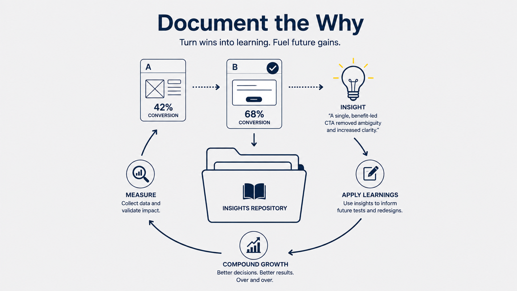
A redesign component that lifts conversion by 12% is a data point. Knowing it lifted conversion because the new CTA removed ambiguity about what happens next is a learning that applies to the next redesign too. This is the same discipline behind structured landing page testing programs, and it’s what separates a one-time redesign from an optimization system that keeps compounding.
For context on scale, the median landing page conversion rate across industries sits at 6.6 percent, based on Unbounce’s analysis of over 41,000 landing pages. Top-performing pages consistently reach 10 percent or higher. Better design budgets don’t explain that gap. It comes from teams that test their way there instead of designing their way there and hoping.

Trust signals, testimonials, security badges, clear return policies, and small interaction details like button feedback or form validation are real conversion levers. But they’re inputs to test, not assumptions to apply uniformly. A trust badge that helps on one checkout page can be visual noise on another. The right approach is to treat every trust and micro-UX decision as a hypothesis with a specific, testable claim, the same way you’d treat a headline or a CTA. It shouldn’t be a checklist of best practices applied by default because an article somewhere said they work.
Most redesigns are scoped around aesthetics, modernizing the look, refreshing the brand, cleaning up navigation, rather than the three things that actually drive conversion: clarity, trust, and friction. A site can look significantly better while those three variables stay untouched, which is why conversion often stays flat even after a visually successful redesign.
Yes. A new layout can bury a CTA that used to be prominent. A cleaner design can remove a trust signal that was quietly working. A rewritten headline can lose specificity that previously told visitors exactly what they were getting. These issues are rarely visible in design review and typically only show up once real traffic hits the new page.
Before, wherever possible. Testing individual high-risk components, checkout flows, hero sections, pricing pages, against the current live experience before a full launch catches problems while they’re still cheap to fix. Otherwise you discover them in a post-launch conversion report weeks later.
Phased rollout, testing components individually before combining them, makes it possible to identify which specific changes are helping and which are working against the redesign. A single simultaneous cutover produces one aggregate number that can’t explain why conversion moved the way it did.
Yes. New page structures, renamed elements, and rebuilt forms frequently break existing event tracking. If a redesign launches without confirming tracking still fires correctly, post-launch results become unreliable regardless of how well the design itself performs.
They can, but their impact varies by page and audience, so they should be tested rather than applied as a universal checklist. A trust badge or interaction detail that helps on one page can be neutral or even distracting on another.