How Many A/B Tests Should You Run a Month? Speed vs Quality
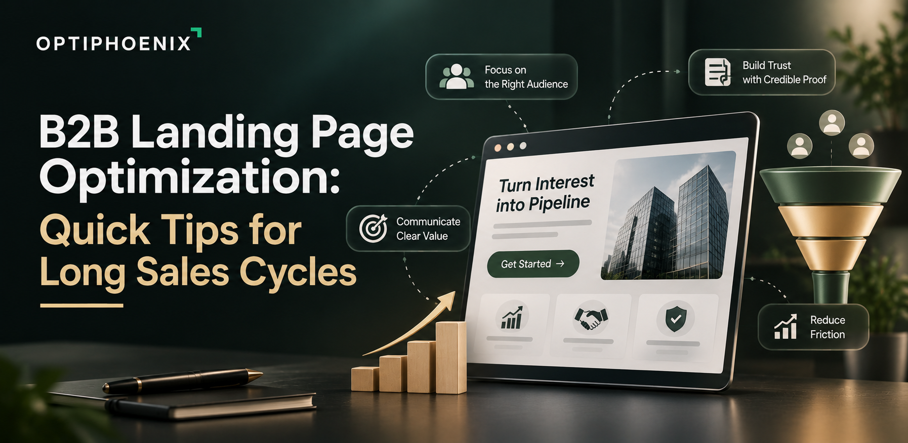
B2B landing page optimization gets harder when the sale takes months. Say a page has one job, a form fill on the first visit. That suits a quick purchase. Nielsen Norman Group describes B2B buying differently. In its words, “B2B purchases are rarely impulsive.” Customers “will begin researching a purchase weeks, months, or even years before the decision is finalized.” So a page that demands a demo request from a first-time visitor often asks too early. Below are quick tips for pages that sit inside a long sales cycle. We mark which points come from research and which are our own view.
On a first visit, many B2B buyers are still learning the category. Some are checking whether you deserve a spot on the shortlist. A demo form asks for a commitment they haven’t made yet, so they leave. You never find out what they needed.
A long cycle also means the person who lands on your page may not be the person who signs. That changes what the page has to say, and it’s the first fix to make.

NN/g warns about a common mistake. Many B2B sites tailor content to decision makers, “who may never actually use a product or service.” Its advice is that “your content must speak to both users and choosers.”
The two groups look for different things:
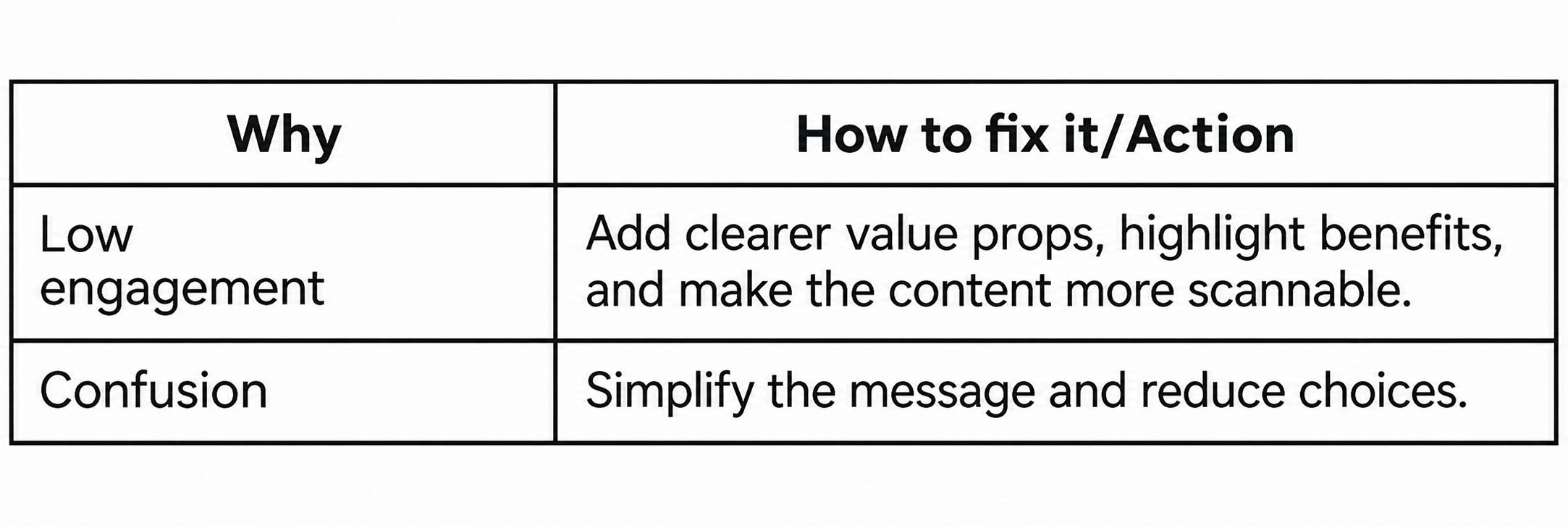
Check your page against both rows. Where would a user find compatibility details? Where would a chooser find the case for the cost? If a row has nothing, that reader leaves with a question you could have answered.
NN/g calls missing compatibility and integration details “a major pain point for B2B customers.” Its specs research adds that complete specifications let buyers get answers “without forcing prospects to email or call.” They also help draw in people at the research stage.
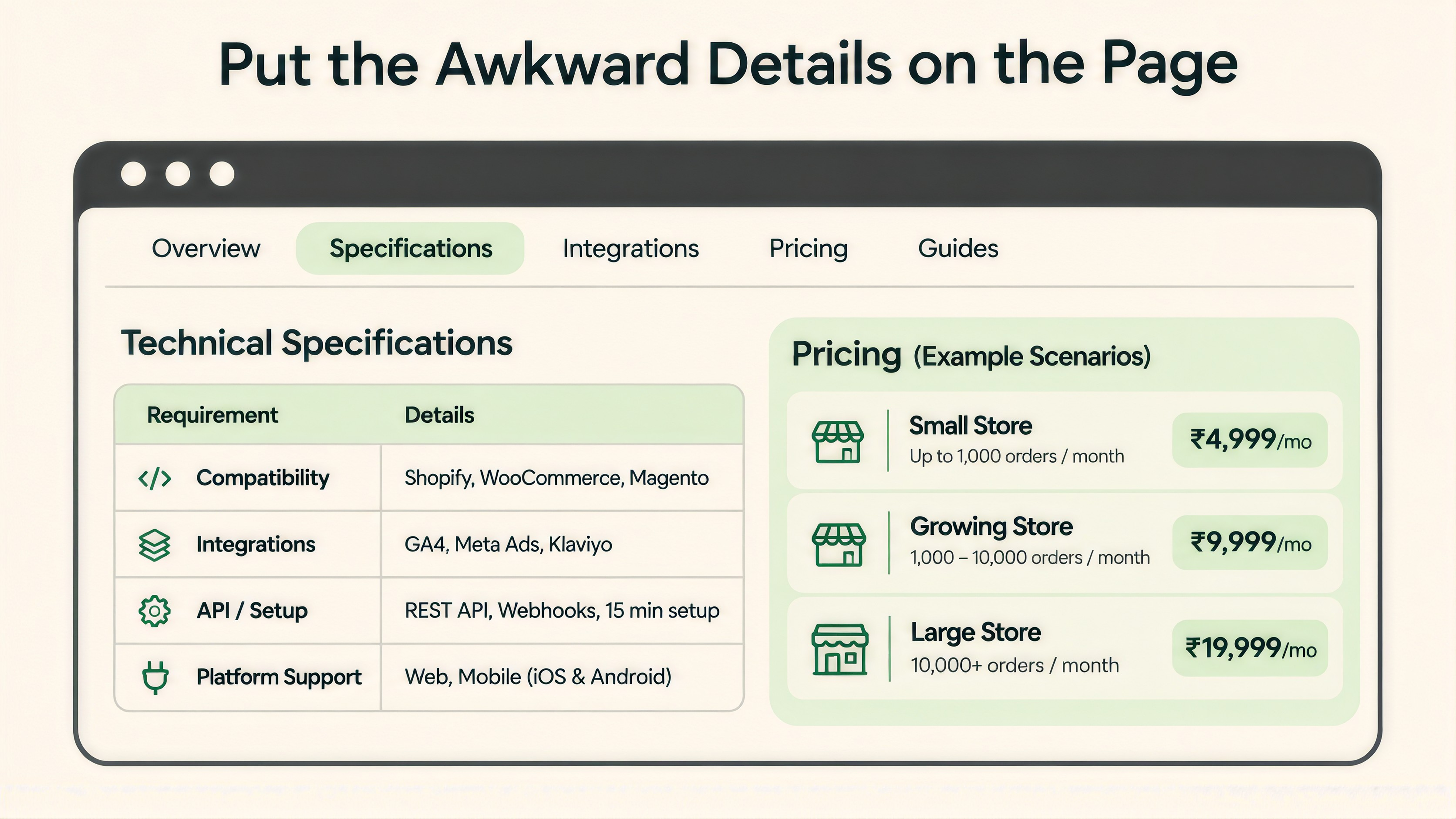
Price works the same way. NN/g’s advice is to “show the exact price” whenever possible. If you can’t, “show representative sample pricing.” Its trust research says hidden prices can make an organization seem dubious.
This is our take on how to apply that. If your price depends on seats or usage, show two or three example scenarios with real numbers. Put specs in HTML on the page, since NN/g recommends HTML and not a PDF alone.

NN/g notes that B2B buyers need to circulate options inside their company, so sites should let them share content with their team. On a landing page, that’s a design question. Could a manager skim the page in a minute and understand the offer? Does the URL still make sense when it lands in a colleague’s inbox?
Proof matters here too. In NN/g’s usability studies, testimonials were often noted as useful in the purchasing decision. The author counts as well, since “people care about who wrote testimonial: the author’s job title and affiliation.” Case studies help most “if your customers come from different industries.” So name the role and the company, and show the case study that matches the visitor’s field.
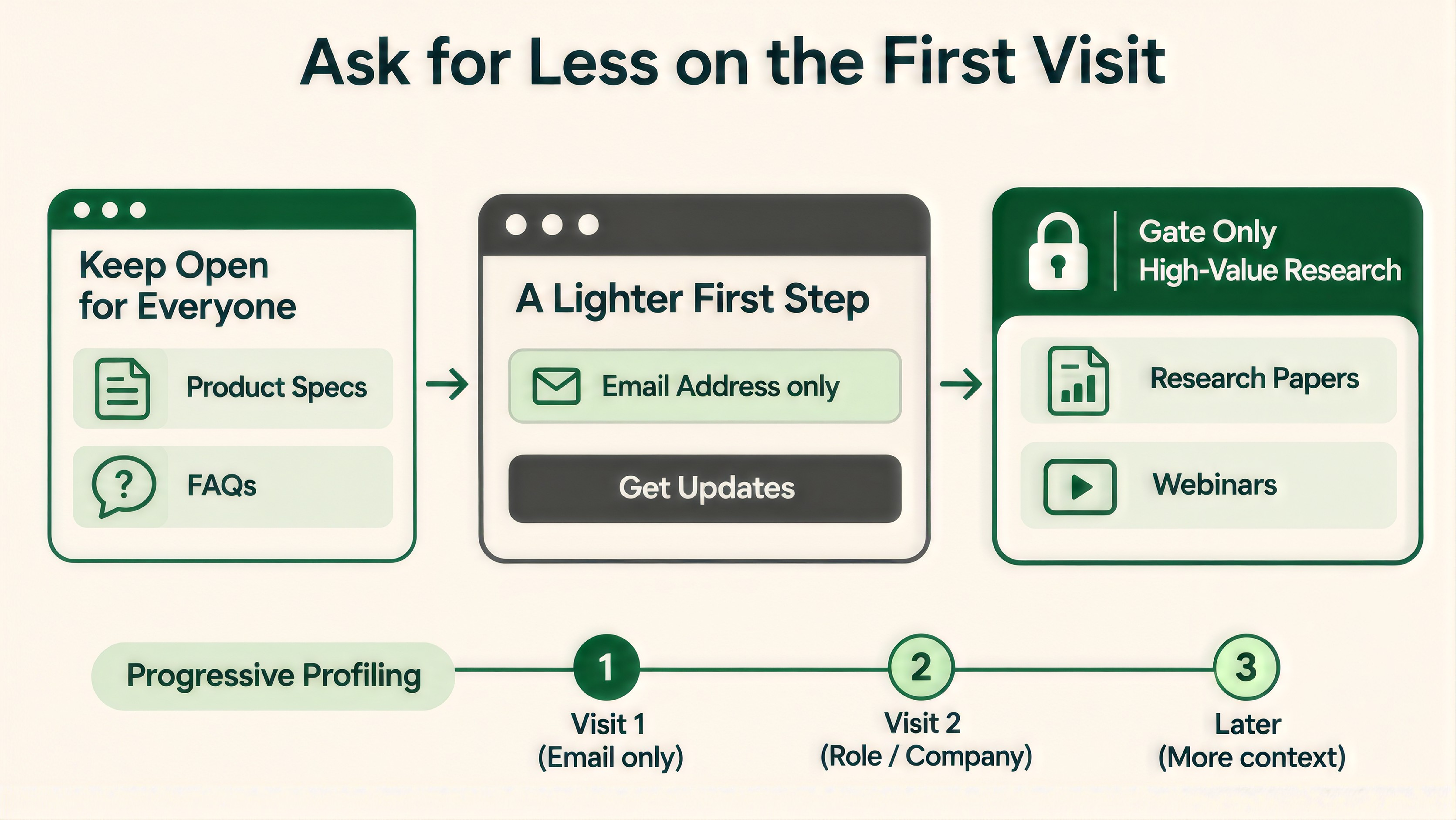
NN/g puts it bluntly: “Most people detest such lead-generation forms.” Timing matters too. “People in the initial stages of the buying cycle have lower commitment and a higher propensity to abandon forms.”
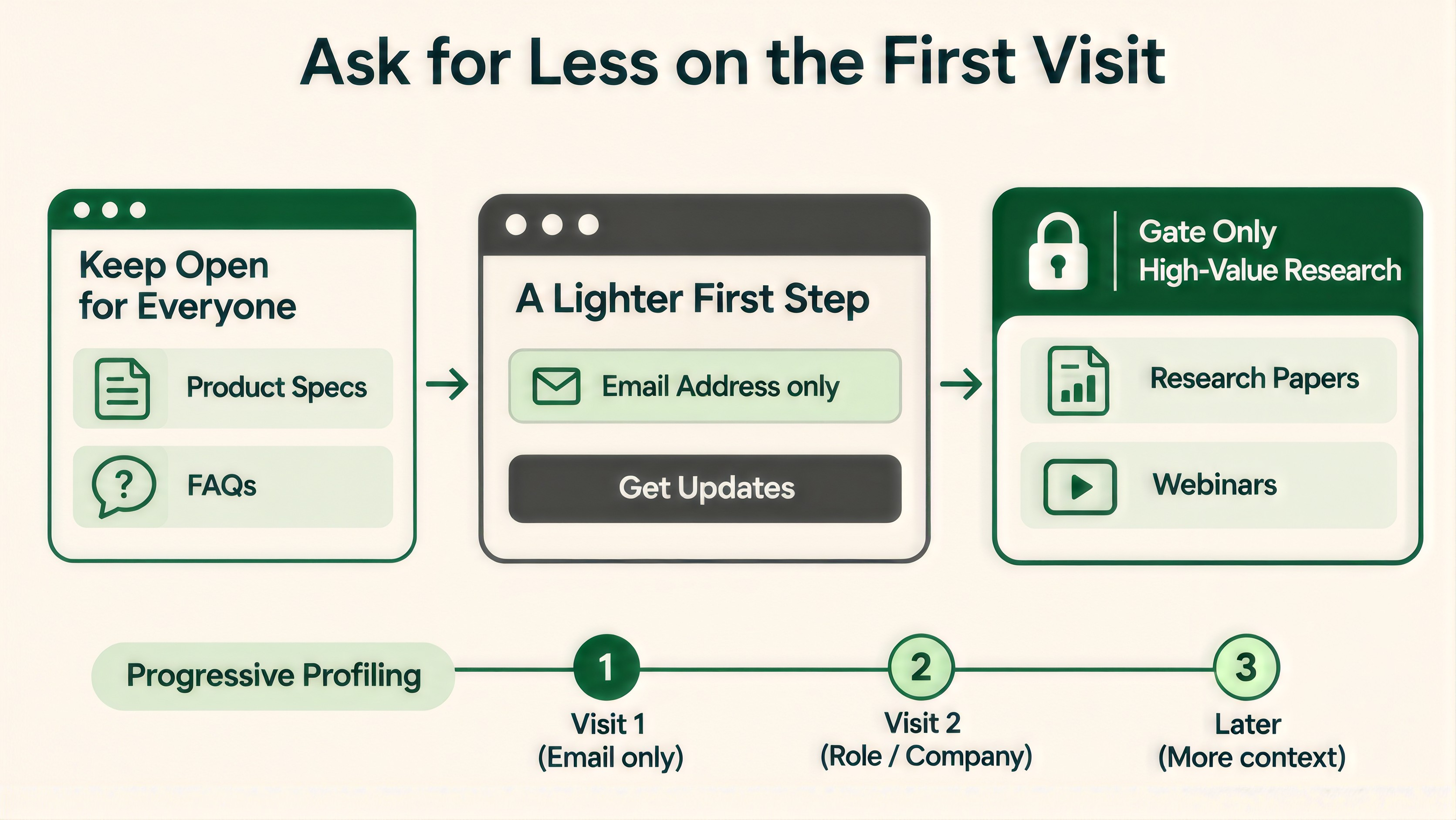
Its guidance for B2B pages is practical. Keep awareness content and basic product information open. Keep case studies, FAQs and specs out from behind a form. Gate only high-value material, such as research papers and webinars. When you do ask for details, keep the questions short and start with one, such as an email address. Collect the rest over time with progressive profiling.
Your sales team may want more fields to qualify leads. That’s a fair concern. Test a shorter form and judge it on what happens to the leads afterward, which the measurement section below covers.
This one is our recommendation, and we haven’t seen research behind it. A buyer who’s ready wants a way to talk to sales. A buyer who’s still researching needs something smaller, like a pricing page, a case study or a guide with no gate.
If the page offers only the first, researchers have nowhere to go. A second, lighter option gives them a reason to return. Track both, since each one tells you something different about who’s visiting.
Long cycles break the usual reporting in two ways.
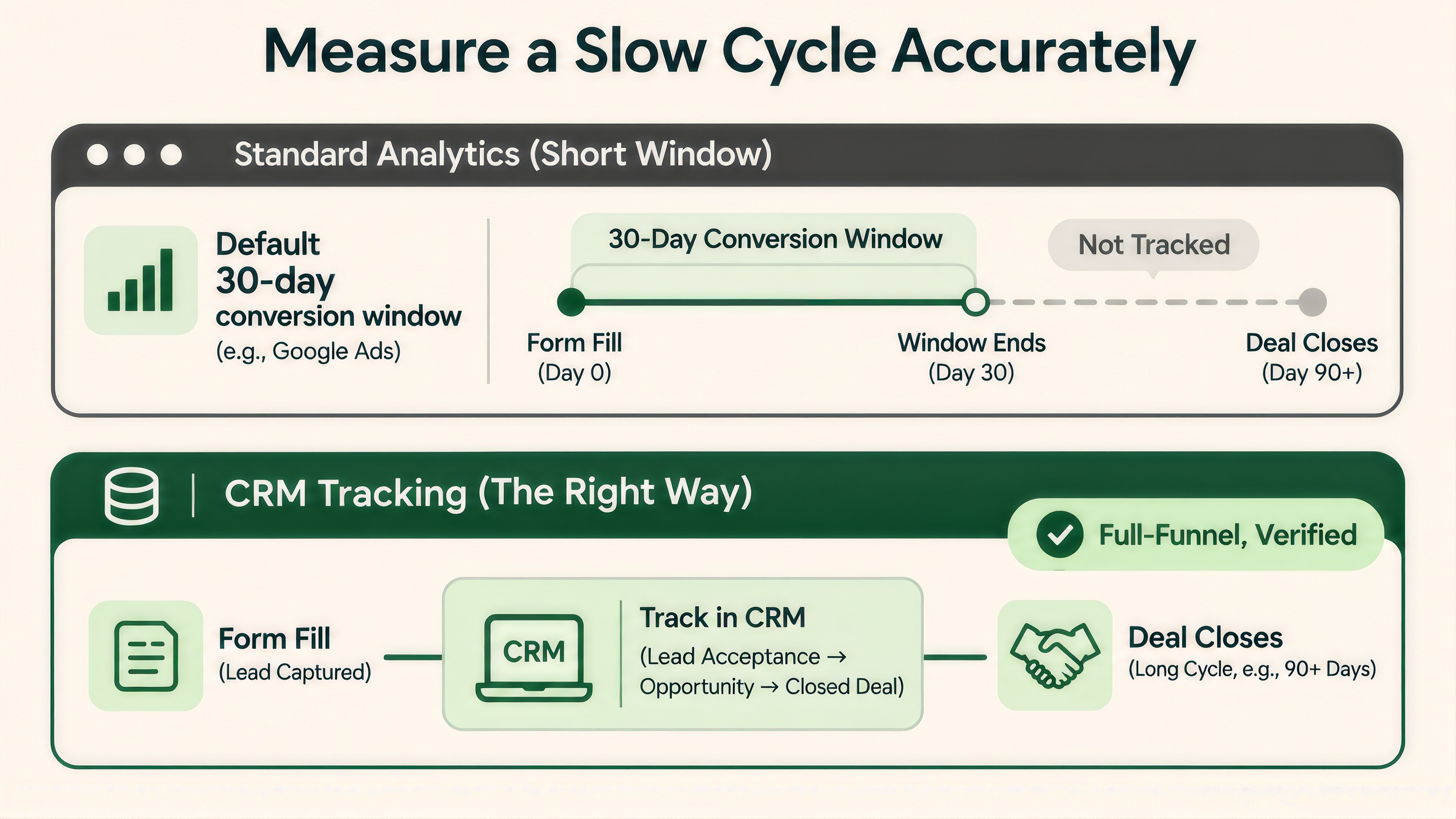
First, the conversion window. Google Ads counts click-through conversions within 30 days by default. You can set it from 1 to 30, 60 or 90 days. Conversions that arrive after the window “won’t be recorded.” If your buyers take longer than that, ad reports will undercount by design. A landing page that attracts slower, bigger buyers can look worse than it is.
Second, cookies. WebKit capped persistent cookies created through document.cookie to a seven-day expiry in Safari. A tool that stores its visitor ID that way may see a buyer who returns on day eight as a new person. Keep that in mind when you compare new and returning visitors.
Our view on what to do about it: treat form fills as an early signal. Pair them with a later one from your CRM, such as the share of leads that sales accepts. A test that lifts form fills while accepted leads fall is a loss. Our post on CRO program metrics beyond win rate covers how to choose those companion numbers. For slow, low-volume pages, how long an A/B test should run shows how to set a stopping point before you start. And before you trust any result, check the data itself with our guide to broken A/B test data and sample ratio mismatch.
Begin with evidence from your own site. A conversion rate audit shows where visitors stall before they reach the form. Then pick the fix from the list above that matches what you find.
If you’d like help finding where your B2B pages lose people before the form, we’ll go through them with you. Talk to our team about a B2B landing page audit.

It varies too much for one number. NN/g says customers may begin researching “weeks, months, or even years” before a decision. The reliable figure is your own: the time from first touch to closed deal in your CRM.
NN/g recommends it. Show the exact price when you can. When price varies, show representative sample pricing or common scenarios.
Gate sparingly. NN/g suggests gating high-value material such as research papers and webinars. It says to keep case studies, FAQs and product specs open.
Know your tool’s window first. Google Ads defaults to 30 days and allows up to 90. Then match leads to later outcomes in your CRM, so a page is judged on accepted leads and not only on form fills.